The Complete Image Optimization Guide for the Web
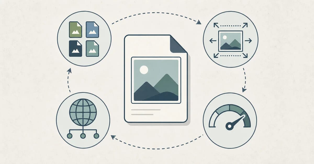
Image optimization end to end: choose a format, size for the layout, compress at the right quality, deliver through a CDN, then check the result.
Disclosure: ImageGuide is published by Sirv, an image CDN company. This guide mentions Sirv products. Read how we write these guides.
Quick answer
Optimize web images by selecting the right crop and dimensions, comparing suitable formats, compressing to acceptable visual quality, and delivering responsive variants. Reserve layout space and load the main visible image promptly. Measure the real page after the change; file size alone does not explain loading performance.
Reference for this answer: Google guidance on image LCP.
Images are the heaviest thing on the average web page. When teams ask why their site feels slow, the answer is almost never JavaScript alone — it is a 2 MB hero photo shipped to a phone, a PNG used where a JPG would do, or an image loaded before the user ever scrolls to it. Image optimization fixes this, and unlike most performance work, it does not require rewriting your application.
This guide is the hub for everything image-related on this site. It walks through a decision framework — right format, right size, right compression, right delivery — and links out to a specialist guide for each step. If you read only one page about image optimization, make it this one. If you need depth on a single topic, follow the links.
Why Image Optimization Matters
Images dominate page weight
Across typical content and e-commerce pages, media accounts for the largest share of total bytes — often more than scripts, styles, and fonts combined. The median page ships several megabytes, and images are usually half of that or more. The exact numbers shift year to year, but the shape does not: if your page is slow, look at your images first.
Images gate LCP
Largest Contentful Paint (LCP) measures when the biggest above-the-fold element finishes rendering. On most pages, that element is an image — a hero banner, a product photo, a featured article thumbnail. Every kilobyte you shave off that one image moves LCP directly. Google’s Core Web Vitals treat 2.5 seconds as the “good” threshold, and unoptimized hero images are the single most common reason sites miss it. We cover the measurement details in core-web-vitals-images.
Slow images cost users and revenue
The relationship between load time and bounce rate is well documented: as pages take longer, the share of visitors who abandon rises steeply in the first few seconds. For e-commerce, product images are the product — slow or broken ones suppress conversion. For publishers, slow images suppress pages per session. You do not need a specific percentage to act on this; the direction is unambiguous, and the fix is cheap.
Optimization compounds
An optimized image pipeline pays off on every page view, for every visitor, forever. Unlike a one-off refactor, the savings scale with your traffic. A 40% reduction in image weight is a 40% reduction in the largest line item on your bandwidth bill — and on your users’ data plans.
The Decision Framework
Image optimization is not one decision. It is four, made in order:
- Right format — Is this a photo, a graphic, an animation, or an icon? The content type dictates the format family.
- Right size — How large does this image actually render on screen, at each breakpoint? Ship pixels for the rendered size, not the camera’s output.
- Right compression — Lossy or lossless, and at what quality? Quality settings dominate file size.
- Right delivery — CDN, caching headers, lazy loading, preloading. A perfectly compressed image still performs badly if it arrives late or re-downloads on every visit.
Most image optimization mistakes happen when someone skips to step 3. Running everything through a compressor while still serving 4000-pixel PNGs for thumbnails is optimizing the wrong variable. Work the framework in order and each step gets easier: once you have the right format and size, compression settings become almost mechanical.
Step 1: Choose the Right Format
Format selection is where the biggest wins live. A wrong-format image can be 5–10× larger than the right-format equivalent at the same visual quality.
| Content | Best format | Runner-up | Why |
|---|---|---|---|
| Photographs | WebP or AVIF | JPG | Modern codecs cut 25–50% vs JPEG at matched quality |
| Screenshots, diagrams, flat graphics | PNG or lossless WebP | AVIF lossless | Sharp edges and text stay crisp; no blocky artifacts |
| Logos, icons, simple illustrations | SVG | PNG (fallback) | Infinitely scalable, tiny, stylable with CSS |
| Images needing transparency | WebP or PNG | AVIF | WebP supports alpha at a fraction of PNG’s size |
| Animations | WebP or AVIF (animated) | GIF | Same visual result at a fraction of the bytes |
| Photos needing maximum compatibility | JPG | WebP with fallback | JPG works everywhere, including ancient clients |
A few rules of thumb:
- JPG remains the safe default for photos when you need one format that works everywhere. It has no transparency support and its compression is dated, but two decades of tooling and universal decode support make it a dependable floor. Our deep dive on tuning it lives in jpeg-optimization-mastery.
- WebP is the pragmatic modern choice. It decodes in every current browser, supports both lossy and lossless modes plus animation and alpha, and typically lands 25–35% smaller than JPEG at matched quality. Start with the complete-webp-guide.
- AVIF pushes compression further, often 20–50% smaller than WebP for photos, at the cost of slower encoding and weaker legacy support. It is the best target when you can serve format negotiation. See complete-avif-guide.
- PNG is for pixels that must be exact: screenshots, UI captures, diagrams with text, images requiring lossless fidelity. For photographic content it is usually the wrong tool — see png-optimization-transparency for when it earns its size.
- SVG is the only correct answer for icons and logos, and it is not close. A vector icon is typically under 2 KB; a raster equivalent is 10–50× larger and blurs on high-density screens.
- GIF is obsolete for everything except nostalgia. Animated WebP or AVIF reproduces the same animation far smaller. Migrate with the patterns in gif-to-modern-formats.
If you are unsure which bucket an image falls into, the general comparison in image-file-types-explained walks through the trade-offs in more depth.
Step 2: Size Images for the Layout, Not the Camera
A modern phone produces 4000-pixel-wide images. If that image renders at 400 CSS pixels wide on a laptop, you are shipping roughly 10× more pixels than needed — and file size scales with pixel count. Resizing alone, before any compression tuning, routinely cuts file size by 70–90%.
Intrinsic size
Start by asking: what is the largest size this image renders at, across all breakpoints? Export to that size times two for high-density (retina) displays — a 400 px slot gets an 800 px file — and stop there. Exporting “just in case” at 3× or 4× wastes bytes for detail no screen shows.
Responsive delivery
One file cannot be optimal for a 360 px phone and a 2560 px desktop. The srcset and sizes attributes let the browser pick the right file:
<img
  src="hero-800.webp"
  srcset="hero-400.webp 400w,
          hero-800.webp 800w,
          hero-1600.webp 1600w"
  sizes="(max-width: 600px) 100vw, 50vw"
  alt="Team collaborating in the studio"
/>
The browser combines srcset with sizes and its own display density to download the smallest file that still looks sharp. This is the core of responsive images; the full treatment — picture, art direction, media queries, and common mistakes — is in responsive-images-complete-guide and its companion on responsive-image-mistakes.
Resizing in practice
You do not need to hand-export a dozen variants per image. Build tools and image CDNs generate the size ladder automatically:
- Build-time:
sharpscripts, Next.jsnext/image, Astro’s image service. - On-the-fly: an image CDN derives variants from one master file per request (more in the delivery section below).
For the mechanics of resizing without visible quality loss, see image-resizing-web-guide and lower-image-resolution.
Step 3: Compress at the Right Quality
Compression is where quality and size meet, and where most fear lives. Two facts dissolve most of it:
First: lossy vs lossless is a content decision, not a quality decision. Lossy encoding discards detail the eye barely notices; lossless preserves every pixel exactly. Photographs tolerate lossy compression extremely well. Screenshots, text, and diagrams do not — artifacts around sharp edges are immediately visible, so those stay lossless. This is the same format logic from Step 1, applied at encode time.
Second: quality settings are nonlinear. In JPEG and WebP, the file size difference between quality 90 and quality 80 is often 30–50%, while the visible difference is negligible. Below roughly quality 60, artifacts start showing in gradients and skin tones. This gives you a wide “free” range.
Typical sweet spots (verify with your own eyes — content varies):
| Content | Lossy quality | Notes |
|---|---|---|
| Hero and marketing photos | 75–85 | Highest visibility; spend bytes here |
| Content and article images | 70–80 | The workhorse range |
| Thumbnails and previews | 60–75 | Small render size hides artifacts |
| Backgrounds, decorative | 50–70 | Blur and overlays forgive more |
| Screenshots, UI, text-bearing | Lossless | Use PNG or lossless WebP |
Two practices make compression safe:
- Compress once, at the source. Re-encoding an already-lossy file compounds artifacts. Always compress from the original master. If you have inherited a library of double-compressed images, remove-jpeg-artifacts covers cleanup.
- Compare visually, not by number. A quality setting is a means, not a goal. Flip between original and compressed at 100% zoom; if you cannot see a difference, the setting is fine. Side-by-side tooling and per-format settings are in reduce-image-file-size and understanding-image-compression.
For a static folder, Press puts both practices into one local pass: it compares the original with WebP, AVIF, or JPEG XL at 100%, then writes the chosen result to a separate output tree without touching the master. Use a build step or CDN instead when new images must be optimized automatically.
For a broader look at settings people get wrong, image-optimization-mistakes catalogs the recurring ones, and image-optimization-myths debunks the folklore (spoiler: “quality 100 or nothing” is not a strategy).
Step 4: Deliver Images Efficiently
A perfectly optimized file can still perform badly if delivery is wrong. Four levers matter.
CDN
A CDN serves images from edge locations near the user instead of one origin server. For images this matters twice: bytes travel a shorter physical distance, and edge nodes can transform images (resize, convert format) on the fly so you store one master and serve many variants. Latency to first byte often drops from hundreds of milliseconds to tens. Choosing between providers is its own decision — we compare them in image-cdn-comparison, and signs-you-need-an-image-cdn helps you tell whether you have outgrown origin-only serving. If you use Sirv, its Media Viewer also handles galleries, zoom, and 360° spins from the same optimized delivery layer — see the Sirv Media Viewer documentation.
Caching headers
Without caching headers, every page view re-downloads images that never changed. Set long lifetimes for immutable assets:
Cache-Control: public, max-age=31536000, immutablePair a one-year lifetime with content-hashed filenames so a changed image gets a new URL and caches update instantly. The full header playbook — ETag, stale-while-revalidate, and CDN-tier caching — is in image-caching-headers.
Lazy loading
Below-the-fold images should not compete with the LCP image for bandwidth. Native lazy loading makes this one attribute:
<img src="photo.webp" loading="lazy" alt="Product on a white background" />The browser defers loading until the image approaches the viewport. Apply it to everything below the fold; never apply it to the LCP image, where it delays rendering. Threshold tuning, fade-in behavior, and framework-specific patterns are covered in lazy-loading-strategies.
Preloading the LCP image
The browser cannot know your hero image is important until it has parsed enough of the page. Preload tells it early:
<link rel="preload" as="image" href="/img/hero-800.webp"
      imagesrcset="/img/hero-400.webp 400w, /img/hero-800.webp 800w"
      imagesizes="100vw" />
Preload the LCP image and nothing else — over-preloading recreates the bandwidth contention you just removed. Priority hints, fetchpriority, and when preloading backfires: image-preloading-priority-hints.
Automation: Build Time vs On-the-Fly
Manual optimization does not survive contact with a real content workflow. Two models automate it:
| Build-time | On-the-fly (CDN) | |
|---|---|---|
| How it works | Pipeline generates optimized variants during build | CDN transforms the master per request |
| Pros | Zero runtime cost; variants cached as static files | One master file; new sizes/formats free; no build step |
| Cons | Every variant committed or rebuilt; slower builds | Per-request cost; transform latency on first hit |
| Best for | Static sites, fixed layouts, small image sets | Dynamic content, user uploads, many breakpoints |
Most mature setups combine both: build-time for the known, static chrome of the site, on-the-fly for content that changes or scales unpredictably. Tooling by stack: build-tool-image-plugins covers bundler integrations, batch-image-processing-workflows covers scripting large libraries, and cicd-image-optimization-pipelines covers enforcing budgets in CI. Framework-specific guides exist for React, Next.js, Angular, WordPress, Shopify, Wix, and Squarespace.
If you would rather not run a pipeline at all, an image CDN with on-the-fly transforms is the pragmatic path — image-cdn-for-image-hosting explains that model. For AI-generated and AI-optimized imagery, see ai-image-generation-optimization and how AI search changes image discovery in ai-search-image-optimization.
Measure: Prove the Win
Optimization without measurement is guesswork. Three layers, cheapest first:
Lab tools simulate a page load on controlled hardware. Lighthouse (built into Chrome DevTools) flags unoptimized images directly — improperly sized, off-priority, missing lazy loading — and reports LCP. Run it on your top pages before you change anything, so you have a baseline. Our walkthrough is lighthouse-image-audit-guide. For deeper network-level inspection, Chrome DevTools shows per-request timing and transfer size; see browser-devtools-image-debugging.
Synthetic field tests like WebPageTest load your page from real locations on real connection profiles (including throttled 4G), with filmstrip views showing exactly when each image appears. Use these to sanity-check lab numbers under realistic networks.
Real-user monitoring (RUM) collects Core Web Vitals from actual visitors — the only data Google uses for ranking and the only data that reflects your true audience mix of devices and networks. Ship web-vitals in your analytics, segment by device type, and watch the 75th percentile.
A practical loop: audit with Lighthouse, fix the flagged items using this guide’s sections, confirm with WebPageTest, then track RUM trends over the following weeks. If LCP is your target metric, the image-specific playbook is in core-web-vitals-images.
The Image Optimization Checklist
Run this against any page or site. It is ordered by impact.
Audit first
- Run Lighthouse on your 5 most-visited pages; note LCP and image warnings
- List your 10 largest images by transferred bytes (DevTools → Network → filter Img)
Format
- Photos are JPG, WebP, or AVIF — not PNG
- Screenshots, diagrams, and text-bearing graphics are PNG or lossless WebP — not JPG
- Icons and logos are SVG
- Animated GIFs are replaced with animated WebP or AVIF where supported
Size
- No image is wider than its largest rendered size × 2 (retina)
- Above-the-fold responsive images use
srcset+sizes - Thumbnails render thumbnails, not scaled-down originals
Compression
- Photographic content is compressed at quality 70–85 from the original master
- Lossless formats (PNG) are minified with a lossless optimizer
- No image is re-compressed from an already-compressed source
Delivery
- Immutable images serve
Cache-Control: max-age=31536000, immutablewith hashed filenames - Below-the-fold images use
loading="lazy" - The LCP image is preloaded (or
fetchpriority="high") and never lazy-loaded - Images are served from a CDN if your audience is geographically spread
Process
- New uploads are optimized automatically (build step or on-the-fly transforms)
- A size budget in CI blocks regressions
- RUM tracks LCP and image weight over time
Work top to bottom. The first unchecked format or sizing item usually pays for the whole exercise.
Where to Go Next
This guide covered the map; the linked guides cover the territory. If you want a suggested path:
- Biggest win, least effort: convert your photo library to WebP — complete-webp-guide, then push further with AVIF — complete-avif-guide.
- If LCP is your problem: core-web-vitals-images plus image-preloading-priority-hints.
- If your images are already compressed but slow: delivery — image-cdn-comparison, image-caching-headers, lazy-loading-strategies.
- If you manage many images across a team: batch-image-processing-workflows and cicd-image-optimization-pipelines.
For hands-on work, the free browser tools on this site handle quick conversions and compression without installing anything, and a platform like Sirv automates the delivery half — resizing, format conversion, and edge caching from a single uploaded master. For creative workflows like background removal and AI-assisted editing on product shots before optimization, Sirv Studio covers that step.
Image optimization rewards systems over heroics. Set up the framework once — right formats, sized responsively, compressed from masters, delivered through a CDN with sane caching — and every image you publish afterward is fast by default.