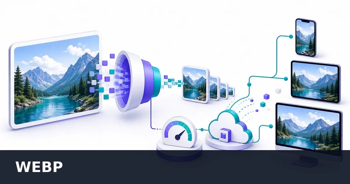
The Complete WebP Guide: Everything You Need to Know
Master WebP image format with this comprehensive guide covering encoding, optimization, browser support, conversion strategies, and real-world implementation.
Disclosure: ImageGuide is published by Sirv, an image CDN company. This guide mentions Sirv products. Read how we write these guides.
WebP has become the de facto standard for web images, offering superior compression while maintaining excellent visual quality. This comprehensive guide covers everything from the basics to advanced optimization techniques.
What is WebP?
WebP is a modern image format developed by Google, first released in 2010. It uses both lossy and lossless compression, and supports animation and alpha transparency. The format was designed specifically for the web, prioritizing file size reduction without sacrificing perceived quality.
Key Characteristics
| Feature | WebP Support |
|---|---|
| Lossy compression | ✓ Yes |
| Lossless compression | ✓ Yes |
| Transparency (alpha) | ✓ Yes |
| Animation | ✓ Yes |
| Color depth | 8-bit per channel |
| Max dimensions | 16383 x 16383 pixels |
WebP typically achieves:
- 25-34% smaller file sizes than JPEG at equivalent quality
- 26% smaller file sizes than PNG for lossless images
- Significantly smaller than GIF for animations
How WebP Compression Works
Understanding how WebP achieves its compression helps you make better optimization decisions.
Lossy Compression
WebP’s lossy compression is based on VP8 video codec technology (the same used in WebM video). The process involves:
-
Macroblock prediction: The image is divided into 16x16 pixel macroblocks. Each block is predicted based on previously decoded blocks.
-
Discrete Cosine Transform (DCT): Residual differences are transformed to frequency domain, allowing more efficient compression of high-frequency data.
-
Quantization: Frequency coefficients are quantized (reduced precision), which is where most data loss occurs.
-
Entropy coding: The quantized data is further compressed using arithmetic coding.
The quality parameter (0-100) primarily affects the quantization step. Higher quality means less aggressive quantization and larger files.
Lossless Compression
WebP lossless uses several techniques unique to image data:
-
Predictor transform: Pixels are predicted based on neighboring pixels, storing only the difference.
-
Color transform: Decorrelates RGB channels to improve compression.
-
Subtract green transform: Uses green channel correlation with red and blue.
-
Color indexing: For images with few colors, creates a palette.
-
LZ77 backward references: Finds and references repeated patterns.
Browser Support in 2026
WebP enjoys excellent browser support, making it safe for production use:
| Browser | Support Since |
|---|---|
| Chrome | Version 17 (2012) |
| Firefox | Version 65 (2019) |
| Safari | Version 14 (2020) |
| Edge | Version 18 (2018) |
| Opera | Version 11 (2011) |
| Samsung Internet | Version 4 (2016) |
| iOS Safari | iOS 14 (2020) |
| Android Browser | Version 4.2 (2013) |
Current global support: ~97% according to Can I Use data.
The remaining ~3% consists primarily of:
- Older iOS devices (pre-iOS 14)
- Legacy enterprise browsers
- Some regional browsers
Handling Unsupported Browsers
For the small percentage of users with unsupported browsers, use the <picture> element:
<picture>
  <source srcset="image.webp" type="image/webp">
  <source srcset="image.jpg" type="image/jpeg">
  <img src="image.jpg" alt="Description" width="800" height="600">
</picture>
Or use server-side content negotiation based on the Accept header:
Accept: image/webp,image/apng,image/*,*/*;q=0.8When to Use WebP
WebP excels in most web image scenarios, but understanding its strengths helps you maximize benefits.
Ideal Use Cases
Photographs and complex images
- Product photos on e-commerce sites
- Hero images and banners
- Blog post images
- User-uploaded content
Graphics with transparency
- Logos on varied backgrounds
- UI elements with shadows
- Overlays and decorative elements
Animated content
- Short animations (replacing GIF)
- Loading indicators
- Interactive elements
- Micro-interactions
When to Consider Alternatives
Vector graphics: Use SVG for logos, icons, and illustrations that need to scale infinitely.
Simple graphics with few colors: PNG might be competitive for very simple graphics.
Print or archival: Use lossless formats like PNG or TIFF when quality preservation is paramount.
Ultra-high compression needs: AVIF offers even better compression ratios, though with slower encoding.
Optimization Strategies
WebP has two encoders behind one extension, and picking the wrong one is the most expensive mistake available. Measured on two very different sources:
Lossy vs Lossless WebP, by Content Type
A 1200×630 illustration and a 1200×1400 UI screenshot, each encoded three ways.
Lossy is 5 to 7 times smaller in both cases — but on the screenshot it puts the same grey halos around text that JPEG does. The right reading is not “lossy wins”, it is that the content decides:
- For the screenshot, lossless WebP at 209 KB replaced a 467 KB PNG. That is a 55% saving with zero quality loss, the single best trade in this guide.
- Near-lossless sits between them, saving about 12% over pure lossless with no visible change. It needs
-z 9alongside it, or it performs worse than plain lossless. - For the illustration, lossy at
-q 78is the obvious answer.
Finding the Right Quality Setting
The quality parameter significantly impacts both file size and visual quality. Here’s a practical approach:
Quality 75-85: Best balance for most photos
- Imperceptible quality loss to most viewers
- Significant file size reduction
- Recommended starting point
Quality 85-95: High-quality needs
- Near-lossless appearance
- Moderate file size savings
- Use for hero images, product shots
Quality 60-75: Aggressive optimization
- Some visible artifacts on close inspection
- Maximum file size reduction
- Suitable for thumbnails, background images
Quality Comparison at Different Settings
For a typical 1920x1080 photograph:
| Quality | File Size | Visual Quality |
|---|---|---|
| 100 | ~450 KB | Perfect |
| 90 | ~180 KB | Excellent |
| 80 | ~95 KB | Very Good |
| 70 | ~65 KB | Good |
| 60 | ~48 KB | Acceptable |
WebP Quality vs File Size
1920x1080 photo — dramatic savings from q100 to q80, diminishing returns below q70
Lossless vs Lossy Decision Tree
Choose lossless when:
- The image contains text that must remain crisp
- You need pixel-perfect reproduction
- The source is already a compressed format
- Screenshots with UI elements
Choose lossy when:
- The image is a photograph
- Small artifacts are acceptable
- File size is a priority
- The image will be displayed at reduced size
Converting to WebP
Command Line with cwebp
Google’s official cwebp encoder provides the most control:
# Basic lossy conversion
cwebp -q 80 input.jpg -o output.webp

# Lossless conversion
cwebp -lossless input.png -o output.webp

# With alpha transparency
cwebp -q 80 -alpha_q 90 input.png -o output.webp

# Near-lossless (quality affects preprocessing only)
cwebp -near_lossless 60 input.png -o output.webp
Key cwebp options:
| Option | Description |
|---|---|
-q [0-100] | Lossy quality factor |
-lossless | Enable lossless mode |
-near_lossless [0-100] | Near-lossless preprocessing |
-alpha_q [0-100] | Alpha channel quality |
-m [0-6] | Compression method (higher = slower, smaller) |
-resize W H | Resize during conversion |
-mt | Multi-threaded encoding |
Using ImageMagick
# Basic conversion
convert input.jpg -quality 80 output.webp

# With resize
convert input.jpg -resize 1200x800 -quality 80 output.webp

# Batch conversion
mogrify -format webp -quality 80 *.jpg
Sharp (Node.js)
const sharp = require('sharp');

// Lossy WebP
await sharp('input.jpg')
  .webp({ quality: 80 })
  .toFile('output.webp');

// Lossless WebP
await sharp('input.png')
  .webp({ lossless: true })
  .toFile('output.webp');

// With resize
await sharp('input.jpg')
  .resize(1200, 800, { fit: 'inside' })
  .webp({ quality: 80 })
  .toFile('output.webp');
Squoosh CLI
Google’s Squoosh provides excellent defaults:
npx @squoosh/cli --webp '{"quality":80}' input.jpgImplementing WebP on Your Website
HTML Picture Element
The most reliable cross-browser method:
<picture>
  <!-- WebP for supporting browsers -->
  <source
    srcset="image-400.webp 400w,
            image-800.webp 800w,
            image-1200.webp 1200w"
    sizes="(max-width: 600px) 400px,
           (max-width: 1000px) 800px,
           1200px"
    type="image/webp">

  <!-- JPEG fallback -->
  <source
    srcset="image-400.jpg 400w,
            image-800.jpg 800w,
            image-1200.jpg 1200w"
    sizes="(max-width: 600px) 400px,
           (max-width: 1000px) 800px,
           1200px"
    type="image/jpeg">

  <!-- Final fallback -->
  <img
    src="image-800.jpg"
    alt="Description"
    width="1200"
    height="800"
    loading="lazy">
</picture>
CSS Background Images
For CSS backgrounds, use @supports or multiple backgrounds:
.hero {
  /* Fallback */
  background-image: url('hero.jpg');
}

@supports (background-image: url('test.webp')) {
  .hero {
    background-image: url('hero.webp');
  }
}
Or use Modernizr-style class detection:
.no-webp .hero {
  background-image: url('hero.jpg');
}

.webp .hero {
  background-image: url('hero.webp');
}
Server-Side Content Negotiation
Configure your server to automatically serve WebP when supported:
Nginx:
map $http_accept $webp_suffix {
  default "";
  "~*webp" ".webp";
}

location ~* ^(.+)\.(jpg|jpeg|png)$ {
  add_header Vary Accept;
  try_files $1$webp_suffix $uri =404;
}
Apache (.htaccess):
RewriteEngine On
RewriteCond %{HTTP_ACCEPT} image/webp
RewriteCond %{REQUEST_FILENAME}.webp -f
RewriteRule ^(.+)\.(jpe?g|png)$ $1.$2.webp [T=image/webp,E=REQUEST_image]
Header append Vary Accept env=REQUEST_image
Using a CDN
Modern CDNs and image services can handle WebP conversion automatically:
<!-- Sirv automatically serves WebP to supporting browsers -->
<img src="https://example.sirv.com/image.jpg" alt="Description">

<!-- Force WebP format -->
<img src="https://example.sirv.com/image.jpg?format=webp" alt="Description">
This approach offers several advantages:
- No need to generate multiple formats
- Automatic browser detection
- On-the-fly optimization
- Reduced storage requirements
WebP Animation
WebP supports animation as an alternative to GIF, with significant advantages:
Advantages Over GIF
| Feature | GIF | WebP |
|---|---|---|
| Colors | 256 | 16.7 million |
| Transparency | 1-bit | 8-bit alpha |
| Compression | ~3x larger | Baseline |
| Lossy option | No | Yes |
Animated WebP files are typically 50-90% smaller than equivalent GIFs.
Creating Animated WebP
From a sequence of images:
# Using img2webp
img2webp -o animation.webp -d 100 frame1.png frame2.png frame3.png

# -d sets frame duration in milliseconds
From GIF:
# Using gif2webp
gif2webp -q 80 input.gif -o output.webp
Implementation
<!-- Animated WebP with GIF fallback -->
<picture>
  <source srcset="animation.webp" type="image/webp">
  <img src="animation.gif" alt="Animation description">
</picture>
Performance Impact
Real-World Case Studies
E-commerce site migration:
- 45% reduction in image payload
- 23% improvement in LCP
- 12% increase in conversion rate
News website:
- 38% faster page load times
- 52% reduction in bandwidth costs
- Improved Core Web Vitals scores
Photography portfolio:
- 67% smaller image files
- No perceptible quality difference
- Significant hosting cost reduction
Measuring Impact
Key metrics to track when migrating to WebP:
- Largest Contentful Paint (LCP): Should improve with smaller hero images
- Total image payload: Measure with browser DevTools
- Time to Interactive: Faster image loading reduces main thread blocking
- Bandwidth usage: Monitor CDN/hosting metrics
Common Pitfalls and Solutions
Pitfall 1: Over-compression
Problem: Setting quality too low results in visible artifacts.
Solution: Start at quality 80 and only reduce if necessary. Test on various device screens.
Pitfall 2: Forgetting Fallbacks
Problem: Some users see broken images.
Solution: Always provide fallback formats using <picture> or server-side negotiation.
Pitfall 3: Not Serving Correct MIME Type
Problem: Browser doesn’t recognize WebP files.
Solution: Ensure server sends Content-Type: image/webp header.
# Nginx
types {
  image/webp webp;
}
Pitfall 4: Ignoring Responsive Images
Problem: Serving full-size WebP defeats the purpose.
Solution: Combine WebP with responsive images using srcset and sizes.
Pitfall 5: Converting Already-Compressed Images
Problem: Re-compressing JPEGs introduces generation loss.
Solution: When possible, convert from original/source files rather than already-compressed versions.
WebP vs Other Modern Formats
WebP vs AVIF
AVIF offers better compression but has tradeoffs:
| Aspect | WebP | AVIF |
|---|---|---|
| Compression | Good | Better (~20% smaller) |
| Encoding speed | Fast | Slow |
| Browser support | 97% | 92% |
| Animation | Good | Limited |
| Tooling | Mature | Developing |
Recommendation: Use WebP as primary with AVIF as progressive enhancement for static images.
WebP vs JPEG XL
JPEG XL is promising but adoption is limited:
| Aspect | WebP | JPEG XL |
|---|---|---|
| Browser support | 97% | ~0% (removed from Chrome) |
| Features | Good | Excellent |
| Backwards compatible | No | Yes (with JPEG) |
Recommendation: Stick with WebP until JPEG XL browser support improves.
Tools and Resources
Online Tools
- Squoosh.app: Browser-based converter with visual comparison
- CloudConvert: Batch conversion service
- TinyPNG: Also supports WebP optimization
Libraries and Frameworks
- Sharp (Node.js): High-performance image processing
- Pillow (Python): WebP support via libwebp
- libwebp: Google’s official C library
Build Tool Plugins
- imagemin-webp: For Gulp/Webpack workflows
- @nuxt/image: Automatic WebP in Nuxt.js
- next/image: Built-in WebP support in Next.js
Testing Tools
- Lighthouse: Checks for modern image format usage
- WebPageTest: Visualizes image loading
- Chrome DevTools: Network panel shows format and size
Summary and Best Practices
Quick Reference Checklist
- ✅ Use WebP for all photographs and complex images
- ✅ Set quality to 75-85 for most use cases
- ✅ Always provide fallback formats
- ✅ Combine with responsive images (
srcset) - ✅ Use lazy loading for below-fold images
- ✅ Consider animated WebP instead of GIF
- ✅ Monitor Core Web Vitals after migration
- ✅ Use a CDN with automatic format conversion when possible
Migration Strategy
- Audit: Identify your largest and most-viewed images
- Test: Convert samples and compare quality
- Implement: Start with
<picture>element for easy rollback - Monitor: Track performance metrics
- Iterate: Optimize quality settings based on data
WebP represents the current sweet spot of browser support, compression efficiency, and feature set. By following this guide, you’ll deliver faster, better-looking images to virtually all your users.