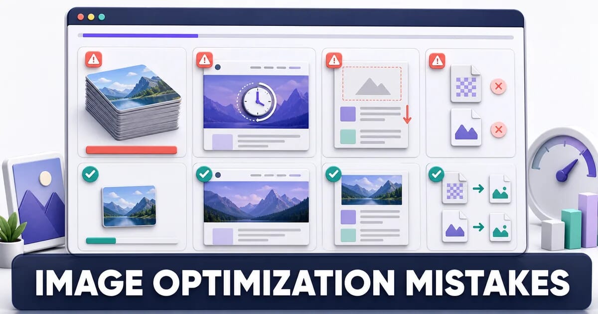
12 Image Optimization Mistakes That Slow Down Your Website
The 12 image mistakes that cost the most performance: oversized files, missing dimensions, lazy-loaded LCP images - how to spot and fix each.
Disclosure: ImageGuide is published by Sirv, an image CDN company. This guide mentions Sirv products. Read how we write these guides.
Images are the largest part of most web pages, so image mistakes cost more than any other kind. The good news: the same twelve mistakes appear on almost every slow site, and every one of them has a known fix.
This list is ordered by impact. Each entry explains why the mistake hurts, how to find it on your own site, and what to change.
Quick Diagnosis
Run this in the browser console on any page. It reports every image that is served much larger than it is displayed.
[...document.querySelectorAll('img')]
  .map(img => ({
    src: img.currentSrc.split('/').pop(),
    natural: `${img.naturalWidth}x${img.naturalHeight}`,
    displayed: `${Math.round(img.getBoundingClientRect().width)}x${Math.round(img.getBoundingClientRect().height)}`,
    wasteFactor: +(img.naturalWidth / (img.getBoundingClientRect().width * devicePixelRatio)).toFixed(1),
    lazy: img.loading === 'lazy',
    hasSize: img.hasAttribute('width') && img.hasAttribute('height')
  }))
  .filter(r => r.wasteFactor > 1.5 || !r.hasSize)
  .sort((a, b) => b.wasteFactor - a.wasteFactor)
  .forEach(r => console.table([r]));
A wasteFactor above 2 means you ship at least four times more pixels than the screen can use. Keep the output open as you read the list.
1. Serving Full-Resolution Originals
This is the single most expensive mistake on the web. A camera or phone produces a 4000×3000 image. It gets uploaded, and CSS scales it down to a 400-pixel-wide thumbnail. The browser still downloads all twelve megapixels.
Why It Hurts
Decoding cost grows with pixel count, not with display size. An oversized image blocks the main thread while it decodes, delays Largest Contentful Paint, and burns mobile data.
| Source image | File size | Displayed at | Wasted bytes |
|---|---|---|---|
| 4000×3000 JPEG q90 | 3,900 KB | 400×300 | ~3,860 KB |
| 2400×1600 JPEG q85 | 1,150 KB | 600×400 | ~1,050 KB |
| 1200×800 JPEG q82 | 210 KB | 600×400 | ~150 KB |
| 800×533 JPEG q82 | 96 KB | 600×400 | ~0 KB |
Bytes wasted by serving originals
Share of the downloaded file that the browser throws away after scaling. Based on the table above.
How to Spot It
In Chrome DevTools, open the Network tab, filter to Img, and add the Dimensions column. Compare each row against the rendered size in the Elements panel. Lighthouse reports the same issue as “Properly size images”.
The Fix
Generate a set of widths and let the browser choose:
<img
  src="product-800.jpg"
  srcset="product-400.jpg 400w,
          product-800.jpg 800w,
          product-1200.jpg 1200w,
          product-1600.jpg 1600w"
  sizes="(max-width: 640px) 100vw, 600px"
  width="800"
  height="533"
  alt="Walnut desk lamp with brass shade">
If you do not want to maintain four files per image, an image CDN generates them on request. With Sirv, the width is a URL parameter:
<img
  src="https://demo.sirv.com/product.jpg?w=800"
  srcset="https://demo.sirv.com/product.jpg?w=400 400w,
          https://demo.sirv.com/product.jpg?w=800 800w,
          https://demo.sirv.com/product.jpg?w=1200 1200w"
  sizes="(max-width: 640px) 100vw, 600px"
  width="800"
  height="533"
  alt="Walnut desk lamp with brass shade">
Read the image resizing guide for the full sizing method.
2. Shipping Only JPEG and PNG
WebP has been supported by every major browser since 2021. AVIF has been supported by every major browser since Safari 16 in 2022. A site that still serves only JPEG and PNG pays a 25% to 50% size penalty on every image request.
Typical Savings
| Content | JPEG q82 | WebP q80 | AVIF q60 |
|---|---|---|---|
| Photograph, 1200×800 | 210 KB | 148 KB | 96 KB |
| Product on white, 1000×1000 | 145 KB | 92 KB | 58 KB |
| Screenshot with text, 1440×900 | 380 KB (PNG: 620 KB) | 210 KB | 165 KB |
| Flat illustration, 1000×1000 | PNG: 180 KB | 44 KB | 31 KB |
The Fix
Use <picture> so unsupported browsers fall back cleanly:
<picture>
  <source srcset="hero.avif" type="image/avif">
  <source srcset="hero.webp" type="image/webp">
  <img src="hero.jpg" width="1200" height="630" alt="Team working at a shared desk">
</picture>
Order matters. The browser takes the first <source> it understands, so list the smallest format first.
An image CDN removes the markup entirely. It reads the Accept header and returns AVIF, WebP, or JPEG per request from a single URL. See the WebP guide and the AVIF guide for encoder settings.
3. Lazy Loading the LCP Image
loading="lazy" on the hero image is the most common self-inflicted performance wound. It is easy to make: a developer adds the attribute to every <img> in a template, including the one at the top of the page.
Why It Hurts
A lazy image is not fetched until layout runs and the browser knows it is in the viewport. That adds a full round trip to the critical path. LCP regressions of 500 ms to 1,500 ms from this one attribute are routine.
How to Spot It
new PerformanceObserver(list => {
  const lcp = list.getEntries().at(-1);
  console.log('LCP element:', lcp.element);
  console.log('loading attr:', lcp.element?.getAttribute('loading'));
  console.log('LCP time:', Math.round(lcp.startTime), 'ms');
}).observe({ type: 'largest-contentful-paint', buffered: true });
If loading attr prints lazy, you found it.
The Fix
| Image position | loading | fetchpriority |
|---|---|---|
| LCP / hero | eager (or omit) | high |
| Above the fold, not LCP | eager | auto |
| Below the fold | lazy | auto |
| Decorative, below fold | lazy | low |
<!-- Hero: never lazy -->
<img src="hero.jpg" fetchpriority="high" width="1200" height="630" alt="…">

<!-- Everything below the fold -->
<img src="section-3.jpg" loading="lazy" width="800" height="600" alt="…">
The lazy loading guide covers the threshold rules in detail.
4. Missing Width and Height Attributes
Without intrinsic dimensions, the browser reserves no space for an image. When the image arrives, everything below it jumps. That is Cumulative Layout Shift, and it is the easiest Core Web Vital to fix.
The Fix
Always set width and height to the image’s real pixel dimensions, then let CSS control the display size:
<img src="photo.jpg" width="1200" height="800" alt="…">img {
max-width: 100%;
height: auto; /* preserves the aspect ratio from the attributes */
}The attributes are not a display size. They are a ratio hint. Modern browsers compute aspect-ratio: 1200 / 800 from them and reserve the box before a single byte arrives.
For images whose ratio is unknown at build time, such as user uploads, set the ratio on the container:
.upload-slot {
  aspect-ratio: 4 / 3;
  background: #f1f1f3;
}
.upload-slot img {
  width: 100%;
  height: 100%;
  object-fit: cover;
}
5. Using PNG for Photographs
PNG is lossless. On a photograph, that means it stores sensor noise faithfully at enormous cost. A photo saved as PNG is commonly five to ten times larger than the same photo as a well-tuned JPEG that nobody can distinguish from it.
| Image type | Correct format | Wrong choice | Penalty |
|---|---|---|---|
| Photograph | JPEG / WebP / AVIF | PNG | 5–10× |
| Logo, icon, line art | SVG | PNG at 3 sizes | 10–50× |
| Screenshot with text | PNG / WebP lossless | JPEG | Text fringing |
| Flat illustration, few colours | SVG or PNG-8 | PNG-24 | 2–4× |
| Photo needing transparency | WebP / AVIF | PNG-24 | 3–8× |
| Animation | MP4 / WebM / animated WebP | GIF | 5–20× |
The one case where PNG is still right for photographic content is a photo that needs a real alpha channel and must work in a very old client. On the web, WebP and AVIF both support alpha and both beat PNG heavily. See the PNG optimization guide.
6. One Image for Every Screen
A single 1600-pixel-wide file sent to a 375-pixel phone is four times too wide. A single 800-pixel file stretched across a 27-inch monitor looks soft. Both problems come from the same cause: no srcset.
The Fix
Two attributes carry the whole responsive image system:
<img
  src="banner-1200.jpg"
  srcset="banner-600.jpg 600w,
          banner-900.jpg 900w,
          banner-1200.jpg 1200w,
          banner-1800.jpg 1800w"
  sizes="(max-width: 700px) 100vw,
         (max-width: 1100px) 50vw,
         640px"
  width="1200"
  height="500"
  alt="…">
srcset lists what exists. sizes tells the browser how wide the image will render, before CSS has loaded. Getting sizes wrong is worse than omitting srcset, because the browser trusts it. Verify it with img.currentSrc at several viewport widths.
Choosing Breakpoints
A practical ladder that covers nearly all devices without generating dozens of files:
| Width | Serves |
|---|---|
| 400w | Small phones, thumbnails |
| 800w | Phones at 2× DPR, tablets |
| 1200w | Laptops, tablets at 2× DPR |
| 1600w | Desktop, laptops at 2× DPR |
| 2400w | Large or high-DPI desktop only |
The responsive images guide explains the descriptor rules fully.
7. Leaving Camera Metadata in Place
A JPEG straight from a phone carries EXIF data, GPS coordinates, a thumbnail preview, and often an embedded colour profile. That is typically 20 KB to 100 KB per file that no visitor ever sees.
Two Problems in One
The first is weight. On a gallery of 60 images, 50 KB of metadata each is 3 MB of pure overhead.
The second is privacy. GPS coordinates in a user-uploaded photo expose the location where it was taken. If your site accepts uploads, stripping metadata is a safety requirement, not an optimization.
The Fix
# Strip everything except the colour profile
mogrify -strip -define png:exclude-chunk=all *.jpg

# Sharp (Node)
sharp(input)
  .withMetadata({ icc: 'srgb' })  // keeps sRGB, drops the rest
  .jpeg({ quality: 82 })
  .toFile(output);

# ExifTool, recursive, keeps orientation
exiftool -all= -tagsFromFile @ -Orientation -r -overwrite_original ./images
Keep the orientation tag or your portrait photos will appear sideways. Keep the ICC profile only if the image is not already sRGB. See the metadata and privacy guide.
8. Animated GIFs Instead of Video
GIF is a 1987 format limited to 256 colours and frame-based compression with no motion prediction. A three-second screen recording is 4 MB as a GIF and 180 KB as an MP4.
| Clip | GIF | Animated WebP | MP4 (H.264) |
|---|---|---|---|
| 3 s UI recording, 800×600 | 4,100 KB | 720 KB | 180 KB |
| 2 s product spin, 600×600 | 2,400 KB | 480 KB | 120 KB |
| 5 s looping banner, 1200×400 | 6,800 KB | 1,100 KB | 260 KB |
The Fix
<video autoplay loop muted playsinline width="800" height="600" poster="preview.jpg">
  <source src="demo.webm" type="video/webm">
  <source src="demo.mp4" type="video/mp4">
</video>
muted and playsinline are both required for autoplay on iOS. The poster frame prevents an empty box while the video loads.
ffmpeg -i animation.gif -movflags faststart -pix_fmt yuv420p \
  -vf "scale=trunc(iw/2)*2:trunc(ih/2)*2" demo.mp4
The GIF migration guide covers the full conversion workflow.
9. Exporting at Quality 100
Quality 100 does not mean “perfect”. In JPEG it means the encoder skips almost all quantization, producing a file two to three times larger than quality 85 with no difference a human eye can see at normal viewing distance.
| Quality | File size | Visible difference |
|---|---|---|
| 100 | 640 KB | Baseline |
| 95 | 380 KB | None |
| 90 | 265 KB | None |
| 85 | 195 KB | None on photos |
| 80 | 158 KB | None on most photos |
| 75 | 130 KB | Slight on flat gradients |
| 60 | 88 KB | Visible on skies, skin |
Measured on a 1600×1067 landscape photograph.
The Fix
Set defaults per format and per content type:
| Format | Photos | Product on white | Screenshots |
|---|---|---|---|
| JPEG | 80–85 | 85–90 | Use PNG or WebP lossless |
| WebP | 75–82 | 80–85 | lossless: true |
| AVIF | 50–63 | 60–68 | 65–75 |
AVIF quality numbers are not comparable to JPEG numbers. AVIF quality 60 is roughly JPEG quality 85. Do not copy your JPEG setting across.
10. Serving Images From Your Origin Server
Every image request that reaches your application server is a request that could have been answered from a cache edge 20 ms from the visitor. Origin delivery adds latency for distant users, consumes application capacity, and rules out per-request format negotiation.
What a CDN Changes
| Concern | Origin | Image CDN |
|---|---|---|
| Latency for distant users | 200–800 ms | 20–60 ms |
| Format negotiation | Manual <picture> | Automatic per request |
| Resizing | Build step or upload step | URL parameter |
| Cache invalidation | Your problem | Managed |
| Origin load | Full | Near zero after first request |
Sirv handles resizing, format negotiation, and global delivery from one URL. The image CDN comparison evaluates the alternatives side by side.
Cache Headers Still Matter
A CDN cannot help if the origin sends no cache headers. Version your filenames and cache aggressively:
Cache-Control: public, max-age=31536000, immutable11. Hiding the Hero Image Behind JavaScript
A carousel that renders client-side, an image inside a hydrated React component, or a data-src swapped by a script all share one problem: the browser cannot discover the image in the HTML. The preload scanner finds nothing, and the fetch starts only after JavaScript executes.
Why It Hurts
The preload scanner is the browser’s biggest performance advantage. It reads ahead in the raw HTML and starts fetches while the parser is still blocked. JavaScript-injected images bypass it completely, adding the entire script download, parse, and execute time to the LCP path.
How to Spot It
Disable JavaScript in DevTools and reload. If the hero image disappears, the preload scanner never sees it either.
The Fix
Put the first slide in the HTML as a plain <img> and let JavaScript enhance it afterwards:
<div class="carousel" data-carousel>
  <!-- Slide 1 is real HTML: discoverable, preloadable -->
  <img src="slide-1.jpg" width="1200" height="600" fetchpriority="high" alt="…">
  <!-- Slides 2+ injected by script after load -->
</div>
If the image genuinely cannot be in the initial HTML, preload it:
<link rel="preload" as="image" href="hero.avif" type="image/avif" fetchpriority="high">See the preloading and priority hints guide.
12. Optimizing Once and Never Measuring Again
Image performance decays. A designer uploads a 6 MB PNG to the CMS. A new marketing section ships with unoptimized assets. Six months after the audit, the page weighs more than it did before.
The Fix: An Image Budget in CI
Fail the build when images exceed a threshold:
// scripts/check-image-budget.mjs
import { readdir, stat } from 'node:fs/promises';
import { join, extname } from 'node:path';

const LIMITS = { '.jpg': 250_000, '.jpeg': 250_000, '.png': 150_000, '.webp': 200_000, '.avif': 150_000, '.gif': 100_000 };
const DIR = 'public/images';

const walk = async (dir) => {
  const entries = await readdir(dir, { withFileTypes: true });
  const files = await Promise.all(entries.map(async (e) => {
    const p = join(dir, e.name);
    return e.isDirectory() ? walk(p) : [p];
  }));
  return files.flat();
};

const violations = [];
for (const file of await walk(DIR)) {
  const limit = LIMITS[extname(file).toLowerCase()];
  if (!limit) continue;
  const { size } = await stat(file);
  if (size > limit) violations.push(`${file}: ${Math.round(size / 1024)} KB (limit ${Math.round(limit / 1024)} KB)`);
}

if (violations.length) {
  console.error('Image budget exceeded:\n' + violations.join('\n'));
  process.exit(1);
}
console.log('Image budget OK');
Pair it with a Lighthouse CI assertion so regressions in LCP surface on the pull request that caused them. The CI/CD pipelines guide has ready-to-use workflow files.
Summary
The Twelve at a Glance
| # | Mistake | Primary cost | Fix |
|---|---|---|---|
| 1 | Full-resolution originals | LCP, bandwidth | srcset + real widths |
| 2 | JPEG and PNG only | 25–50% extra bytes | AVIF and WebP with fallback |
| 3 | Lazy-loaded LCP image | LCP +0.5–1.5 s | loading="eager", fetchpriority="high" |
| 4 | No width/height | CLS | Set intrinsic dimensions |
| 5 | PNG for photos | 5–10× size | JPEG, WebP, or AVIF |
| 6 | One size for all screens | Mobile waste, blurry desktop | srcset + accurate sizes |
| 7 | Camera metadata retained | 20–100 KB per file, privacy | Strip EXIF, keep orientation |
| 8 | Animated GIF | 5–20× size | MP4 or WebM video |
| 9 | Quality 100 | 2–3× size | 80–85 JPEG, 50–63 AVIF |
| 10 | Origin delivery | Latency, no negotiation | Image CDN |
| 11 | JS-injected hero | Preload scanner blind | Real <img> in HTML |
| 12 | No ongoing measurement | Slow decay | Image budget in CI |
Checklist
- ✅ No image is served more than 1.5× its displayed size at the target DPR
- ✅ AVIF or WebP is offered on every raster image
- ✅ The LCP image is not lazy loaded and carries
fetchpriority="high" - ✅ Every
<img>haswidthandheight - ✅ Format matches content type (photo, art, screenshot, animation)
- ✅
srcsetandsizesare present and verified withcurrentSrc - ✅ EXIF and GPS data are stripped from uploads
- ✅ No animated GIFs remain in production
- ✅ Quality settings are tuned per format, not left at 100
- ✅ Images are delivered from a CDN with long cache lifetimes
- ✅ The hero image exists in the initial HTML
- ✅ CI fails when an image exceeds the budget
Fix the first three and most sites see the largest single improvement they will ever get from a front-end change. Work down the rest in order, then put mistake 12 in place so the gains hold.