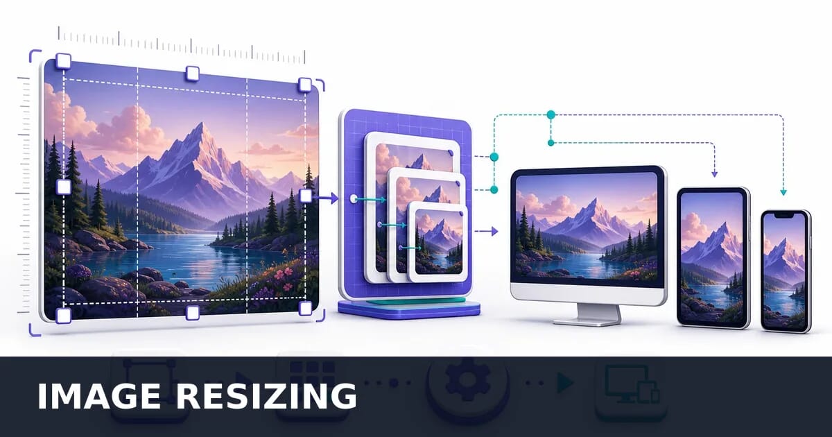
Image Resizing for the Web: The Complete Guide
Resize images for the web: pick dimensions from the layout, keep aspect ratios honest, and automate the work with a CDN or a build step.
Disclosure: ImageGuide is published by Sirv, an image CDN company. This guide mentions Sirv products. Read how we write these guides.
Oversized images are the single biggest source of wasted bandwidth on the web. A 4000x3000 photo served to a mobile device that displays it at 400px wide wastes over 95% of the downloaded pixels. This guide covers everything about resizing images correctly, from choosing the right dimensions to automating the process at scale.
Why Image Resizing Matters
The opening claim is easy to verify. The same image, resized and encoded identically at each width:
What Width Costs You
One source encoded as WebP q78 at four output widths.
Serving the 2400-pixel file to a phone that displays it at 400 pixels wastes 89% of the bytes. No compression setting recovers that, which is why resizing comes before format choice and quality tuning.
Note that file size does not scale with the square of the width in practice — 6× the width cost 8.8× the bytes here rather than 36×, because larger renditions contain more smoothly-varying detail that compresses well. The saving is still decisive.
Images account for roughly 50-70% of total page weight on most websites. Serving images larger than necessary directly harms performance, user experience, and business metrics.
The Real Cost of Oversized Images
| Scenario | Image Served | Image Needed | Wasted Data | Load Impact |
|---|---|---|---|---|
| 4K photo on mobile (375px) | 4000x3000 (2.8 MB) | 750x563 (85 KB) | 97% wasted | +3-5s on 4G |
| DSLR photo as blog thumbnail | 6000x4000 (5.2 MB) | 600x400 (40 KB) | 99% wasted | +8-12s on 4G |
| Unresized hero on tablet | 3840x2160 (1.5 MB) | 1536x864 (180 KB) | 88% wasted | +2-3s on 4G |
| Product photo in cart widget | 2400x2400 (900 KB) | 150x150 (8 KB) | 99% wasted | +1-2s on 4G |
Core Web Vitals Impact
Google’s Core Web Vitals measure real user experience, and images are the primary factor in two of the three metrics:
LCP (Largest Contentful Paint):
- The LCP element is an image on ~70% of web pages
- Oversized images take longer to download, directly increasing LCP
- Target: under 2.5 seconds
- A 1 MB image takes approximately 2.5 seconds on a typical 4G connection
CLS (Cumulative Layout Shift):
- Images without explicit width/height cause layout shifts when they load
- Resized images with proper dimensions prevent CLS entirely
- Target: under 0.1
Real-world savings:
Before optimization:
  Hero image: 3840x2160 JPEG = 1.4 MB
  LCP on 4G: ~4.2 seconds (failing)

After proper resizing:
  Hero image: 1200x675 WebP = 85 KB
  + srcset for other sizes
  LCP on 4G: ~1.1 seconds (passing)

Savings: 94% bandwidth reduction
Business Impact
| Metric | Per 1s Load Improvement |
|---|---|
| Bounce rate | -7% reduction |
| Conversion rate | +2% increase |
| Page views per session | +11% increase |
| Mobile revenue | +8.4% (Walmart study) |
| SEO ranking | Direct Core Web Vitals factor |
Common Web Image Dimensions
Different contexts require different image sizes. Here is a comprehensive reference for the most common web image dimensions.
Standard Web Image Sizes
| Use Case | Recommended Size (px) | Aspect Ratio | Notes |
|---|---|---|---|
| Hero banner (full-width) | 1920x1080 | 16:9 | Provide 1200, 1920, 2560 for responsive |
| Hero banner (contained) | 1200x600 | 2:1 | Common in blog/marketing layouts |
| Blog featured image | 1200x630 | 1.91:1 | Matches OG image ratio |
| Blog content image | 800x450 | 16:9 | In-content width |
| Product image (main) | 800x800 | 1:1 | Square for consistent grid |
| Product image (zoom) | 1600x1600 | 1:1 | Loaded on demand |
| Product thumbnail | 400x400 | 1:1 | Category/listing pages |
| Cart thumbnail | 150x150 | 1:1 | Mini cart and order summary |
| Avatar | 200x200 | 1:1 | User profiles |
| Avatar (small) | 48x48 | 1:1 | Comments, chat |
| Logo | 250x80 (max) | Varies | Keep under 300px wide |
| Favicon | 32x32 | 1:1 | Browser tab |
| Apple touch icon | 180x180 | 1:1 | iOS home screen |
| Icon (general) | 24x24 to 64x64 | 1:1 | UI elements |
Social Media and OG Image Sizes
| Platform / Context | Size (px) | Aspect Ratio | Format |
|---|---|---|---|
| Open Graph (og:image) | 1200x630 | 1.91:1 | JPEG or PNG |
| Twitter card (large) | 1200x628 | 1.91:1 | JPEG or PNG |
| Twitter card (summary) | 240x240 | 1:1 | JPEG or PNG |
| Facebook shared image | 1200x630 | 1.91:1 | JPEG or PNG |
| Instagram post (square) | 1080x1080 | 1:1 | JPEG |
| Instagram post (portrait) | 1080x1350 | 4:5 | JPEG |
| Instagram story | 1080x1920 | 9:16 | JPEG or PNG |
| LinkedIn post | 1200x627 | 1.91:1 | JPEG or PNG |
| Pinterest pin | 1000x1500 | 2:3 | JPEG |
Email Image Dimensions
| Element | Recommended Width | Notes |
|---|---|---|
| Email header/banner | 600px | Standard email width |
| Full-width email image | 600px | Matches container |
| Half-width email image | 280-290px | Two-column layout |
| Email product image | 200-250px | Product grid |
| Email logo | 200px max | Keep crisp at 1x and 2x |
Note: Email clients have limited support for responsive images. Design for 600px max width and provide 2x assets for retina displays.
Understanding Aspect Ratios
Aspect ratios define the proportional relationship between width and height. Using consistent ratios prevents awkward cropping and layout shifts.
Common Aspect Ratios
| Ratio | Decimal | Common Uses |
|---|---|---|
| 16:9 | 1.778 | Hero banners, video thumbnails, YouTube |
| 4:3 | 1.333 | Traditional photos, presentations, iPad |
| 1:1 | 1.000 | Product images, avatars, Instagram squares |
| 3:2 | 1.500 | DSLR photos, standard prints, Flickr |
| 1.91:1 | 1.910 | Open Graph images, Twitter cards |
| 2:1 | 2.000 | Panoramic banners |
| 4:5 | 0.800 | Instagram portrait, product lifestyle |
| 2:3 | 0.667 | Pinterest pins, portrait photos |
| 9:16 | 0.563 | Stories, vertical video, mobile full-screen |
| 21:9 | 2.333 | Ultra-wide banners, cinema |
CSS aspect-ratio Property
The CSS aspect-ratio property prevents layout shift by reserving space before the image loads:
/* Fixed aspect ratio container */
.hero-image {
  aspect-ratio: 16 / 9;
  width: 100%;
  object-fit: cover;
}

/* Product image - always square */
.product-image {
  aspect-ratio: 1 / 1;
  width: 100%;
  object-fit: contain;
  background: #f5f5f5;
}

/* OG-ratio banner */
.og-banner {
  aspect-ratio: 1.91 / 1;
  width: 100%;
  object-fit: cover;
}

/* Responsive with max dimensions */
.blog-image {
  aspect-ratio: 16 / 9;
  width: 100%;
  max-width: 800px;
  object-fit: cover;
}
object-fit Options
When the image aspect ratio does not match the container:
/* Cover - fills container, may crop edges */
.cover { object-fit: cover; }

/* Contain - fits inside container, may show background */
.contain { object-fit: contain; }

/* Fill - stretches to fill (distorts) */
.fill { object-fit: fill; }

/* Scale-down - like contain but never scales up */
.scale-down { object-fit: scale-down; }| object-fit | Behavior | Best For |
|---|---|---|
cover | Fills container, crops excess | Hero images, backgrounds, thumbnails |
contain | Fits inside, preserves ratio | Product images, logos |
fill | Stretches to fill (distorts!) | Almost never use this |
scale-down | Like contain, never enlarges | User-uploaded images |
none | No resizing at all | Pixel-perfect sprites |
Calculating Dimensions from Ratio
function calculateDimensions(targetWidth, aspectRatio) {
  // aspectRatio as "16:9" string
  const [w, h] = aspectRatio.split(':').map(Number);
  const targetHeight = Math.round(targetWidth * (h / w));
  return { width: targetWidth, height: targetHeight };
}

// Examples
calculateDimensions(1200, '16:9');  // { width: 1200, height: 675 }
calculateDimensions(800, '1:1');    // { width: 800, height: 800 }
calculateDimensions(1200, '1.91:1'); // { width: 1200, height: 628 }
calculateDimensions(1000, '2:3');   // { width: 1000, height: 1500 }
Retina and HiDPI Considerations
Modern displays have device pixel ratios (DPR) greater than 1, meaning each CSS pixel maps to multiple physical pixels. Images must account for this to appear sharp.
Device Pixel Ratios
| DPR | Devices | Image Size Needed for 400px Display |
|---|---|---|
| 1x | Older monitors, budget laptops | 400px |
| 1.5x | Some Windows devices | 600px |
| 2x | iPhones, MacBooks, most Android | 800px |
| 3x | iPhone Plus/Max, flagship Android | 1200px |
Responsive Images with Density Descriptors
For fixed-size images (logos, icons, avatars):
<img
  src="avatar-96.jpg"
  srcset="
    avatar-96.jpg 1x,
    avatar-192.jpg 2x,
    avatar-288.jpg 3x
  "
  width="96"
  height="96"
  alt="User avatar"
>
Responsive Images with Width Descriptors
For fluid images that change size with the viewport:
<img
  src="hero-1200.jpg"
  srcset="
    hero-400.jpg 400w,
    hero-800.jpg 800w,
    hero-1200.jpg 1200w,
    hero-1600.jpg 1600w,
    hero-2400.jpg 2400w
  "
  sizes="
    (max-width: 600px) 100vw,
    (max-width: 1200px) 80vw,
    1200px
  "
  alt="Hero banner"
  width="1200"
  height="675"
>
How browsers select the right image:
- Parse
sizesto determine the display width (e.g., 600px viewport = 100vw = 600px) - Multiply by device pixel ratio (600px x 2 DPR = 1200px needed)
- Select the smallest image from
srcsetthat is at least 1200px wide
When to Provide Each Density
| Use Case | 1x | 2x | 3x | Reasoning |
|---|---|---|---|---|
| Hero/banner | Yes | Yes | Optional | Large savings on 1x devices |
| Content images | Yes | Yes | No | 3x is rare on desktop |
| Product images | Yes | Yes | Yes | Mobile e-commerce is critical |
| Thumbnails | Yes | Yes | No | Small files anyway |
| Icons/logos | Yes | Yes | Yes | Tiny files, sharpness matters |
DPR-Aware Sizing Function
function getResponsiveSizes(baseWidth, options = {}) {
  const { maxDpr = 2, widths = null } = options;

  if (widths) return widths;

  const sizes = [baseWidth];
  if (maxDpr >= 1.5) sizes.push(Math.round(baseWidth * 1.5));
  if (maxDpr >= 2) sizes.push(baseWidth * 2);
  if (maxDpr >= 3) sizes.push(baseWidth * 3);

  return [...new Set(sizes)].sort((a, b) => a - b);
}

// Hero banner: base 1200px, up to 2x
getResponsiveSizes(1200);
// [1200, 1800, 2400]

// Thumbnail: base 200px, up to 3x
getResponsiveSizes(200, { maxDpr: 3 });
// [200, 300, 400, 600]
Resizing Techniques Compared
Not all resizing algorithms produce the same results. The choice of algorithm affects image quality, processing speed, and file size.
Algorithm Comparison
| Algorithm | Quality (downscale) | Quality (upscale) | Speed | Best For |
|---|---|---|---|---|
| Nearest neighbor | Poor (pixelated) | Poor (blocky) | Fastest | Pixel art, retro effects |
| Bilinear | Good | Fair | Fast | Real-time resizing, previews |
| Bicubic | Very good | Good | Moderate | General-purpose resizing |
| Lanczos | Excellent | Good | Slower | Final production images |
| Mitchell-Netravali | Excellent | Very good | Slower | Photos, detailed images |
Visual Quality Differences
Downscaling 4000px → 400px:

Nearest neighbor:  Jagged edges, moire patterns, lost detail
Bilinear:          Smooth but slightly soft, minimal artifacts
Bicubic:           Sharp with good detail, slight ringing on edges
Lanczos:           Sharpest detail preservation, best for photos
Mitchell:          Similar to Lanczos, slightly less ringing
Algorithm Selection Guide
Is this pixel art or icons?
  └─ Yes → Nearest neighbor (preserves hard edges)
  └─ No
       ├─ Real-time / client-side?
       │    └─ Bilinear (fast, acceptable quality)
       └─ Server-side / build-time?
            ├─ Photos → Lanczos (best detail)
            ├─ Graphics with text → Mitchell (less ringing)
            └─ General → Lanczos (default choice)
Algorithm in Different Tools
| Tool | Default Algorithm | Others Available |
|---|---|---|
| Sharp (Node.js) | Lanczos3 | nearest, cubic, mitchell, lanczos2/3 |
| Pillow (Python) | BICUBIC (resize) | NEAREST, BILINEAR, LANCZOS, BOX, HAMMING |
| ImageMagick | Mitchell | over 30 filters including Lanczos, Catrom |
| CSS/browser | Varies by browser | image-rendering: pixelated for nearest neighbor |
| Sirv CDN | Lanczos | Automatic best-quality |
Server-Side Resizing
Sharp (Node.js)
Sharp is the fastest Node.js image processing library, built on libvips.
const sharp = require('sharp');

// Basic resize
await sharp('input.jpg')
  .resize(800, 600)
  .toFile('output.jpg');

// Resize to width, auto-calculate height
await sharp('input.jpg')
  .resize({ width: 800 })
  .toFile('output.jpg');

// Resize with aspect ratio preservation
await sharp('input.jpg')
  .resize(800, 600, {
    fit: 'inside',       // Fit inside 800x600 box
    withoutEnlargement: true  // Never upscale
  })
  .toFile('output.jpg');

// Cover (crop to fill dimensions)
await sharp('input.jpg')
  .resize(800, 800, {
    fit: 'cover',
    position: 'attention' // Smart crop using saliency detection
  })
  .toFile('output-square.jpg');

// Contain (fit inside, pad with background color)
await sharp('input.jpg')
  .resize(800, 800, {
    fit: 'contain',
    background: { r: 255, g: 255, b: 255 }
  })
  .toFile('output-padded.jpg');
Generate multiple sizes for responsive images:
const sharp = require('sharp');
const path = require('path');

async function generateResponsiveSizes(inputPath, outputDir, sizes) {
  const filename = path.parse(inputPath).name;

  for (const width of sizes) {
    for (const format of ['avif', 'webp', 'jpg']) {
      let pipeline = sharp(inputPath)
        .resize(width, null, {
          withoutEnlargement: true,
          kernel: sharp.kernel.lanczos3
        });

      const outputPath = `${outputDir}/${filename}-${width}.${format}`;

      if (format === 'avif') {
        await pipeline.avif({ quality: 65, effort: 4 }).toFile(outputPath);
      } else if (format === 'webp') {
        await pipeline.webp({ quality: 80 }).toFile(outputPath);
      } else {
        await pipeline.jpeg({ quality: 82, mozjpeg: true }).toFile(outputPath);
      }
    }
  }
}

// Generate hero image sizes
await generateResponsiveSizes(
  './originals/hero.jpg',
  './output',
  [400, 800, 1200, 1600, 2400]
);

// Generate product image sizes
await generateResponsiveSizes(
  './originals/product.jpg',
  './output',
  [150, 400, 800, 1600]
);
Pillow (Python)
from PIL import Image

def resize_image(input_path, output_path, target_width, target_height=None):
    """Resize image maintaining aspect ratio."""
    with Image.open(input_path) as img:
        if target_height is None:
            # Calculate height from width
            ratio = target_width / img.width
            target_height = round(img.height * ratio)

        resized = img.resize(
            (target_width, target_height),
            Image.LANCZOS  # Best quality
        )
        resized.save(output_path, quality=85, optimize=True)

# Basic resize
resize_image('photo.jpg', 'photo-800.jpg', 800)

# Generate multiple sizes
def generate_sizes(input_path, output_dir, sizes):
    """Generate multiple sizes for responsive images."""
    import os

    with Image.open(input_path) as img:
        name = os.path.splitext(os.path.basename(input_path))[0]

        for width in sizes:
            if width > img.width:
                continue  # Never upscale

            ratio = width / img.width
            height = round(img.height * ratio)

            resized = img.resize((width, height), Image.LANCZOS)

            # Save as JPEG
            jpeg_path = os.path.join(output_dir, f'{name}-{width}.jpg')
            resized.save(jpeg_path, 'JPEG', quality=85, optimize=True)

            # Save as WebP
            webp_path = os.path.join(output_dir, f'{name}-{width}.webp')
            resized.save(webp_path, 'WebP', quality=80)

generate_sizes('hero.jpg', './output', [400, 800, 1200, 1600, 2400])
Smart Cropping with Python
from PIL import Image
import numpy as np

def smart_crop(input_path, output_path, target_width, target_height):
    """Crop to target dimensions focusing on the most interesting region."""
    with Image.open(input_path) as img:
        # Calculate crop dimensions
        img_ratio = img.width / img.height
        target_ratio = target_width / target_height

        if img_ratio > target_ratio:
            # Image is wider - crop sides
            new_width = int(img.height * target_ratio)
            left = (img.width - new_width) // 2
            box = (left, 0, left + new_width, img.height)
        else:
            # Image is taller - crop top/bottom
            new_height = int(img.width / target_ratio)
            top = (img.height - new_height) // 3  # Rule of thirds: favor top
            box = (0, top, img.width, top + new_height)

        cropped = img.crop(box)
        resized = cropped.resize(
            (target_width, target_height),
            Image.LANCZOS
        )
        resized.save(output_path, quality=85)

# Crop to 16:9 hero banner
smart_crop('photo.jpg', 'hero.jpg', 1200, 675)

# Crop to square thumbnail
smart_crop('photo.jpg', 'thumb.jpg', 400, 400)
ImageMagick CLI
# Resize to width, maintain aspect ratio
convert input.jpg -resize 800x output.jpg

# Resize to exact dimensions (may distort)
convert input.jpg -resize 800x600! output.jpg

# Resize to fit inside box (no distortion)
convert input.jpg -resize 800x600 output.jpg

# Resize to fill box, then crop
convert input.jpg -resize 800x600^ -gravity center -extent 800x600 output.jpg

# Resize only if larger (never upscale)
convert input.jpg -resize '800x600>' output.jpg

# Batch resize all JPEGs to max 1200px width
mogrify -resize '1200x>' -quality 85 *.jpg

# Generate thumbnails with center crop
mogrify -resize 400x400^ -gravity center -extent 400x400 \
  -path thumbnails *.jpg

# Batch with specific Lanczos filter
convert input.jpg -filter Lanczos -resize 800x -quality 85 output.jpg
CDN-Based Resizing
CDN-based resizing transforms images on the fly via URL parameters. This is the most efficient approach for most websites because you store a single high-resolution original and generate any size on demand.
Sirv CDN
Sirv provides real-time image resizing, format conversion, and optimization through URL parameters:
<!-- Resize to 800px width -->
<img src="https://your-account.sirv.com/photos/hero.jpg?w=800">

<!-- Resize to exact dimensions -->
<img src="https://your-account.sirv.com/photos/hero.jpg?w=800&h=600">

<!-- Resize and crop to fill -->
<img src="https://your-account.sirv.com/photos/hero.jpg?w=800&h=600&scale.option=fill">

<!-- Square product thumbnail with padding -->
<img src="https://your-account.sirv.com/products/shoe.jpg?w=400&h=400&canvas.width=400&canvas.height=400&canvas.color=white&canvas.position=center">

<!-- Auto-format (serves AVIF, WebP, or JPEG based on browser) -->
<img src="https://your-account.sirv.com/photos/hero.jpg?w=800&format=optimal">

<!-- Quality control -->
<img src="https://your-account.sirv.com/photos/hero.jpg?w=800&q=80&format=optimal">
Responsive images with Sirv:
<img
  src="https://your-account.sirv.com/photos/hero.jpg?w=800&format=optimal"
  srcset="
    https://your-account.sirv.com/photos/hero.jpg?w=400&format=optimal 400w,
    https://your-account.sirv.com/photos/hero.jpg?w=800&format=optimal 800w,
    https://your-account.sirv.com/photos/hero.jpg?w=1200&format=optimal 1200w,
    https://your-account.sirv.com/photos/hero.jpg?w=1600&format=optimal 1600w,
    https://your-account.sirv.com/photos/hero.jpg?w=2400&format=optimal 2400w
  "
  sizes="(max-width: 600px) 100vw, (max-width: 1200px) 80vw, 1200px"
  alt="Hero banner"
  width="1200"
  height="675"
>
Sirv responsive helper function:
function sirvResponsive(path, options = {}) {
  const {
    baseUrl = 'https://your-account.sirv.com',
    widths = [400, 800, 1200, 1600, 2400],
    quality = 80,
    format = 'optimal',
    sizes = '100vw'
  } = options;

  const srcset = widths
    .map(w => `${baseUrl}${path}?w=${w}&q=${quality}&format=${format} ${w}w`)
    .join(',\n    ');

  const defaultWidth = widths[Math.floor(widths.length / 2)];
  const src = `${baseUrl}${path}?w=${defaultWidth}&q=${quality}&format=${format}`;

  return { src, srcset, sizes };
}

// Usage
const hero = sirvResponsive('/photos/hero.jpg', {
  widths: [400, 800, 1200, 1600, 2400],
  sizes: '(max-width: 600px) 100vw, (max-width: 1200px) 80vw, 1200px'
});

// Output ready for <img> or framework component
console.log(hero.srcset);Cloudinary
<!-- Resize to 800px width -->
<img src="https://res.cloudinary.com/demo/image/upload/w_800/sample.jpg">

<!-- Crop to fill 800x600 -->
<img src="https://res.cloudinary.com/demo/image/upload/w_800,h_600,c_fill/sample.jpg">

<!-- Auto quality and format -->
<img src="https://res.cloudinary.com/demo/image/upload/w_800,q_auto,f_auto/sample.jpg">

<!-- Smart crop with AI focus -->
<img src="https://res.cloudinary.com/demo/image/upload/w_400,h_400,c_fill,g_auto/sample.jpg">
Imgix
<!-- Resize to width -->
<img src="https://your-source.imgix.net/photo.jpg?w=800">

<!-- Crop to fill -->
<img src="https://your-source.imgix.net/photo.jpg?w=800&h=600&fit=crop">

<!-- Auto format and quality -->
<img src="https://your-source.imgix.net/photo.jpg?w=800&auto=format,compress">

<!-- Face-aware crop for avatars -->
<img src="https://your-source.imgix.net/portrait.jpg?w=200&h=200&fit=facearea&facepad=2">
CDN Comparison
| Feature | Sirv | Cloudinary | Imgix |
|---|---|---|---|
| URL-based resizing | Yes | Yes | Yes |
| Auto format (AVIF/WebP) | Yes (format=optimal) | Yes (f_auto) | Yes (auto=format) |
| Smart crop | Yes | Yes (AI) | Yes (face detection) |
| Free tier | 500 MB storage, 2 GB transfer | 25 credits/mo | None (trial only) |
| Background removal | Via AI Studio | Yes (add-on) | No |
| 360 spin / zoom viewer | Yes (Media Viewer) | No | No |
| Edge caching | Global CDN | Global CDN | Global CDN |
Build-Time Resizing
For static sites and JAMstack applications, resizing images at build time ensures zero runtime processing cost.
Astro Image Optimization
Astro has built-in image optimization:
---
import { Image } from 'astro:assets';
import heroImage from '../assets/hero.jpg';
---

<!-- Astro automatically resizes and optimizes -->
<Image
  src={heroImage}
  widths={[400, 800, 1200]}
  sizes="(max-width: 600px) 100vw, (max-width: 1200px) 80vw, 1200px"
  alt="Hero banner"
/>
Astro generates multiple sizes and formats at build time, producing HTML with proper srcset attributes.
Vite with vite-imagetools
// vite.config.js
import { defineConfig } from 'vite';
import { imagetools } from 'vite-imagetools';

export default defineConfig({
  plugins: [
    imagetools({
      defaultDirectives: (url) => {
        if (url.searchParams.has('hero')) {
          return new URLSearchParams({
            w: '400;800;1200;1600',
            format: 'avif;webp;jpg',
            quality: '80',
            as: 'srcset'
          });
        }
        return new URLSearchParams();
      }
    })
  ]
});
Usage in code:
// Import with query parameters
import heroSrcset from './hero.jpg?w=400;800;1200;1600&format=avif;webp;jpg&as=srcset';
import thumbUrl from './thumb.jpg?w=200&format=webp';
Next.js Image Component
import Image from 'next/image';

// Automatic resizing and optimization
export default function HeroSection() {
  return (
    <Image
      src="/photos/hero.jpg"
      alt="Hero banner"
      width={1200}
      height={675}
      sizes="(max-width: 768px) 100vw, (max-width: 1200px) 80vw, 1200px"
      priority  // Preload for LCP
    />
  );
}

// With external image CDN (like Sirv)
// next.config.js
module.exports = {
  images: {
    remotePatterns: [
      {
        protocol: 'https',
        hostname: '*.sirv.com'
      }
    ],
    // Or use Sirv as the image loader
    loader: 'custom',
    loaderFile: './sirv-loader.js'
  }
};
Custom Sirv loader for Next.js:
// sirv-loader.js
export default function sirvLoader({ src, width, quality }) {
  const params = new URLSearchParams({
    w: width,
    q: quality || 80,
    format: 'optimal'
  });
  return `https://your-account.sirv.com${src}?${params}`;
}
Webpack with responsive-loader
// webpack.config.js
module.exports = {
  module: {
    rules: [
      {
        test: /\.(jpg|png)$/,
        use: {
          loader: 'responsive-loader',
          options: {
            adapter: require('responsive-loader/sharp'),
            sizes: [400, 800, 1200, 1600],
            format: 'webp',
            quality: 80,
            placeholder: true,
            placeholderSize: 20
          }
        }
      }
    ]
  }
};
Client-Side Resizing
Client-side resizing is useful for image uploads, previews, and interactive tools. Avoid it for serving content images since it requires downloading the full-size original first.
Canvas API
function resizeImage(file, maxWidth, maxHeight, quality = 0.85) {
  return new Promise((resolve) => {
    const img = new Image();
    const canvas = document.createElement('canvas');
    const ctx = canvas.getContext('2d');

    img.onload = () => {
      // Calculate new dimensions
      let { width, height } = img;
      if (width > maxWidth) {
        height = Math.round(height * (maxWidth / width));
        width = maxWidth;
      }
      if (height > maxHeight) {
        width = Math.round(width * (maxHeight / height));
        height = maxHeight;
      }

      canvas.width = width;
      canvas.height = height;

      // Use high-quality smoothing
      ctx.imageSmoothingEnabled = true;
      ctx.imageSmoothingQuality = 'high';

      ctx.drawImage(img, 0, 0, width, height);

      canvas.toBlob(
        (blob) => resolve(blob),
        'image/jpeg',
        quality
      );
    };

    img.src = URL.createObjectURL(file);
  });
}

// Usage: Resize avatar upload before sending to server
const fileInput = document.querySelector('#avatar-upload');
fileInput.addEventListener('change', async (e) => {
  const file = e.target.files[0];
  const resized = await resizeImage(file, 400, 400);

  // Upload the resized blob
  const formData = new FormData();
  formData.append('avatar', resized, 'avatar.jpg');
  await fetch('/api/upload', { method: 'POST', body: formData });
});
OffscreenCanvas for Background Processing
// Worker thread (resize-worker.js)
self.onmessage = async (e) => {
  const { imageBitmap, width, height, quality } = e.data;

  const canvas = new OffscreenCanvas(width, height);
  const ctx = canvas.getContext('2d');

  ctx.imageSmoothingEnabled = true;
  ctx.imageSmoothingQuality = 'high';
  ctx.drawImage(imageBitmap, 0, 0, width, height);

  const blob = await canvas.convertToBlob({
    type: 'image/webp',
    quality: quality || 0.85
  });

  self.postMessage({ blob });
};

// Main thread
async function resizeInWorker(file, width, height) {
  const bitmap = await createImageBitmap(file);
  const worker = new Worker('resize-worker.js');

  return new Promise((resolve) => {
    worker.onmessage = (e) => {
      resolve(e.data.blob);
      worker.terminate();
    };
    worker.postMessage(
      { imageBitmap: bitmap, width, height },
      [bitmap]  // Transfer ownership for performance
    );
  });
}
When Client-Side Resizing Makes Sense
| Use Case | Client-Side | Server/CDN |
|---|---|---|
| Avatar upload preview | Yes | Final processing on server |
| Image crop/edit tool | Yes | Save result to server |
| Thumbnail preview before upload | Yes | Not needed |
| Content images for display | No | Yes (always) |
| Responsive image delivery | No | Yes (CDN) |
| Batch gallery upload | Yes (reduce upload size) | Final processing on server |
Responsive Sizing Strategy
A complete responsive image strategy combines proper sizing, format selection, and delivery optimization.
Breakpoint-Based Sizes
Define image widths at common breakpoints:
<img
  src="article-800.jpg"
  srcset="
    article-400.jpg 400w,
    article-600.jpg 600w,
    article-800.jpg 800w,
    article-1000.jpg 1000w,
    article-1200.jpg 1200w,
    article-1600.jpg 1600w
  "
  sizes="
    (max-width: 640px) 100vw,
    (max-width: 1024px) calc(100vw - 4rem),
    (max-width: 1280px) calc(100vw - 20rem),
    800px
  "
  alt="Article image"
  width="800"
  height="450"
  loading="lazy"
>
Art Direction with picture Element
When different crops or compositions are needed at different breakpoints:
<picture>
  <!-- Mobile: square crop, product focus -->
  <source
    media="(max-width: 600px)"
    srcset="product-mobile-400.avif 400w, product-mobile-800.avif 800w"
    sizes="100vw"
    type="image/avif"
  >
  <source
    media="(max-width: 600px)"
    srcset="product-mobile-400.webp 400w, product-mobile-800.webp 800w"
    sizes="100vw"
    type="image/webp"
  >

  <!-- Desktop: wide banner with context -->
  <source
    srcset="product-wide-800.avif 800w, product-wide-1200.avif 1200w, product-wide-1600.avif 1600w"
    sizes="(max-width: 1200px) 100vw, 1200px"
    type="image/avif"
  >
  <source
    srcset="product-wide-800.webp 800w, product-wide-1200.webp 1200w, product-wide-1600.webp 1600w"
    sizes="(max-width: 1200px) 100vw, 1200px"
    type="image/webp"
  >

  <img
    src="product-wide-1200.jpg"
    alt="Product lifestyle shot"
    width="1200"
    height="675"
  >
</picture>
Container Queries for Image Sizing
Modern CSS container queries let images adapt to their container rather than the viewport:
.card {
  container-type: inline-size;
}

.card img {
  width: 100%;
  aspect-ratio: 16 / 9;
  object-fit: cover;
}

/* Small card: lower quality is fine */
@container (max-width: 300px) {
  .card img {
    aspect-ratio: 1 / 1;
  }
}

/* Large card: show full banner ratio */
@container (min-width: 600px) {
  .card img {
    aspect-ratio: 21 / 9;
  }
}
Performance Budgets
Set image size budgets based on connection speed targets:
| Connection | Budget per Image | Total Page Images |
|---|---|---|
| Slow 3G (400 kbps) | < 50 KB | < 200 KB total |
| Fast 3G (1.6 Mbps) | < 100 KB | < 500 KB total |
| 4G (10 Mbps) | < 200 KB | < 1 MB total |
| WiFi/5G (50+ Mbps) | < 500 KB | < 2 MB total |
// Check image budget compliance
function checkImageBudget(images, budgetKB = 200) {
  const results = images.map(img => ({
    src: img.src,
    sizeKB: Math.round(img.size / 1024),
    overBudget: img.size / 1024 > budgetKB
  }));

  const totalKB = results.reduce((sum, r) => sum + r.sizeKB, 0);

  return {
    images: results,
    totalKB,
    overBudget: results.filter(r => r.overBudget),
    recommendation: totalKB > 1000
      ? 'Consider lazy loading below-fold images'
      : 'Within budget'
  };
}
Automated Resizing Workflows
On-Upload Resize Pipeline
Process images the moment they are uploaded to generate all required sizes:
const sharp = require('sharp');
const path = require('path');

const IMAGE_PRESETS = {
  hero: {
    widths: [400, 800, 1200, 1600, 2400],
    formats: ['avif', 'webp', 'jpg'],
    quality: { avif: 60, webp: 80, jpg: 82 },
    maxHeight: null
  },
  product: {
    widths: [150, 400, 800, 1600],
    formats: ['avif', 'webp', 'png'],
    quality: { avif: 65, webp: 82, png: null },
    aspectRatio: '1:1',
    fit: 'contain',
    background: { r: 255, g: 255, b: 255 }
  },
  thumbnail: {
    widths: [200, 400],
    formats: ['avif', 'webp', 'jpg'],
    quality: { avif: 55, webp: 75, jpg: 78 },
    aspectRatio: '16:9',
    fit: 'cover'
  },
  avatar: {
    widths: [48, 96, 192],
    formats: ['avif', 'webp', 'jpg'],
    quality: { avif: 60, webp: 80, jpg: 80 },
    aspectRatio: '1:1',
    fit: 'cover'
  }
};

async function processUpload(inputBuffer, preset, outputDir, name) {
  const config = IMAGE_PRESETS[preset];
  if (!config) throw new Error(`Unknown preset: ${preset}`);

  const results = [];

  for (const width of config.widths) {
    let height = null;
    if (config.aspectRatio) {
      const [rw, rh] = config.aspectRatio.split(':').map(Number);
      height = Math.round(width * (rh / rw));
    }

    for (const format of config.formats) {
      let pipeline = sharp(inputBuffer)
        .resize(width, height, {
          fit: config.fit || 'inside',
          withoutEnlargement: true,
          background: config.background || { r: 0, g: 0, b: 0, alpha: 0 }
        });

      const quality = config.quality[format];
      const outputPath = path.join(outputDir, `${name}-${width}.${format}`);

      if (format === 'avif') {
        pipeline = pipeline.avif({ quality, effort: 4 });
      } else if (format === 'webp') {
        pipeline = pipeline.webp({ quality });
      } else if (format === 'jpg') {
        pipeline = pipeline.jpeg({ quality, mozjpeg: true });
      } else if (format === 'png') {
        pipeline = pipeline.png({ compressionLevel: 9 });
      }

      const output = await pipeline.toFile(outputPath);
      results.push({
        path: outputPath,
        width: output.width,
        height: output.height,
        size: output.size,
        format
      });
    }
  }

  return results;
}
CI/CD Integration
Resize images as part of your build pipeline:
# .github/workflows/optimize-images.yml
name: Optimize Images

on:
  push:
    paths:
      - 'content/images/**'

jobs:
  optimize:
    runs-on: ubuntu-latest
    steps:
      - uses: actions/checkout@v4

      - name: Setup Node.js
        uses: actions/setup-node@v4
        with:
          node-version: '20'

      - name: Install dependencies
        run: npm install sharp glob

      - name: Resize and optimize images
        run: node scripts/resize-images.js

      - name: Commit optimized images
        run: |
          git config user.name "Image Bot"
          git config user.email "bot@example.com"
          git add content/images/optimized/
          git diff --staged --quiet || git commit -m "Optimize images"
          git push
The resize script:
// scripts/resize-images.js
const sharp = require('sharp');
const { globSync } = require('glob');
const path = require('path');
const fs = require('fs');

const INPUT_DIR = 'content/images/originals';
const OUTPUT_DIR = 'content/images/optimized';

const SIZES = [400, 800, 1200, 1600];
const FORMATS = ['avif', 'webp', 'jpg'];

async function main() {
  const images = globSync(`${INPUT_DIR}/**/*.{jpg,jpeg,png}`);
  console.log(`Found ${images.length} images to process`);

  for (const imagePath of images) {
    const name = path.parse(imagePath).name;
    const relDir = path.relative(INPUT_DIR, path.dirname(imagePath));
    const outDir = path.join(OUTPUT_DIR, relDir);
    fs.mkdirSync(outDir, { recursive: true });

    for (const width of SIZES) {
      for (const format of FORMATS) {
        const outPath = path.join(outDir, `${name}-${width}.${format}`);

        // Skip if already exists and source is older
        if (fs.existsSync(outPath)) {
          const srcStat = fs.statSync(imagePath);
          const outStat = fs.statSync(outPath);
          if (srcStat.mtimeMs <= outStat.mtimeMs) continue;
        }

        let pipeline = sharp(imagePath)
          .resize(width, null, { withoutEnlargement: true });

        if (format === 'avif') pipeline = pipeline.avif({ quality: 65 });
        else if (format === 'webp') pipeline = pipeline.webp({ quality: 80 });
        else pipeline = pipeline.jpeg({ quality: 82, mozjpeg: true });

        await pipeline.toFile(outPath);
      }
    }

    console.log(`Processed: ${name}`);
  }

  console.log('Done');
}

main().catch(console.error);
CDN Auto-Resize
Instead of generating files yourself, let the CDN handle resizing on the fly. Upload one high-resolution original, and serve any size via URL parameters.
// Upload original to Sirv, serve any size
function getImageUrl(imagePath, width, options = {}) {
  const { quality = 80, format = 'optimal', height } = options;

  const params = new URLSearchParams({ w: width, q: quality, format });
  if (height) params.set('h', height);

  return `https://your-account.sirv.com${imagePath}?${params}`;
}

// Single source, infinite sizes
const hero1200 = getImageUrl('/photos/hero.jpg', 1200);
const hero400 = getImageUrl('/photos/hero.jpg', 400);
const thumb = getImageUrl('/photos/hero.jpg', 200, { height: 200 });
This eliminates the need for build-time or upload-time processing entirely. The CDN generates the requested size on the first request and caches it globally.
Common Resizing Mistakes
1. Upscaling Small Images
Enlarging a small image creates blurry, pixelated results. No algorithm can add detail that does not exist.
// WRONG: Upscaling 400px image to 1600px
await sharp('small-400.jpg')
  .resize(1600)  // This will look terrible
  .toFile('blurry-upscale.jpg');

// RIGHT: Prevent upscaling
await sharp('small-400.jpg')
  .resize(1600, null, { withoutEnlargement: true })
  .toFile('correct.jpg');
// Output: stays at 400px width
2. Ignoring Aspect Ratio
Forcing dimensions without maintaining the aspect ratio distorts the image.
# WRONG: Force exact dimensions (distorts)
convert photo.jpg -resize 800x600! distorted.jpg

# RIGHT: Fit inside box (preserves ratio)
convert photo.jpg -resize 800x600 correct.jpg

# RIGHT: Fill box and crop (preserves ratio)
convert photo.jpg -resize 800x600^ -gravity center -extent 800x600 cropped.jpg
3. Not Providing width and height Attributes
Missing dimensions cause layout shifts (CLS):
<!-- WRONG: No dimensions - causes layout shift -->
<img src="photo.jpg" alt="Photo">

<!-- RIGHT: Explicit dimensions for aspect ratio calculation -->
<img src="photo.jpg" alt="Photo" width="800" height="600">

<!-- RIGHT: With CSS sizing -->
<img
  src="photo.jpg"
  alt="Photo"
  width="800"
  height="600"
  style="width: 100%; height: auto;"
>
4. Ignoring Device Pixel Ratio
Serving only 1x images looks blurry on retina displays:
<!-- WRONG: Single size for all devices -->
<img src="photo-800.jpg" width="800" alt="Photo">

<!-- RIGHT: Multiple densities -->
<img
  src="photo-800.jpg"
  srcset="
    photo-400.jpg 400w,
    photo-800.jpg 800w,
    photo-1200.jpg 1200w,
    photo-1600.jpg 1600w
  "
  sizes="(max-width: 800px) 100vw, 800px"
  width="800"
  height="600"
  alt="Photo"
>
5. Not Using Responsive Images
Serving one large image to all devices wastes bandwidth on mobile:
<!-- WRONG: Same 2400px image for all devices -->
<img src="hero-2400.jpg" alt="Hero">

<!-- RIGHT: Responsive with format fallback -->
<picture>
  <source
    srcset="hero-400.avif 400w, hero-800.avif 800w, hero-1200.avif 1200w, hero-1600.avif 1600w"
    sizes="100vw"
    type="image/avif"
  >
  <source
    srcset="hero-400.webp 400w, hero-800.webp 800w, hero-1200.webp 1200w, hero-1600.webp 1600w"
    sizes="100vw"
    type="image/webp"
  >
  <img
    src="hero-1200.jpg"
    srcset="hero-400.jpg 400w, hero-800.jpg 800w, hero-1200.jpg 1200w, hero-1600.jpg 1600w"
    sizes="100vw"
    alt="Hero banner"
    width="1600"
    height="900"
  >
</picture>
6. Resizing in CSS Instead of at the Source
/* WRONG: Browser downloads 4000px and CSS scales it down */
.hero {
  width: 100%;
  max-width: 1200px;
}
/* The full 4000px image is still downloaded */

/* This CSS is fine, but the src must be properly sized */
.hero {
  width: 100%;
  max-width: 1200px;
  height: auto;
}
/* Combine with srcset to serve the right source size */
7. Generating Too Many or Too Few Sizes
// TOO FEW: Big jump between sizes wastes bandwidth
const sizes = [400, 1600]; // Mobile gets 1600px image

// TOO MANY: Marginal benefit, increased complexity
const sizes = [300, 350, 400, 450, 500, 550, 600, 650, 700, 750, 800];

// JUST RIGHT: Cover key breakpoints with reasonable gaps
const sizes = [400, 800, 1200, 1600]; // ~2x gap between each

// For critical images (hero), add one more:
const heroSizes = [400, 800, 1200, 1600, 2400];
A good rule of thumb: each size should be roughly 1.5-2x the previous one.
Summary
Quick Reference: Image Sizing by Context
| Context | Width | Aspect Ratio | Sizes to Generate | Format Priority |
|---|---|---|---|---|
| Hero banner | 1200px base | 16:9 | 400, 800, 1200, 1600, 2400 | AVIF > WebP > JPEG |
| Blog image | 800px base | 16:9 or 3:2 | 400, 800, 1200 | AVIF > WebP > JPEG |
| Product main | 800px base | 1:1 | 400, 800, 1600 | AVIF > WebP > JPEG |
| Product thumb | 400px base | 1:1 | 200, 400 | AVIF > WebP > JPEG |
| Avatar | 96px base | 1:1 | 48, 96, 192 | AVIF > WebP > JPEG |
| OG image | 1200x630 | 1.91:1 | Single size | JPEG or PNG |
| Email image | 600px max | Varies | 600, 1200 (2x) | JPEG or PNG |
Resizing Strategy Checklist
- Start with a high-resolution original (at least 2x your largest display size)
- Choose the right aspect ratio for the context
- Generate sizes at 1.5-2x intervals covering your breakpoints
- Always set
widthandheightattributes on<img>elements - Use
srcsetwithsizesfor fluid images - Use density descriptors (
2x,3x) only for fixed-size images - Serve modern formats (AVIF, WebP) with JPEG/PNG fallback
- Never upscale - use
withoutEnlargement: truein processing tools - Use CDN-based resizing to avoid managing generated files
- Set performance budgets and monitor image sizes in CI
When to Use Each Approach
| Approach | Best For | Tradeoffs |
|---|---|---|
| CDN resizing (Sirv, Cloudinary) | Most websites | Ongoing cost, external dependency |
| Build-time (Astro, Vite) | Static sites, blogs | Slower builds, disk space |
| Upload-time (Sharp pipeline) | User-generated content | Server compute, storage for variants |
| Client-side (Canvas) | Upload previews, crops | Only for UI, not delivery |
For most projects, CDN-based resizing offers the best combination of simplicity, performance, and flexibility. Upload your originals once and let the CDN handle the rest. Sirv CDN provides automatic resizing, format conversion, and global delivery from a single URL.