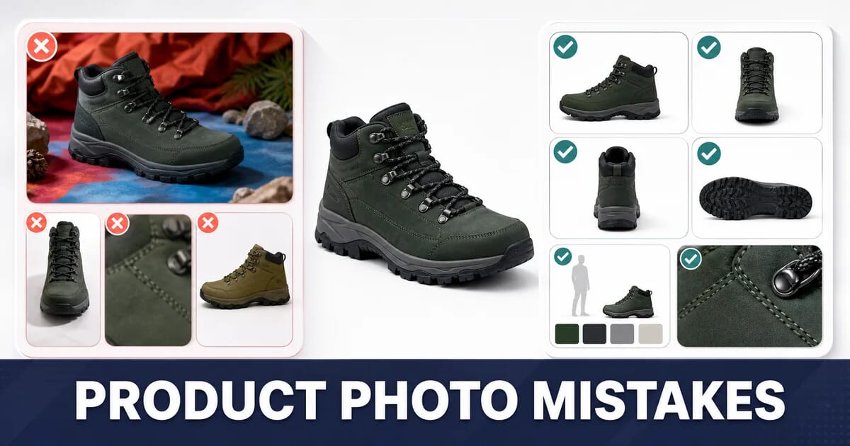
10 Product Photo Mistakes That Hurt E-commerce Conversions
Ten product photo mistakes that cost sales: inconsistent framing, cluttered backgrounds, one angle, no scale reference - with the fix for each.
Disclosure: ImageGuide is published by Sirv, an image CDN company. This guide mentions Sirv products. Read how we write these guides.
Quick answer
Product photos should answer a shopper’s questions about appearance, scale, condition, and variants. Show consistent views and useful detail without hiding defects or changing the item through editing. Optimize delivery after the photography is accurate; a faster but misleading image does not solve the buying problem.
Reference for this answer: Google image SEO guidance.
Online, the photograph is the product. A shopper cannot pick the item up, check the weight, or see how the fabric falls. Everything they use to decide comes through the image, so a weak photo is not a cosmetic problem. It is a missing answer to a question the shopper needed answered before buying.
These ten mistakes appear in almost every catalogue audit. Each one is a question the images fail to answer, and each has a concrete fix.
1. Inconsistent Framing Across the Catalogue
One product fills the frame, the next floats in the middle at half the size, a third is cropped tight at an angle. On a category grid the effect is chaotic, and the eye reads it as amateur before it reads any individual product.
Why It Hurts
Shoppers compare products against each other on the grid. Inconsistent scale makes comparison impossible, so a genuinely larger item looks small and a small item looks substantial. The grid stops being useful and shoppers leave.
The Fix: A Written Shot Spec
Publish a spec and hold every supplier and photographer to it.
| Parameter | Specification |
|---|---|
| Aspect ratio | 1:1 for the catalogue, 4:5 optional for apparel |
| Canvas | 2000×2000 minimum |
| Product fill | 80–85% of the frame height, consistent within a category |
| Margin | Equal padding on all four sides |
| Camera height | Fixed per category |
| Primary angle | Fixed per category (front, or three-quarter) |
| Background | Pure white, RGB 255,255,255 |
| Shadow | Consistent style: none, contact, or drop |
| Colour space | sRGB |
Enforce it programmatically at upload:
const SPEC = { minWidth: 2000, minHeight: 2000, ratio: 1, ratioTolerance: 0.02 };

function validateProductImage({ width, height }) {
  const errors = [];
  if (width < SPEC.minWidth || height < SPEC.minHeight) {
    errors.push(`Too small: ${width}x${height}, need ${SPEC.minWidth}x${SPEC.minHeight}`);
  }
  const ratio = width / height;
  if (Math.abs(ratio - SPEC.ratio) > SPEC.ratioTolerance) {
    errors.push(`Wrong aspect ratio: ${ratio.toFixed(2)}, need ${SPEC.ratio}`);
  }
  return errors;
}
Padding to a consistent canvas can be automated too, so suppliers who shoot slightly off-spec do not break the grid:
# Fit the product into a 2000×2000 white canvas with even margins
magick product.jpg -resize 1700x1700 -background white -gravity center \
  -extent 2000x2000 product-normalized.jpg
2. Cluttered or Coloured Backgrounds
A wooden table, a studio wall, a shadow from the window. Every one of these adds visual noise, and on a grid of twelve products it turns into visual mud.
Why It Hurts
Three separate costs. Attention splits between the product and the background. The grid loses coherence. And most marketplaces, including Amazon and Google Shopping, require a pure white background on the main image, so off-spec photos get rejected or suppressed.
The Fix
Shoot on white where you can. For the catalogue you already have, automated background removal is faster and more consistent than reshooting.
Sirv AI Studio removes backgrounds in batch and produces a consistent result across a whole catalogue. For automated pipelines, the Sirv Studio API exposes the same processing programmatically, so new supplier uploads are normalized on ingest rather than by hand.
Keep the Shadow
A product cut out with no shadow floats and looks pasted on. Keep a soft contact shadow, or add one consistently:
| Shadow style | Best for |
|---|---|
| Contact shadow | Products that sit on a surface: shoes, bottles, appliances |
| Soft drop shadow | Products shown floating: jewellery, electronics |
| No shadow | Flat lay apparel, marketplace main images with strict rules |
Pick one per category and never mix within a category.
Background Removal Also Shrinks Files
A flat white background compresses to almost nothing. The same product photo with a busy wooden table behind it is commonly 40% to 60% larger, because the encoder has to represent all that texture.
3. Only One Angle
A single front-facing photo answers one question and leaves five unanswered. What does the back look like? How thick is it? What is the strap made of? Is the finish matte or glossy? How does the lid close?
Why It Hurts
Unanswered questions become either an abandoned cart or a return. Returns are more expensive than the extra photographs.
The Fix: A Shot List Per Category
| Category | Required shots |
|---|---|
| Apparel | Front, back, side, fabric detail, on-model, scale |
| Footwear | Three-quarter, side profile, sole, top, heel, pair |
| Electronics | Front, back with ports, side profile, in-hand, screen on |
| Furniture | Front, three-quarter, back, material detail, in-room |
| Jewellery | Front, side, worn, clasp/mechanism, macro of the stone |
| Cosmetics | Product, texture swatch, applied, ingredient label |
| Bags | Front, back, side, interior, hardware, worn |
Six to eight images per product is a reasonable target for most categories.
When Angles Are Not Enough
Some products need continuous rotation rather than a set of stills: anything with complex geometry, an unusual shape, or a finish that changes with the light. A 360 spin lets the shopper turn the product themselves.
The Sirv Media Viewer handles 360 spins, zoom, and video in the same gallery component, so you do not need a separate widget per media type. The 360 product viewer guide covers capture and setup.
4. No Sense of Scale
A photograph of a ceramic vase on white could be 10 cm tall or 60 cm tall. A watch face could be 34 mm or 44 mm. The dimensions are in the specification table, but shoppers do not build a mental picture from millimetres.
Why It Hurts
Scale confusion is one of the most common causes of returns. The product arrives and it is not the size the customer pictured. That return costs the shipping both ways, the restocking, and often the customer.
The Fix
Add at least one scale reference per product:
| Method | Best for |
|---|---|
| Human hand or model | Wearables, small electronics, cosmetics, bags |
| In-room or in-context shot | Furniture, rugs, art, appliances |
| Everyday object comparison | Small hardware, collectibles |
| Dimension overlay on the image | Furniture, technical products |
| Size comparison against another product in your range | Anything with variants |
A dimension overlay can be generated automatically rather than drawn by hand. With Sirv’s dynamic imaging, text is a URL parameter:
https://demo.sirv.com/vase.jpg?w=1000
  &text=42 cm&text.position=east&text.size=8&text.color=333333
The overlay is rendered on delivery, so updating a dimension means updating the URL, not re-exporting the image.
5. Zoom Resolution That Is Too Low
The gallery offers a zoom, the shopper clicks it, and the image goes soft and blocky. That is worse than offering no zoom at all, because the shopper came looking for detail and found evidence of low quality.
Why It Hurts
Zoom is where the shopper decides about material, stitching, finish, and texture. A soft zoom answers “I cannot tell”, and “I cannot tell” does not convert.
The Fix: Resolution Ladder
| Purpose | Resolution | Quality | Loading |
|---|---|---|---|
| Source master | 3000×3000+ | Lossless or q95 | Not served |
| Zoom image | 2000×2000 | 85–90 | On demand |
| Main gallery image | 1000×1000 | 82–88 | Eager, fetchpriority="high" |
| Grid thumbnail | 400×400 | 78–82 | Lazy below the fold |
| Cart or mini thumbnail | 150×150 | 75–80 | Lazy |
The rule of thumb: the zoom image should be at least 2.5× the displayed gallery size. Below that, zooming reveals interpolation instead of detail.
Do Not Load the Zoom Image Up Front
A 2000×2000 image on page load costs LCP for a feature most visitors never use. Load it when the shopper actually zooms:
const gallery = document.querySelector('[data-gallery]');
let zoomLoaded = false;

gallery.addEventListener('pointerenter', () => {
  if (zoomLoaded) return;
  zoomLoaded = true;
  const img = new Image();
  img.src = gallery.dataset.zoomSrc;   // 2000px version
}, { once: true });
The Sirv Media Viewer does this progressively by default: it loads a small image first, then requests only the zoomed region at full resolution as the shopper pans.
6. Colour That Does Not Match the Product
A navy jumper photographed under warm studio light and exported without a colour profile arrives on screen looking black, or purple. The customer orders navy, receives navy, and returns it because it is not the colour they saw.
Why It Hurts
Colour returns are pure loss. The product was correct. Only the photograph was wrong.
The Fix
Shoot with a colour reference. Include a grey card or a colour checker in the first frame of each session, then apply the correction across the set.
Convert to sRGB before export. A photograph in Adobe RGB or ProPhoto RGB displayed without its profile shows visibly wrong, usually desaturated or shifted colours.
# Convert to sRGB and strip everything else
magick product.tif -profile sRGB.icc -strip -quality 88 product.jpg
// Sharp: convert to sRGB, keep the profile so browsers render correctly
sharp('product.tif')
.toColorspace('srgb')
.withMetadata({ icc: 'srgb' })
.jpeg({ quality: 88 })
.toFile('product.jpg');Keep chroma subsampling off for saturated products. Lossy WebP and default JPEG use 4:2:0 subsampling, which smears sharp colour edges. For a bright red product against white, use 4:4:4:
magick product.tif -sampling-factor 1x1 -quality 90 product.jpgShow the actual variant. A colour swatch that maps to a generic photo is a guarantee of returns. Photograph every colourway.
The colour spaces guide explains what happens when profiles are dropped.
7. No Lifestyle or In-Context Shot
A white-background cutout tells the shopper what the product looks like. It does not tell them what owning it looks like. A rug on white is a rectangle. A rug in a room is a decision.
Why It Hurts
Cutouts serve comparison. Context serves desire. A catalogue with only cutouts asks the shopper to imagine the product in their life, and most shoppers will not do that work.
The Fix
Include at least one contextual image per product, positioned second or third in the gallery, not first. The first image should stay the clean cutout, because that is what the grid and the marketplaces need.
| Category | Context shot |
|---|---|
| Apparel | On a model, full length and detail |
| Furniture | Styled in a room at eye level |
| Kitchen | In use, mid-task |
| Cosmetics | Applied, on varied skin tones |
| Tools | In hand, doing the job |
| Outdoor gear | In the environment it is built for |
Order the Gallery Deliberately
- Clean cutout on white, the marketplace-compliant hero
- Context or on-model shot
- Alternative angle
- Detail or macro
- Scale reference
- 360 spin or video
- Remaining angles
8. A Gallery That Is Slow or Awkward to Use
The images are excellent. The gallery loads all eight of them at full resolution on page load, shifts the layout when each one arrives, and needs a precise click on a 20-pixel arrow to advance.
Why It Hurts
On mobile, where most product pages are viewed, a heavy gallery delays the point at which the shopper sees anything. Layout shift makes them tap the wrong thing. Both push people back to search results.
The Fix
Reserve the space. Every gallery slot gets a fixed aspect ratio so nothing moves:
.gallery-main {
  aspect-ratio: 1 / 1;
  background: #f4f4f5;
}
.gallery-main img {
  width: 100%;
  height: 100%;
  object-fit: contain;
}
Load slide one eagerly, the rest lazily.
<div class="gallery-main">
  <img src="product-1000.jpg" width="1000" height="1000"
       fetchpriority="high" alt="Walnut desk lamp, front view">
</div>

<div class="gallery-thumbs">
  <img src="product-thumb-1.jpg" width="80" height="80" alt="">
  <img src="product-thumb-2.jpg" width="80" height="80" loading="lazy" alt="">
  <img src="product-thumb-3.jpg" width="80" height="80" loading="lazy" alt="">
</div>
The first slide must be real HTML, not injected by JavaScript. If it is injected, the browser’s preload scanner never sees it and LCP suffers by a full script execution cycle.
Make the touch targets real. Swipe on mobile, minimum 44×44 px arrows on desktop, and keyboard arrow support for accessibility.
Do not autoplay a carousel. Rotating the hero image away from the shopper while they are reading is a usability failure and it also makes LCP unstable.
The Sirv Media Viewer handles the loading order, touch gestures, keyboard navigation, and fullscreen behaviour, and mixes stills, spins, and video in one gallery.
9. Images That Are Too Heavy on Mobile
An 8-image gallery at 2000×2000 and JPEG quality 95 is roughly 8 MB. On a mid-range phone over 4G that is a page that never really finishes.
Why It Hurts
Product pages are where the money is, and they are the heaviest pages on most stores. A shopper on a train does not wait.
The Fix
Serve the size the device asks for, in the format it supports:
<img
  src="https://demo.sirv.com/lamp.jpg?w=1000"
  srcset="https://demo.sirv.com/lamp.jpg?w=400 400w,
          https://demo.sirv.com/lamp.jpg?w=800 800w,
          https://demo.sirv.com/lamp.jpg?w=1200 1200w,
          https://demo.sirv.com/lamp.jpg?w=1600 1600w"
  sizes="(max-width: 768px) 100vw, 600px"
  width="1000"
  height="1000"
  fetchpriority="high"
  alt="Walnut desk lamp with brass shade, front view">
Realistic Budget for a Product Page
| Asset | Budget |
|---|---|
| Main gallery image (LCP) | ≤ 120 KB |
| Each additional gallery image | ≤ 80 KB |
| Thumbnails, all combined | ≤ 60 KB |
| Zoom image, on demand only | ≤ 400 KB |
| Total on initial load | ≤ 400 KB |
Hitting that budget needs AVIF or WebP, correct widths, and quality around 82 rather than 95. A CDN like Sirv negotiates format and width per request, so one URL serves an AVIF at 400 px to a phone and a WebP at 1200 px to a laptop.
10. Missing Alt Text and Structured Data
The images are perfect and invisible. No alt text means screen reader users get nothing and search engines get nothing. No structured data means Google Shopping and rich results have no image to show.
Why It Hurts
Product image search is a real acquisition channel, particularly in fashion, furniture, and hardware. An image with no textual signal cannot rank. And alt text is an accessibility requirement, not an SEO trick.
The Fix: Alt Text That Describes the Shot
Each image in a gallery shows something different, so each alt text should say something different.
| Image | Poor alt text | Good alt text |
|---|---|---|
| Main | "product" | "Walnut desk lamp with brass shade, front view" |
| Back | "lamp 2" | "Rear of the walnut desk lamp showing the cable channel" |
| Detail | "detail" | "Close-up of the brushed brass shade and walnut joint" |
| On model | "lifestyle" | "Desk lamp lit on a study desk beside an open book" |
| Scale | "size" | "Desk lamp beside a laptop showing it stands 42 cm tall" |
Do not start with “Image of” or “Photo of”. Screen readers already announce it as an image. Do not stuff keywords: it reads badly aloud and search engines discount it.
Add Product Structured Data
<script type="application/ld+json">
{
  "@context": "https://schema.org",
  "@type": "Product",
  "name": "Walnut Desk Lamp",
  "image": [
    "https://example.com/lamp-1x1.jpg",
    "https://example.com/lamp-4x3.jpg",
    "https://example.com/lamp-16x9.jpg"
  ],
  "description": "Solid walnut desk lamp with a brushed brass shade.",
  "sku": "LMP-WAL-001",
  "brand": { "@type": "Brand", "name": "Example Co" },
  "offers": {
    "@type": "Offer",
    "price": "149.00",
    "priceCurrency": "GBP",
    "availability": "https://schema.org/InStock"
  }
}
</script>
Supply the same image in 1:1, 4:3, and 16:9 crops. Google selects the ratio that fits each surface, and providing all three increases the chance of a rich result. An image CDN generates the crops from one master:
https://demo.sirv.com/lamp.jpg?w=1200&h=1200&scale.option=fill
https://demo.sirv.com/lamp.jpg?w=1200&h=900&scale.option=fill
https://demo.sirv.com/lamp.jpg?w=1200&h=675&scale.option=fill
The alt text guide and the image SEO guide cover both areas in full.
Summary
The Ten at a Glance
| # | Mistake | Question left unanswered | Fix |
|---|---|---|---|
| 1 | Inconsistent framing | “How do these compare?” | Written shot spec, validated on upload |
| 2 | Cluttered backgrounds | “What am I looking at?” | Batch background removal, consistent shadow |
| 3 | One angle only | “What does the back look like?” | 6–8 shot list per category |
| 4 | No scale reference | “How big is it?” | Hand, room, or dimension overlay |
| 5 | Low-resolution zoom | “What is it made of?” | 2000 px zoom, loaded on demand |
| 6 | Wrong colour | “Is that the real navy?” | Grey card, sRGB, 4:4:4 on saturated products |
| 7 | No context shot | “What would this look like in my home?” | One lifestyle image, second in the gallery |
| 8 | Slow, awkward gallery | Shopper leaves before seeing it | Reserved space, lazy after slide one |
| 9 | Heavy on mobile | Page never finishes | srcset, AVIF/WebP, 400 KB budget |
| 10 | No alt text or schema | Search engines see nothing | Per-image alt text, Product JSON-LD |
Checklist
- ✅ Every product follows one written shot spec, enforced at upload
- ✅ Main image is a clean cutout on pure white with a consistent shadow
- ✅ Six to eight images per product, following a category shot list
- ✅ At least one image communicates physical scale
- ✅ Zoom source is 2000 px or more and loads only on interaction
- ✅ Colour is corrected against a reference and exported as sRGB
- ✅ At least one lifestyle image sits second or third in the gallery
- ✅ Gallery slots have reserved aspect ratios and no layout shift
- ✅ Initial product page image payload is under 400 KB
- ✅ Every image has unique, descriptive alt text
- ✅ Product JSON-LD lists 1:1, 4:3, and 16:9 image URLs
- ✅ Mobile gallery supports swipe with 44 px minimum targets
Fix mistakes 3, 4, and 5 first. Angles, scale, and zoom answer the questions that most often stop a purchase. Then work through the delivery problems in 8 and 9, which decide whether the shopper ever sees the work at all.
Sources
Related Resources
Related Guides
E-commerce Product Image Optimization
Image Background Removal: Tools, Techniques & Automation
360 Product Viewer: Images, Spins and Zoom
Image Alt Text: The Complete Writing Guide
Image SEO: File Names, Structured Data, and Search Rankings
Shopify Image Optimization Bible
12 Image Optimization Mistakes That Slow Down Your Website