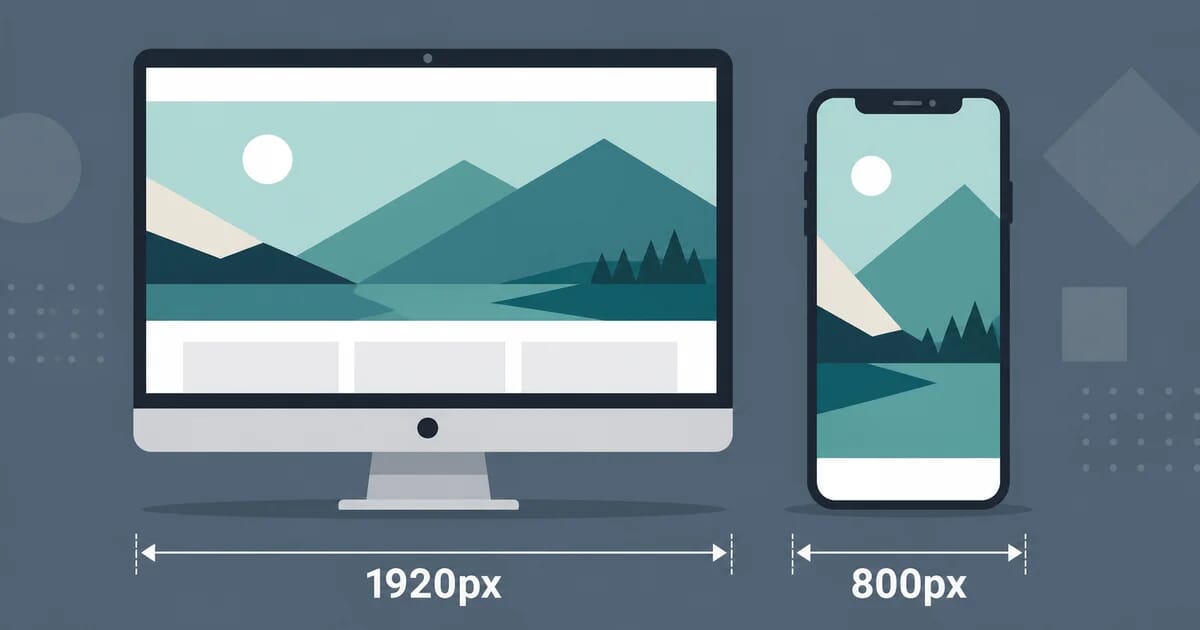
Hero Image Size: The Complete Guide to Hero Image Dimensions for Every Layout
Hero image size in practice: 1920x1080 or 2560x1440 at the source, aspect ratios per layout, text-overlay safe zones, and a weight budget.
Disclosure: ImageGuide is published by Sirv, an image CDN company. This guide mentions Sirv products. Read how we write these guides.
Quick answer
Choose a hero image’s dimensions from its rendered width, aspect ratio, and target pixel density. A 1920-pixel-wide desktop source is a useful starting point, not a universal requirement. Use responsive variants and a mobile crop when needed, reserve layout space, and avoid lazy-loading the LCP image.
Reference for this answer: MDN responsive image guidance.
A 1920×1080 desktop export from a 2560×1440 source is one useful starting point for a wide hero. Choose the final dimensions from the layout and required detail, then generate responsive derivatives. A 200KB budget is a target to test, not a guarantee of a particular LCP score.
This guide covers what a hero image is, why a single fixed size fails, which aspect ratio fits each layout, how to protect text overlays, and the exact dimensions popular platforms expect.
What Is a Hero Image?
A hero image is the large visual at the top of a page. It sits behind or beside your headline and your primary call to action. It is usually the first thing a visitor sees, and it often occupies most of the viewport on load.
Hero images appear in three common shapes:
| Shape | Description | Typical use |
|---|---|---|
| Full-width banner | Spans the whole viewport width | Marketing homepages |
| Split hero | Image on one side, text on the other | SaaS landing pages |
| Contained hero | Image inside a fixed-width container | Blogs, documentation |
Because the hero is almost always the largest element visible when the page opens, browsers treat it as the Largest Contentful Paint (LCP) candidate. Your hero image size decision is therefore both a design decision and a performance decision. If you need a refresher on that metric, read our guide to Core Web Vitals for images.
The Standard Hero Image Size
Most design systems converge on one recommendation:
- Source file: 2560×1440 pixels (a 16:9 frame).
- Desktop delivery: 1920×1080 pixels or the natural viewport width.
- Tablet delivery: roughly 1024–1366 pixels wide.
- Mobile delivery: roughly 640–828 pixels wide.
Why 2560×1440 as the source? Two reasons:
- It covers large desktop monitors and retina-class laptops without upscaling.
- It gives you spare pixels to crop vertically for portrait screens without losing sharpness.
You rarely ship the 2560px file itself. You ship smaller derivatives generated from it. A typical srcset offers 640, 1024, 1600, and 1920 pixel widths, and the browser picks the best fit. Exporting at 1920×1080 alone works too, but you lose cropping headroom for tall mobile viewports.
One caution: do not export at 3840×2160 “just in case.” Oversized sources inflate build times and tempt teams into shipping huge files. A 2560px master is enough for virtually every site.
Why One Size Fails: The Mobile Center-Crop Problem
A single fixed image cannot fill every screen. Designers solve this with object-fit: cover or CSS background-size: cover. Both scale the image until it covers the container, then trim the overflow.
The trimming is the problem. Cover-cropping trims equally from the sides by default, and on a tall phone it trims a lot:
| Viewport | Aspect ratio | What happens to a 16:9 hero |
|---|---|---|
| Desktop 1920×1080 | 16:9 | Full frame visible |
| Tablet 768×1024 | 3:4 | Sides cropped hard |
| Phone 390×844 | ~9:19.5 | Only a narrow vertical slice survives |
On a phone, a landscape hero loses most of its width. Any subject sitting off-center gets cut. Faces drift out of frame. Product shots lose their product.
Three fixes work well in practice:
- Compose center-safe. Put the subject in the middle third of the frame so aggressive crops still look intentional.
- Set a focal point. Use
object-position: 50% 30%(or similar) to bias the crop toward the important region instead of the exact center. - Art-direct with two files. Serve a separate square or portrait crop on small screens using the
<picture>element. This costs one extra export and solves the problem completely.
<picture>
  <source
    media="(max-width: 640px)"
    srcset="hero-portrait-640.avif 640w,
            hero-portrait-1080.avif 1080w"
    sizes="100vw"
    type="image/avif">
  <img
    src="hero-landscape-1280.jpg"
    srcset="hero-landscape-640.jpg 640w,
            hero-landscape-1024.jpg 1024w,
            hero-landscape-1600.jpg 1600w,
            hero-landscape-1920.jpg 1920w"
    sizes="100vw"
    alt="Team collaborating around a laptop in a bright office"
    fetchpriority="high">
</picture>
Note the fetchpriority="high" attribute. It tells the browser to load the hero early because it knows the hero is the LCP element. This is one of the cheapest LCP wins available.
Aspect-Ratio Strategy per Layout
Pick the aspect ratio from the layout first, then size the exports to match. One ratio per layout keeps your crops predictable.
Full-viewport hero
A hero that fills the entire first screen (height: 100vh or 100svh) needs a wide master. 16:9 is the default. 21:9 suits cinematic brands and ultrawide monitors, but demands stricter center-safe composition because phones crop it even harder.
Reserve vertical space before the image loads with:
.hero {
  aspect-ratio: 16 / 9;
  object-fit: cover;
}
Without a reserved space, the page shifts when the image arrives. Layout shift is a Core Web Vitals failure, and heroes are its most common cause.
Split hero
A split hero places the image beside the headline, usually at half the viewport width. Here the image behaves like a tall rectangle, not a banner. Target roughly 4:5 or 1:1 at 800–1200 pixels wide. Because the container is narrower, you can ship much smaller files than a full-bleed hero needs.
Contained hero
A contained hero sits inside a max-width container, typically 1140–1440 pixels. Export at 1600×900 and let the container cap display size. This is the lightest hero pattern and the easiest to keep fast.
Quick reference
| Layout | Master size | Display ratio | Notes |
|---|---|---|---|
| Full-viewport | 2560×1440 | 16:9 (or 21:9) | Highest risk of heavy mobile crops |
| Split hero | 1200×1500 | 4:5 or 1:1 | Smallest files of the three |
| Contained hero | 1600×900 | 16:9 | Container caps the display width |
Text-Overlay Safe Zones
Many heroes carry a headline and a button directly on the image. Text over a busy area is unreadable, and text over a cropped-away area disappears entirely.
Follow these rules:
- Keep text out of the outer 10% on every edge. Different platforms and scrollbars eat edge pixels unpredictably.
- Keep critical content in the central 60% horizontally. Phones will crop the rest.
- Add a scrim. A dark gradient can improve text contrast; check the actual composition against the required contrast ratio:
.hero::after {
  content: "";
  position: absolute;
  inset: 0;
  background: linear-gradient(
    to right,
    rgb(0 0 0 / 60%),
    rgb(0 0 0 / 0%) 60%
  );
}- Prefer side gradients over full overlays. A gradient anchored to the text side preserves the photo’s mood while protecting legibility.
If you plan to swap hero photos regularly, test each candidate against the overlay before publishing. Tools like Sirv Media Viewer help you preview crops and zoom behavior across breakpoints before anything ships.
File Weight Budget: Under 200KB
Your hero should land under about 200KB, ideally closer to 100–150KB. Here is why the number matters:
- The hero is the LCP element on most pages, so its download time sets your LCP score.
- Google evaluates LCP on real mobile connections, not your office Wi-Fi.
- A 500KB hero can take several seconds to arrive on a typical 4G connection; a 120KB hero arrives in a fraction of that.
Hitting the budget is straightforward with modern formats:
| Format | Typical quality setting | Approximate result for a 1920×1080 photo |
|---|---|---|
| JPEG | q75–80, progressive | 200–350KB |
| WebP | q70–80 | 100–180KB |
| AVIF | q50–60 | 60–130KB |
Serve AVIF first, WebP second, JPEG last, using <picture> or CDN content negotiation. Our format guides cover the settings in depth: see the complete WebP guide and the complete AVIF guide.
Two more budget rules:
- Never ship the 2560px master. Generate responsive derivatives and let
srcsetpick. - Compress once, correctly. Re-compressing an already compressed JPEG stacks artifacts. Always compress from the original master. If your existing hero already shows blocking artifacts, our guide on removing JPEG artifacts walks through cleanup options.
Responsive Delivery: srcset and sizes in Practice
Here is a production-ready hero snippet with every piece in place:
<img
  src="hero-1024.webp"
  srcset="
    hero-640.webp   640w,
    hero-1024.webp 1024w,
    hero-1600.webp 1600w,
    hero-1920.webp 1920w"
  sizes="100vw"
  width="1920"
  height="1080"
  alt="Designer sketching interface wireframes at a desk"
  fetchpriority="high"
  decoding="async">
What each part does:
srcsetlists the available widths; the browser picks based on viewport and pixel density.sizes="100vw"tells the browser the image fills the viewport. For a contained hero use something likesizes="(max-width: 1200px) 100vw, 1200px".widthandheightreserve space and prevent layout shift.fetchpriority="high"pulls the load forward.decoding="async"keeps decode work off the main thread.
For a split hero, change sizes to reflect the half-width container:
sizes="(max-width: 800px) 100vw, 50vw"Getting sizes right matters more than adding more breakpoints. An overstated sizes value makes phones download desktop files. We break down the full syntax in the complete responsive images guide.
Background Image vs img Element
Heroes built with background-image in CSS are common, but the approach trades away performance features. Compare:
| Concern | <img> element | CSS background-image |
|---|---|---|
Responsive srcset | Yes | No (needs image-set() hacks) |
Art direction via <picture> | Yes | No |
| Preload priority control | fetchpriority="high" | Needs manual <link rel="preload"> |
| Counts as LCP candidate | Yes | Only sometimes, with quirks |
| SEO and alt text | Yes | None |
| Lazy loading attribute | Native loading | Not applicable |
Use the <img> element for heroes in almost every case. Reserve CSS backgrounds for decorative textures where responsiveness and LCP do not matter. If you must use a background image, preload it explicitly and set fetchpriority="high" on the preload link:
<link rel="preload" as="image"
      href="hero-1920.webp"
      fetchpriority="high">
Dark-Mode Variants
Sites with dark themes often need a darker hero variant. A bright daylight photo next to a dark UI feels jarring, and pure white areas glow in a dim room.
The cleanest technique pairs the <picture> element with a media query:
<picture>
  <source
    media="(prefers-color-scheme: dark)"
    srcset="hero-dark-1920.avif 1920w,
            hero-dark-1024.avif 1024w"
    sizes="100vw"
    type="image/avif">
  <img
    src="hero-light-1024.webp"
    srcset="hero-light-640.webp 640w,
            hero-light-1024.webp 1024w,
            hero-light-1920.webp 1920w"
    sizes="100vw"
    alt="Product dashboard on a designer's monitor"
    fetchpriority="high">
</picture>
Practical tips:
- Do not just darken in CSS. A filter flattens contrast and can push text overlays below accessibility thresholds. Export a true dark variant with adjusted exposure.
- Reuse the same composition. Crop both variants identically so switching themes does not reframe the subject.
- Budget for two masters. Dark-mode doubling doubles your export list; automate it in your build pipeline if you maintain many pages.
Platform-Specific Hero Sizes
Page builders and CMS themes impose their own hero dimensions. The table below collects commonly used values. Treat them as starting points; your specific theme may differ, so check its documentation.
| Platform | Common hero recommendation | Notes |
|---|---|---|
| WordPress | 1920×1080 to 2560×1440 upload | Theme defaults vary widely; block themes respect your aspect-ratio CSS |
| Shopify | 1800×1000+ for full-width banners | Sections upscale small uploads; supply large sources |
| Wix | 1920×1080 strip backgrounds | Strips auto-crop on mobile; check the mobile editor |
| Squarespace | 2500px wide maximum upload | Platform resizes internally; banners crop per section settings |
Platform details deserve their own reading. We cover WordPress specifics in the WordPress image performance guide, Shopify in the Shopify image optimization guide, Wix in the Wix image optimization guide, and Squarespace in the Squarespace image optimization guide.
A universal warning: these platforms happily accept a 6000-pixel upload and serve it unscaled. Downsize to your target dimensions before uploading rather than trusting the platform to do it.
Compression Settings That Hit the Budget
A repeatable export recipe for a 1920×1080 hero photo:
- Start from the 2560×1440 master.
- Resize to each target width with a high-quality resampler (Lanczos or similar).
- Encode AVIF at quality 50–60 for the smallest tier.
- Encode WebP at quality 75–80 as the fallback.
- Encode JPEG at quality 80, progressive, as the last fallback.
- Verify the 1920px WebP lands under 200KB. If not, drop quality in steps of 5 until it does.
Command-line example with cwebp and avifenc:
# Resize master to 1920 wide
magick hero-master.png -resize 1920x -quality 92 hero-1920.png

# Encode WebP near q78
cwebp -q 78 hero-1920.png -o hero-1920.webp

# Encode AVIF near q55
avifenc --min 45 --max 60 hero-1920.png hero-1920.avif
Check the result visually at 100% zoom. Banding in smooth skies and blur around text are the first signs you dropped quality too far. For batch pipelines, our guide on batch image processing workflows automates exactly this sequence.
If you would rather skip the pipeline entirely, an image CDN can generate all sizes on the fly from one master. Services such as Sirv handle resizing, format conversion, and delivery automatically, and you can create a free account to test the workflow on your own heroes. Their platform also includes AI editing features such as background removal, which is handy when your hero subject needs isolating from a busy scene.
Decision Table: Choosing Your Hero Setup
Use this table to settle your configuration in one pass:
| Question | If yes | If no |
|---|---|---|
| Does the hero fill the whole viewport? | 2560×1440 master, 16:9, strict center-safe composition | 1600×900 master, contained ratio |
| Does text sit on the image? | Add scrim, enforce safe zones, verify contrast | Skip scrim, compose freely |
| Do mobile visitors matter most? | Art-direct a portrait crop via <picture> | Single landscape crop with object-position tuning |
| Is the page judged on LCP? | <img> with srcset, sizes, fetchpriority="high", under 200KB | CSS background acceptable for decoration |
| Does the site support dark mode? | Export matched dark variant, pair with prefers-color-scheme | Single light master |
| Do you run a build pipeline? | Automate derivative generation from one master | Use a CDN or platform resizing |
Common Mistakes to Avoid
Teams reuse the same five hero mistakes across projects. Check yours against this list before launch.
- Shipping the master file. A 2560×1440 JPEG straight from the camera or a stock library weighs several megabytes. Phones on 4G wait seconds for it, and LCP fails. Always generate derivatives.
- Declaring
sizes="100vw"on a contained hero. The browser then downloads a viewport-width file for an image that renders at half that width. Matchsizesto the rendered layout, not the ambition. - Forgetting
widthandheight. Without them the browser cannot reserve space, the hero pushes content down on load, and Cumulative Layout Shift suffers. Two attributes, zero cost. - Cropping for desktop only. A designer previews on a 27-inch monitor, approves the composition, and never checks a 390-pixel phone where the subject sits outside the visible slice. Preview every breakpoint.
- Stacking compression. Each re-save of a JPEG at high quality multiplies artifacts around edges and text. Keep the lossless master, regenerate every derivative from it, and discard the intermediates.
Each mistake is cheap to fix and easy to prevent with the checklist that follows.
Final Checklist
Before you publish a hero, confirm every line:
- Source master is 2560×1440 or larger.
- Desktop delivery tops out at 1920 pixels wide.
-
srcsetoffers at least 640, 1024, and 1920 pixel widths. -
sizesmatches the actual rendered width. -
widthandheightattributes prevent layout shift. -
fetchpriority="high"marks the hero as priority. - The 1920px file weighs under 200KB.
- Composition survives a phone-sized center crop.
- Text overlays sit inside safe zones with a scrim behind them.
- A dark-mode variant exists if the theme supports dark mode.
Get these right once, save the setup as a template, and every future hero inherits correct hero image dimensions by default. The standard recommendation holds because it works: a 2560×1440 master, responsively delivered, fits every layout on this page and stays fast on every connection your visitors use.