Crop one product photo for a card, a hero and a zoom view
Use one shirt photo to compare a square card, a wide hero, a mobile crop and a zoom source. Includes exact crop coordinates, CSS and responsive picture markup.
A square product card needs to show enough of a shirt to identify it. A wide banner might show its collar and fabric. A zoom view needs the detail you removed from both.
Trying to serve all three from one pre-cropped thumbnail leaves the page short of pixels and composition choices. Keep the original, then derive an image for each placement.
The source and the crop decisions
We used the navy-shirt photograph from Sirv’s public Media Viewer documentation example. The source is 1152 × 1423 pixels. The collar sits near the top of the garment and the cuffs sit close to the lower edges, so a crop can remove useful product details.
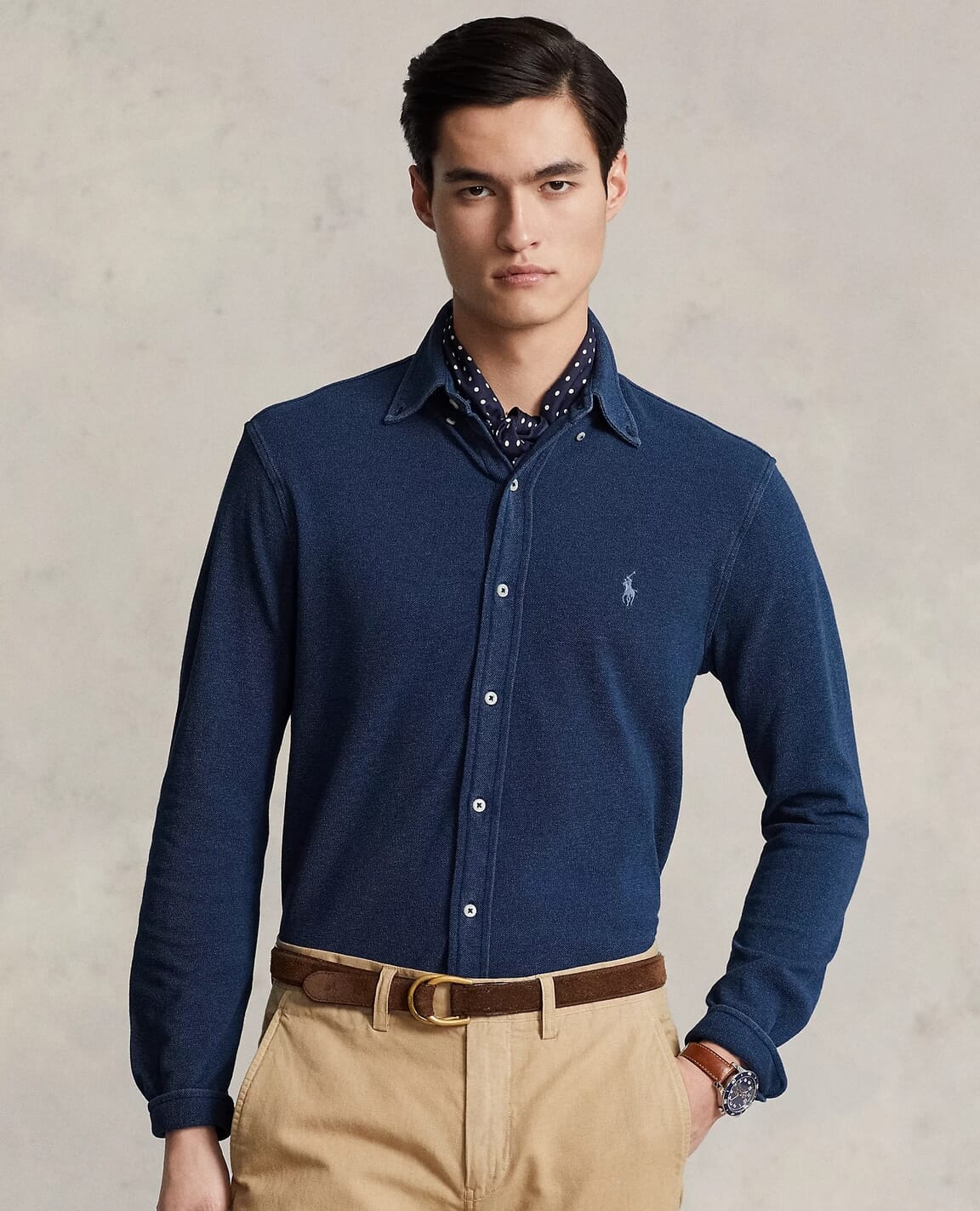
The examples below are actual exports made with Sharp 0.35.3. They are crop demonstrations, not screenshots of a browser or a claim about conversion rates. The source photograph remains credited to the Sirv demo and its original rights holders.
| Placement | Source region | Output | Decision |
|---|---|---|---|
| Square card | Whole 1152 × 1423 image | 600 × 600 | Fit the full image inside a square |
| Automatic wide hero | Center crop | 960 × 320 | Show what the default removes |
| Selected wide hero | x=0, y=390, width=1152, height=384 | 960 × 320 | Keep the collar and chest detail |
| Mobile crop | x=180, y=380, width=800, height=1000 | 640 × 800 | Show more of the garment vertically |
| Zoom source | Whole original | 1152 × 1423 | Retain the available detail |
Crop coordinates use the top-left corner of the source as zero. These are choices for this photograph. They are not reusable coordinates for every shirt.
Use containment for the card
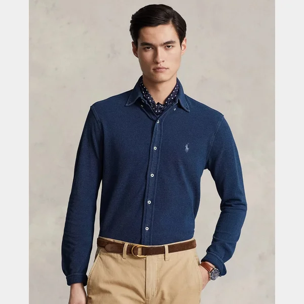
Containment leaves space when the image and card have different proportions. That is useful when cutting off a sleeve would hide more than the extra space costs.
You can make the same display choice with CSS:
.product-card img {
  display: block;
  width: 100%;
  aspect-ratio: 1;
  object-fit: contain;
  background: #eee;
}
CSS changes the displayed box. It does not reduce the downloaded image’s dimensions or file size. Supply an appropriately sized source using the responsive image patterns alongside the crop choice.
Choose the hero composition explicitly
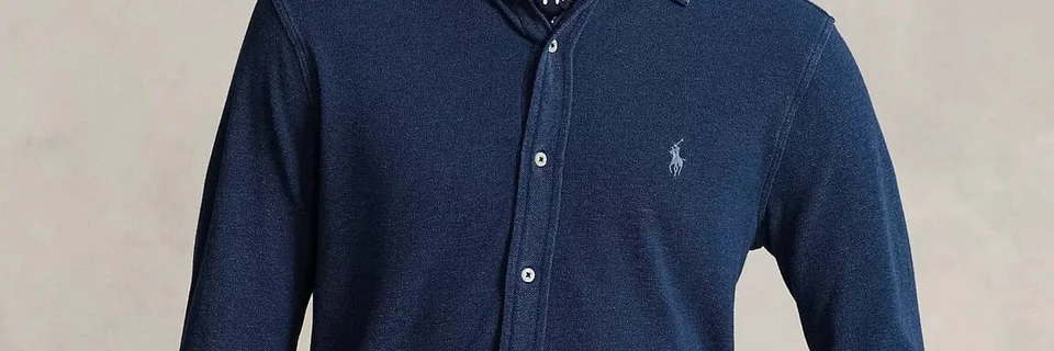
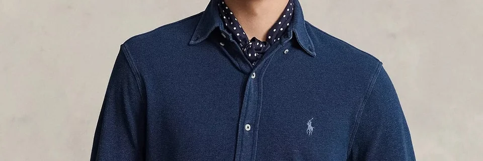
For the chosen hero, we extracted a 3:1 region before resizing it:
await sharp('shirt-source.jpg')
  .extract({ left: 0, top: 390, width: 1152, height: 384 })
  .resize(960)
  .webp({ quality: 85 })
  .toFile('shirt-hero-detail.webp');
An object-position adjustment can also move the visible part of a cover-fitted image. Its percentages describe alignment between the image and its box, not a direct pixel coordinate in the source. Check the result at each aspect ratio rather than translating an editor’s focal point blindly. MDN documents the positioning behavior.
Give mobile its own composition
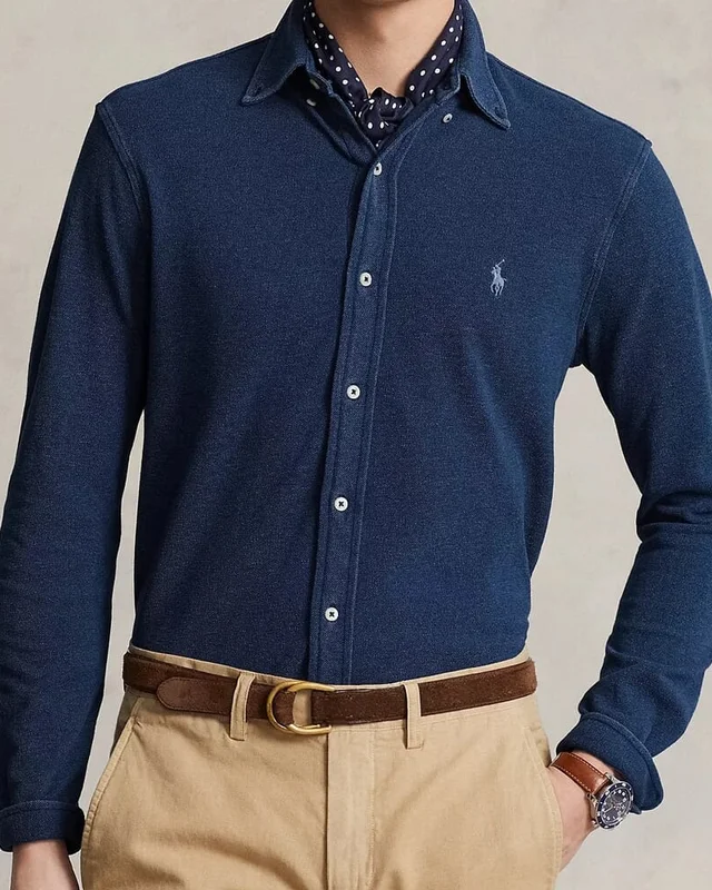
Changing resolution with srcset preserves the composition. Changing the composition calls for art direction with picture, as explained in web.dev’s art-direction guide.
<picture class="product-hero">
  <source media="(max-width: 640px)"
    srcset="/experiments/2026-09/shirt-mobile.webp"
    width="640" height="800">
  <img src="/experiments/2026-09/shirt-hero-detail.webp"
    width="960" height="320"
    alt="Navy shirt with a pointed collar and embroidered chest logo">
</picture>
.product-hero img {
display: block;
width: 100%;
height: auto;
aspect-ratio: 3 / 1;
}
@media (max-width: 640px) {
.product-hero img { aspect-ratio: 4 / 5; }
}The explicit aspect ratios reserve the intended box. The sample sources are 640 and 960 pixels wide. If the display needs more physical pixels, generate a larger variant only when the original has enough detail. This source cannot produce a genuine 2400-pixel photograph.
Keep zoom attached to the original
The 960 × 320 banner has discarded much of the shirt. Enlarging it cannot reveal the cuffs. Use the 1152 × 1423 original as the zoom source instead.
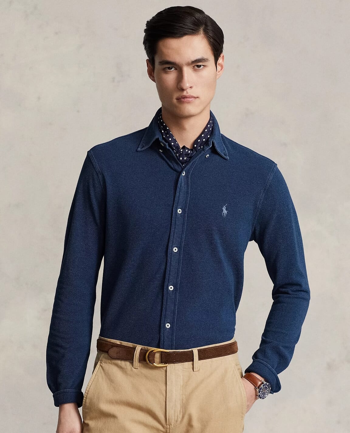
For a product gallery, Sirv Media Viewer supports a zoom item using this documented markup:
<script src="https://scripts.sirv.com/sirvjs/v3/sirv.js"></script>
<div class="Sirv" data-options="layout.aspectRatio:1/1">
  <div
    data-src="https://demo.sirv.com/demo/sirv-media-viewer/ralphlauren/featherweight-shirt-navy-1.jpg"
    data-type="zoom"
    data-alt="Navy shirt, full front view with collar, buttons and cuffs">
  </div>
</div>
Load the script once, replace the demo URL with your uploaded original and test keyboard focus, fullscreen and touch behavior in your page. This article demonstrates the crop files. It does not present the viewer snippet as a completed browser compatibility test. A Sirv account lets you host your own source images for this workflow.
Reproduce and review
Run the crop script from the ImageGuide checkout:
node public/experiments/2026-09/run.mjs cropsIt reads the checked-in source, produces the four exports and asserts their dimensions. Review the card, desktop hero and mobile crop side by side. If a crop removes the detail that identifies the product, change the composition before adjusting compression.