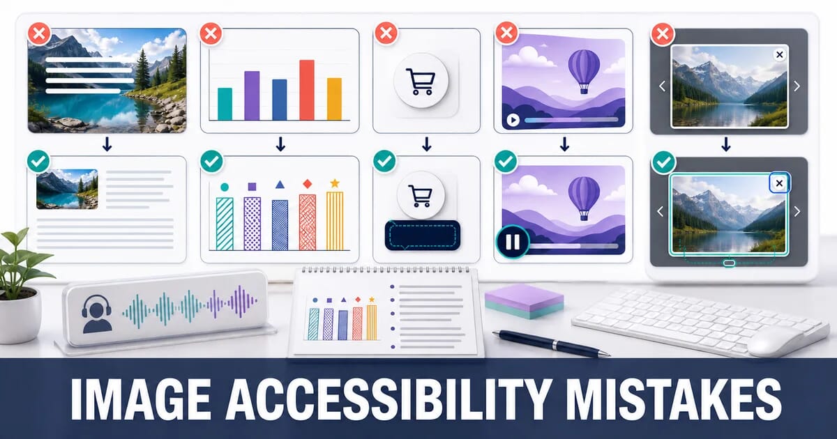
9 Image Accessibility Mistakes That Exclude Real Users
Nine image accessibility mistakes beyond alt text: text baked into images, colour-only meaning, unlabelled icon buttons, and the fix for each.
Most teams treat image accessibility as one task: write alt text. Alt text matters, and it is covered thoroughly in the alt text guide. It is also only one of nine ways images exclude people.
The other eight affect users with low vision, colour vision deficiency, motion sensitivity, cognitive disabilities, and anyone navigating by keyboard. Several of them affect users with no disability at all, on a bright day outdoors or on a slow connection.
Who Is Affected
| Barrier | Who it affects | Roughly how common |
|---|---|---|
| No text alternative | Screen reader users | Millions of web users |
| Text baked into images | Low vision, translation users, anyone zooming | Very common need |
| Colour as the only signal | Colour vision deficiency | About 1 in 12 men, 1 in 200 women |
| Low contrast | Low vision, bright sunlight, older screens | Extremely broad |
| Autoplaying motion | Vestibular disorders, ADHD, migraine | Significant minority |
| Keyboard traps | Motor disabilities, power users | Anyone not using a mouse |
None of these are edge cases.
1. Text Baked Into Images
A promotional banner with the offer rendered as pixels. A pricing table exported from a design tool as a PNG. A quote card for social media, reused on the site. In every case the text is unreadable by anything except human eyes.
Why It Excludes People
| Who | What happens |
|---|---|
| Screen reader users | Nothing is announced unless the alt repeats the whole text |
| Low vision users | Zooming past 200% turns the text into blur, because pixels do not reflow |
| Users with custom stylesheets | Their font, size, and contrast preferences are ignored |
| Translation users | Browser translation cannot touch it |
| Anyone on a slow connection | Text arrives only when the image does |
WCAG 1.4.5 (Images of Text) is explicit: use real text unless a particular presentation is essential, such as a logotype.
The Fix
Build it with HTML and CSS over a background image, so the text stays real:
<div class="promo">
  <img src="promo-background.jpg" alt="" width="1200" height="400">
  <div class="promo__content">
    <h2>Summer sale</h2>
    <p>25% off all lighting until 31 August</p>
    <a href="/sale" class="promo__cta">Shop the sale</a>
  </div>
</div>
.promo { position: relative; }
.promo img { width: 100%; height: auto; }
.promo__content {
position: absolute;
inset: 0;
display: flex;
flex-direction: column;
justify-content: center;
padding: 2rem;
}The background image gets alt="" because it is decorative. The message is real text: selectable, zoomable, translatable, and readable by a screen reader.
When You Genuinely Cannot
If the image must contain text, for example a screenshot of an error message in documentation, put the text in the alt attribute and, when it is long, in the surrounding page as well:
<figure>
  <img src="npm-error.png" width="800" height="220"
       alt="Terminal output reading: npm ERR! code ERESOLVE, unable to resolve dependency tree">
  <figcaption>
    The full error also names the conflicting package versions, shown in the
    transcript below.
  </figcaption>
</figure>
The documentation screenshots guide covers this pattern in depth.
2. Colour as the Only Signal
A chart where the only difference between the two lines is that one is red and one is green. A status indicator that is a coloured dot. A form that marks errors by turning the border red.
Why It Excludes People
Around 1 in 12 men has some form of colour vision deficiency, most commonly red-green. Those two lines are the same line to them. The same is true for anyone on a monochrome display, a badly calibrated projector, or a printout.
The Fix: Always Pair Colour With a Second Cue
| Signal | Colour alone | Colour plus |
|---|---|---|
| Chart series | Red vs green line | Solid vs dashed, plus direct labels |
| Status | Green dot vs red dot | Dot plus a word, or dot plus icon shape |
| Form error | Red border | Red border, icon, and a text message |
| Map regions | Colour fill | Colour plus pattern fill or a label |
| Required field | Red asterisk | Asterisk plus “required” in the label |
<!-- Colour only: invisible to many users -->
<span class="status status--red"></span>

<!-- Colour plus text and shape -->
<span class="status status--error">
  <svg aria-hidden="true" focusable="false" width="16" height="16">…</svg>
  Out of stock
</span>
For Charts Specifically
Label the series directly on the plot rather than relying on a legend keyed by colour. Direct labelling helps everyone, because it removes the eye movement between legend and line.
Sales ─────────────  ← labelled at the end of the line
Returns ┈┈┈┈┈┈┈┈┈┈   ← different dash pattern, also labelled
The data visualization guide covers accessible chart construction.
3. Insufficient Contrast in Image-Based Text and Overlays
White text on a photograph looks excellent in the design file, where the photograph happens to be dark. Then a lighter photo goes into the same slot and the text disappears.
The Requirement
WCAG 1.4.3 requires a contrast ratio of at least:
| Text size | Minimum ratio (AA) | Enhanced (AAA) |
|---|---|---|
| Under 18 pt regular | 4.5:1 | 7:1 |
| 18 pt+, or 14 pt+ bold | 3:1 | 4.5:1 |
| UI components and graphics | 3:1 | — |
The Fix
Never rely on the image itself for contrast. Guarantee it with a scrim:
.hero {
  position: relative;
}

/* A gradient scrim guarantees contrast regardless of the photo behind it */
.hero::after {
  content: '';
  position: absolute;
  inset: 0;
  background: linear-gradient(to top, rgb(0 0 0 / 0.75), rgb(0 0 0 / 0.15));
}

.hero__text {
  position: relative;
  z-index: 1;
  color: #fff;
  text-shadow: 0 1px 3px rgb(0 0 0 / 0.4);  /* belt and braces */
}
A gradient scrim is better than a flat overlay because it darkens the area behind the text while leaving the top of the photograph visible.
Test It With the Worst Image
Take the lightest photograph anyone might upload, put it in the slot, and measure the contrast. Design for that case, not for the carefully chosen hero in the mockup.
4. Icon Buttons With No Accessible Name
A magnifying glass, a heart, a hamburger, a chevron. Each one is a button whose entire meaning is the picture, and each one is regularly announced as “button” and nothing else.
The Three Ways to Get It Wrong
<!-- 1. SVG with no label at all -->
<button><svg>…</svg></button>

<!-- 2. Icon font with no label: some screen readers read the private-use character -->
<button><i class="icon-search"></i></button>

<!-- 3. Image with a filename-derived alt -->
<button><img src="search-icon.svg" alt="search-icon.svg"></button>
The Fix
Give the button a name and hide the decorative graphic from assistive technology:
<!-- Inline SVG -->
<button type="button" aria-label="Search products">
  <svg aria-hidden="true" focusable="false" width="20" height="20" viewBox="0 0 20 20">
    <path d="…"/>
  </svg>
</button>

<!-- Or with visible text, which is better still -->
<button type="button">
  <svg aria-hidden="true" focusable="false" width="20" height="20">…</svg>
  <span>Search</span>
</button>

<!-- Or with visually hidden text, which survives CSS failure better than aria-label -->
<button type="button">
  <svg aria-hidden="true" focusable="false" width="20" height="20">…</svg>
  <span class="visually-hidden">Search products</span>
</button>
.visually-hidden {
position: absolute;
width: 1px;
height: 1px;
padding: 0;
margin: -1px;
overflow: hidden;
clip-path: inset(50%);
white-space: nowrap;
border: 0;
}focusable="false" matters on inline SVG because older Internet Explorer and some current tooling put SVG elements in the tab order otherwise.
Name the Action, Not the Picture
aria-label="Magnifying glass" describes the icon. aria-label="Search products" describes what happens. Always write the second.
5. Autoplaying Animation With No Way to Stop It
An animated GIF that loops forever, an autoplaying background video, a carousel that rotates every four seconds. For users with vestibular disorders, motion can cause genuine nausea and dizziness. For users with attention or reading difficulties, moving content beside text makes the text unreadable.
The Requirement
WCAG 2.2.2 is direct: any motion that starts automatically, lasts more than five seconds, and runs alongside other content must have a mechanism to pause, stop, or hide it.
The Fix
Respect the system preference. Users can already say they want less motion. Honour it:
@media (prefers-reduced-motion: reduce) {
  *,
  *::before,
  *::after {
    animation-duration: 0.01ms !important;
    animation-iteration-count: 1 !important;
    transition-duration: 0.01ms !important;
    scroll-behavior: auto !important;
  }
}
For video, check the preference in JavaScript too:
const prefersReduced = window.matchMedia('(prefers-reduced-motion: reduce)');

document.querySelectorAll('video[autoplay]').forEach(video => {
  if (prefersReduced.matches) {
    video.removeAttribute('autoplay');
    video.pause();
    video.setAttribute('controls', '');
  }
});
For GIFs, there is no pause control. That is one more reason to convert them to video, which has native controls:
<video autoplay loop muted playsinline controls width="800" height="600" poster="preview.jpg">
  <source src="demo.webm" type="video/webm">
  <source src="demo.mp4" type="video/mp4">
</video>
Do not autoplay carousels at all. They fail 2.2.2, they move the content a user is reading, and they make LCP unstable. If you must, provide a visible pause control that is reachable by keyboard.
6. Lightboxes and Galleries That Trap or Lose Focus
The gallery works beautifully with a mouse. With a keyboard, pressing Tab moves focus behind the open lightbox, Escape does nothing, and closing the lightbox drops focus back to the top of the page.
What a Correct Modal Does
- Moves focus into the dialog when it opens
- Keeps Tab and Shift+Tab cycling inside the dialog
- Closes on Escape
- Returns focus to the element that opened it
- Hides the rest of the page from screen readers
The Fix: Use the Native Dialog Element
<dialog> gives you most of this for free, and it is supported in all current browsers:
<button type="button" data-open-gallery>
  <img src="lamp-thumb.jpg" width="120" height="120" alt="Walnut desk lamp, front view">
</button>

<dialog id="gallery" aria-label="Product image gallery">
  <button type="button" data-close autofocus>
    <span class="visually-hidden">Close gallery</span>
    <svg aria-hidden="true" focusable="false" width="24" height="24">…</svg>
  </button>
  <img src="lamp-1600.jpg" width="1600" height="1600" alt="Walnut desk lamp, front view">
</dialog>
const dialog = document.getElementById('gallery');
const opener = document.querySelector('[data-open-gallery]');
opener.addEventListener('click', () => dialog.showModal());
dialog.querySelector('[data-close]').addEventListener('click', () => dialog.close());
// showModal() handles focus trapping, Escape, and inert background.
// This restores focus to the trigger:
dialog.addEventListener('close', () => opener.focus());showModal() traps focus, closes on Escape, and makes the rest of the document inert, all natively. A hand-rolled <div role="dialog"> has to reimplement every one of those, and usually reimplements at least one of them incorrectly.
Keyboard Navigation Between Slides
Arrow keys should move between images, and the current position should be announced:
<div role="group" aria-label="Product images, 1 of 6">
  <!-- update aria-label as the user navigates -->
</div>
7. Complex Images With Only a Short Description
A sales chart, an architecture diagram, an infographic, a map. A one-sentence alt cannot carry the information in these, and WCAG requires that the information be available, not merely acknowledged.
The Test
If you cannot describe the image adequately in about 150 characters, it needs a long description as well as an alt.
The Fix
Short alt names the image, a longer description carries the content:
<figure>
  <img src="quarterly-revenue.png" width="800" height="500"
       alt="Bar chart of quarterly revenue for 2025, described in full below">
  <figcaption id="revenue-desc">
    Revenue rose each quarter of 2025: £1.2m in Q1, £1.4m in Q2, £1.9m in Q3
    and £2.6m in Q4. The largest single jump was between Q3 and Q4, driven by
    the November lighting range launch.
  </figcaption>
</figure>
Better still, give the underlying data as a table. A table is machine-readable, sortable, translatable, and works when the image fails to load:
<figure>
  <img src="quarterly-revenue.png" alt="" width="800" height="500">
  <figcaption>Quarterly revenue, 2025</figcaption>
</figure>

<table>
  <caption>Quarterly revenue, 2025</caption>
  <thead><tr><th scope="col">Quarter</th><th scope="col">Revenue</th></tr></thead>
  <tbody>
    <tr><th scope="row">Q1</th><td>£1.2m</td></tr>
    <tr><th scope="row">Q2</th><td>£1.4m</td></tr>
    <tr><th scope="row">Q3</th><td>£1.9m</td></tr>
    <tr><th scope="row">Q4</th><td>£2.6m</td></tr>
  </tbody>
</table>
Here the image gets alt="" because the table carries the same information. Duplicating it in the alt would make screen reader users hear everything twice.
Inline SVG Charts
An inline SVG can be described directly:
<svg role="img" aria-labelledby="chart-title chart-desc" viewBox="0 0 800 500">
  <title id="chart-title">Quarterly revenue, 2025</title>
  <desc id="chart-desc">
    Revenue rose each quarter, from £1.2m in Q1 to £2.6m in Q4.
  </desc>
  <!-- shapes -->
</svg>
8. Images That Carry Meaning Only When They Load
An image-based CAPTCHA. A product colour shown only by a swatch photograph. A form instruction rendered as a picture. When the image fails, the meaning goes with it, and images fail more often than people assume: slow connections, blocked hosts, ad blockers, corporate proxies, and printing.
The Fix
Never use image-only CAPTCHA. Offer an audio alternative at minimum, and prefer approaches that do not require solving a puzzle at all, such as honeypot fields or a privacy-respecting challenge service.
Name colours in text, not just in swatches:
<!-- Colour communicated only visually -->
<button class="swatch" style="background:#1a2b4c"></button>

<!-- Colour named -->
<button class="swatch" style="background:#1a2b4c">
  <span class="visually-hidden">Navy</span>
</button>
<span aria-hidden="true">Navy</span>
Make sure alt text is genuinely useful when the image is missing. That is the state in which alt text is rendered visually, so it should read as a sensible replacement, not as an SEO string.
Check the print stylesheet. Background images do not print by default. If information lives in a background image, it disappears on paper.
9. Never Testing With a Screen Reader
Automated tools catch missing alt attributes and contrast failures. They cannot tell you that your alt text is unhelpful, that your gallery announces “button button button”, or that your carousel interrupts the reading position every four seconds.
A 20-Minute Test That Finds Most Problems
| Platform | Screen reader | Start it |
|---|---|---|
| macOS | VoiceOver | Cmd + F5 |
| Windows | NVDA (free) | Ctrl + Alt + N |
| iOS | VoiceOver | Settings → Accessibility |
| Android | TalkBack | Settings → Accessibility |
Then do these five things on a real page:
- Navigate by image. In NVDA press
Grepeatedly, in VoiceOver use the rotor. Every announcement should make sense on its own. - Tab through the whole page. Focus should always be visible and should never disappear behind an overlay.
- Open the gallery with the keyboard only. Then close it and check where focus lands.
- Turn off images entirely. In Chrome: Settings → Privacy and security → Site settings → Images → Don’t allow. The page should still be usable.
- Zoom to 400%. Text should reflow. Anything that requires horizontal scrolling to read has failed WCAG 1.4.10.
Automated Checks Worth Running Anyway
# axe-core via the CLI
npx @axe-core/cli https://example.com --tags wcag2a,wcag2aa

# Pa11y
npx pa11y https://example.com --standard WCAG2AA
Run both in CI. They catch regressions cheaply, and they free your manual testing time for the things only a human notices. The screen reader guide covers the testing workflow in detail.
Summary
The Nine at a Glance
| # | Mistake | WCAG reference | Fix |
|---|---|---|---|
| 1 | Text baked into images | 1.4.5 | Real text over a background image |
| 2 | Colour as the only signal | 1.4.1 | Add shape, pattern, or a label |
| 3 | Low contrast over photos | 1.4.3 | Gradient scrim, test with the lightest image |
| 4 | Unlabelled icon buttons | 4.1.2 | Visually hidden text, aria-hidden on the icon |
| 5 | Unstoppable animation | 2.2.2 | prefers-reduced-motion, video controls, no autoplay carousels |
| 6 | Focus traps in lightboxes | 2.1.2, 2.4.3 | Native <dialog> with showModal() |
| 7 | Complex images, short alt | 1.1.1 | Long description or a data table |
| 8 | Meaning lost when images fail | 1.1.1 | Text alternatives that stand alone |
| 9 | No screen reader testing | — | 20 minutes with VoiceOver or NVDA |
Checklist
- ✅ No promotional or informational text is baked into an image
- ✅ Every colour-coded signal has a second, non-colour cue
- ✅ Text over images has a scrim guaranteeing 4.5:1 contrast
- ✅ Every icon button has an accessible name describing the action
- ✅
prefers-reduced-motionis honoured, and nothing autoplays without a control - ✅ Galleries use native
<dialog>, and focus returns to the trigger on close - ✅ Charts and diagrams have a long description or an equivalent data table
- ✅ The page is usable with images disabled
- ✅ axe or Pa11y runs in CI
- ✅ Someone has actually navigated the page with a screen reader
Mistakes 1 and 4 are the most common and the quickest to fix. Mistake 9 is the one that finds the other eight.
Sources
Related Resources
Related Guides
Accessible Images for Screen Readers: A Developer's Guide
Image Alt Text: The Complete Writing Guide
Maps and Data Visualization Images: Optimization Guide
SVG Best Practices for Web Performance
Screenshots and Documentation Images: Optimization Guide
8 Image SEO Mistakes That Hurt Your Rankings