Maps and Data Visualization Images: Optimization Guide
Optimize charts, graphs, maps, and infographics for the web. Learn format selection, responsive strategies, and accessibility best practices for data visualizations.
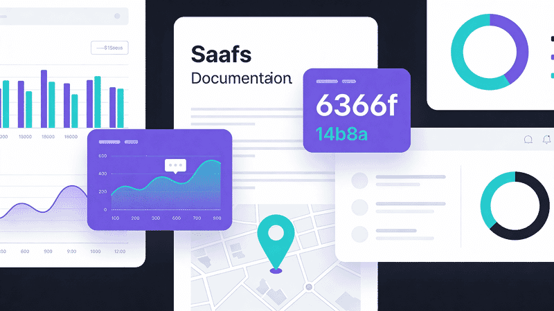
Data visualizations—charts, graphs, maps, and infographics—have unique optimization requirements. They need to be sharp at any size, accessible, and often interactive. This guide covers best practices for optimizing data viz images.
Format Selection
When to Use Each Format
| Visualization Type | Best Format | Why |
|---|---|---|
| Charts (bar, line, pie) | SVG | Scales perfectly, small file |
| Maps (vector) | SVG | Infinite zoom, interactivity |
| Maps (satellite/terrain) | WebP/JPEG | Photographic content |
| Infographics | SVG + PNG fallback | Crisp text at any size |
| Heatmaps | PNG/WebP | Complex color gradients |
| Screenshots of dashboards | PNG | Preserve exact appearance |
SVG Advantages for Data Viz
<svg viewBox="0 0 400 300" role="img" aria-labelledby="chart-title">
  <title id="chart-title">Monthly Revenue 2025</title>
  <!-- Scales to any size without quality loss -->
  <!-- Accessible with proper markup -->
  <!-- Interactive with CSS/JS -->
  <!-- Small file size for simple charts -->
</svg>
Chart Optimization
Exporting from Chart Libraries
Most chart libraries can export SVG:
// Chart.js to image
const canvas = document.getElementById('myChart');
const imageUrl = canvas.toDataURL('image/png', 1.0);

// D3.js SVG export
const svgElement = document.querySelector('#chart svg');
const svgString = new XMLSerializer().serializeToString(svgElement);
Optimizing Chart SVGs
# Using SVGO
svgo chart.svg -o chart-optimized.svg

# With specific optimizations for charts
svgo chart.svg --config='{"plugins":[{"name":"preset-default","params":{"overrides":{"removeViewBox":false}}}]}'
Static Chart Best Practices
| Consideration | Recommendation |
|---|---|
| Colors | High contrast, colorblind-safe palette |
| Text size | Minimum 12px (16px preferred) |
| Line weight | Minimum 2px for visibility |
| Data labels | Direct labels vs. legends when possible |
| Export size | 2x intended display size for retina |
Map Optimization
Vector Maps (SVG)
For geographic boundaries, country outlines, etc.:
<svg
  viewBox="0 0 1000 500"
  role="img"
  aria-label="Map of United States showing sales by region"
>
  <!-- State paths -->
  <path d="..." data-state="CA" class="region-west"/>
  <!-- Interactive regions possible -->
</svg>
Optimization tips:
- Simplify paths (fewer points)
- Remove unnecessary precision (
d="M 10.123456"→d="M 10.1") - Combine similar paths
- Use CSS for styling instead of inline attributes
Raster Maps (Satellite, Terrain)
<picture>
  <source
    srcset="map-terrain.avif"
    type="image/avif"
  >
  <source
    srcset="map-terrain.webp"
    type="image/webp"
  >
  <img
    src="map-terrain.jpg"
    alt="Terrain map of Rocky Mountain region"
    width="800"
    height="600"
    loading="lazy"
  >
</picture>
Tile-Based Maps
For interactive maps, use tile services:
// Leaflet with optimized tiles
const map = L.map('map').setView([51.505, -0.09], 13);

L.tileLayer('https://tiles.example.com/{z}/{x}/{y}.webp', {
  maxZoom: 19,
  attribution: '© OpenStreetMap'
}).addTo(map);
Infographic Optimization
Hybrid Approach
Infographics often combine vector graphics with photos:
<figure class="infographic">
  <!-- Vector elements as SVG -->
  <svg class="infographic-graphics" viewBox="0 0 800 2000">
    <!-- Icons, text, shapes -->
  </svg>

  <!-- Photographic elements -->
  <img
    src="product-photo.webp"
    alt="Product showcase"
    loading="lazy"
    class="infographic-photo"
  >
</figure>
Export Strategies
| Export Method | File Size | Quality | Use When |
|---|---|---|---|
| Pure SVG | Tiny | Perfect | Simple graphics only |
| SVG + embedded images | Medium | Perfect | Mixed content |
| PNG @2x | Large | Excellent | Universal compatibility |
| WebP @2x | Medium | Excellent | Modern browsers |
Text in Infographics
<!-- Prefer HTML text over image text when possible -->
<div class="infographic-stat">
  <svg class="icon" aria-hidden="true">...</svg>
  <span class="stat-number">47%</span>
  <span class="stat-label">Increase in efficiency</span>
</div>
Benefits:
- Accessible
- Searchable
- Translatable
- Smaller file size
Responsive Data Viz
Scaling Charts
.chart-container {
  width: 100%;
  max-width: 800px;
}

.chart-container svg {
  width: 100%;
  height: auto;
}
Art Direction for Charts
Different layouts for different screens:
<picture>
  <!-- Mobile: Vertical bar chart -->
  <source
    media="(max-width: 600px)"
    srcset="chart-vertical.svg"
    type="image/svg+xml"
  >
  <!-- Desktop: Horizontal bar chart -->
  <img
    src="chart-horizontal.svg"
    alt="Q4 Sales by Region"
  >
</picture>
Responsive SVG Viewbox
<svg
  viewBox="0 0 800 400"
  preserveAspectRatio="xMidYMid meet"
  role="img"
  aria-labelledby="chart-title"
>
  <title id="chart-title">Sales Trend 2020-2025</title>
  <!-- Chart content -->
</svg>
Accessibility
Screen Reader Support
<figure role="figure" aria-labelledby="fig-title">
  <svg role="img" aria-describedby="chart-desc">
    <title id="fig-title">Monthly Website Traffic</title>
    <desc id="chart-desc">
      Bar chart showing traffic from January to December.
      Traffic peaked in November at 150,000 visitors.
      Lowest month was February with 45,000 visitors.
    </desc>
    <!-- Chart elements -->
  </svg>

  <!-- Provide data table for complex charts -->
  <details>
    <summary>View data table</summary>
    <table>
      <caption>Monthly Website Traffic 2025</caption>
      <thead>
        <tr><th>Month</th><th>Visitors</th></tr>
      </thead>
      <tbody>
        <tr><td>January</td><td>52,000</td></tr>
        <!-- ... -->
      </tbody>
    </table>
  </details>
</figure>
Color Accessibility
/* Use patterns in addition to color */
.data-series-1 {
  fill: #2563eb;
  fill-opacity: 0.8;
  stroke: #2563eb;
  stroke-dasharray: none;
}

.data-series-2 {
  fill: #dc2626;
  fill-opacity: 0.5;
  stroke: #dc2626;
  stroke-dasharray: 5,5;
}
Colorblind-safe palettes:
- Blue → Orange (instead of Red → Green)
- Use patterns/textures as secondary differentiator
- Ensure sufficient contrast (4.5:1 minimum)
Using Image CDNs
Sirv can optimize data visualizations:
<!-- Resize chart while maintaining sharpness -->
<img
  src="https://your-site.sirv.com/charts/revenue.svg?w=800"
  alt="Revenue chart"
>

<!-- Convert SVG to PNG for compatibility -->
<img
  src="https://your-site.sirv.com/charts/revenue.svg?format=png&w=1600"
  alt="Revenue chart"
>
For complex infographics, Sirv AI Studio can enhance image quality and optimize file sizes automatically.
Performance Tips
Lazy Loading Charts
<!-- Lazy load below-fold visualizations -->
<img
  src="chart.svg"
  alt="Annual trends"
  loading="lazy"
  decoding="async"
>
Intersection Observer for Animations
const observer = new IntersectionObserver((entries) => {
  entries.forEach(entry => {
    if (entry.isIntersecting) {
      entry.target.classList.add('animate-in');
    }
  });
}, { threshold: 0.2 });

document.querySelectorAll('.chart').forEach(chart => {
  observer.observe(chart);
});
Preload Critical Charts
<link rel="preload" href="hero-chart.svg" as="image" type="image/svg+xml">File Size Guidelines
| Visualization Type | Target Size | Max Size |
|---|---|---|
| Simple chart (SVG) | 5-20 KB | 50 KB |
| Complex chart (SVG) | 20-50 KB | 100 KB |
| Infographic (SVG) | 50-150 KB | 300 KB |
| Map tiles (WebP) | 20-50 KB each | 100 KB |
| Dashboard screenshot | 100-200 KB | 500 KB |
Conclusion
Optimizing data visualizations requires:
- SVG for vector graphics - Scalable, accessible, small
- WebP/JPEG for raster maps - Photographic content
- Accessibility first - Alt text, data tables, color contrast
- Responsive design - Different layouts for different screens
- Lazy loading - Defer non-critical visualizations
Use Sirv for on-demand resizing and format conversion of your data visualizations.