The Complete Responsive Images Guide
Master responsive images with srcset, sizes, and picture elements. Learn resolution switching, art direction, and modern implementation patterns for optimal web performance.
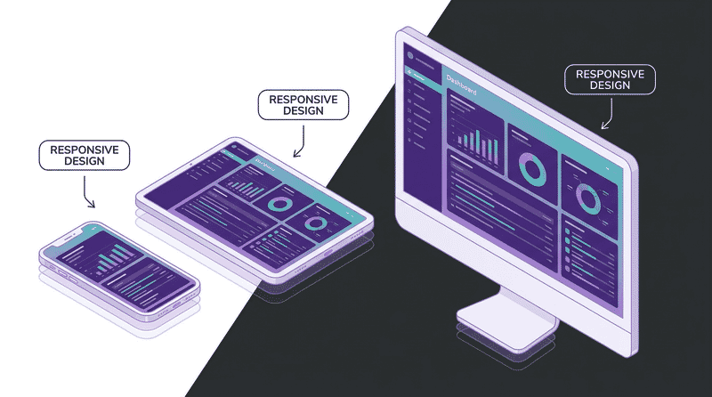
Responsive images ensure users download only what they need—mobile users shouldn’t download desktop-sized images. This comprehensive guide covers everything from basic srcset to advanced art direction patterns.
Why Responsive Images Matter
Consider a typical page with a hero image:
| Device | Viewport | DPR | Needed Size | Typical JPEG |
|---|---|---|---|---|
| Mobile | 375px | 2x | 750px | 60 KB |
| Tablet | 768px | 2x | 1536px | 180 KB |
| Desktop | 1440px | 1x | 1440px | 160 KB |
| Desktop | 1920px | 2x | 3840px | 450 KB |
Without responsive images, you serve the same file to everyone—either too large for mobile or too blurry for retina displays.
The Three Problems Solved
- Resolution switching: Different sizes of the same image for different viewport widths
- Density switching: Different resolutions for different pixel densities (1x, 2x, 3x)
- Art direction: Different images (crops, compositions) for different contexts
Understanding srcset
The srcset attribute tells browsers what image options are available.
Width Descriptors (w)
Tell the browser each image’s width in pixels:
<img
  src="image-800.jpg"
  srcset="
    image-400.jpg 400w,
    image-800.jpg 800w,
    image-1200.jpg 1200w,
    image-1600.jpg 1600w
  "
  sizes="100vw"
  alt="Hero image"
>
How browsers choose:
- Parse
sizesto determine display width (e.g., 100vw = 375px on mobile) - Multiply by device pixel ratio (375px × 2 = 750px)
- Select smallest image that satisfies the requirement (800w)
Density Descriptors (x)
For fixed-size images with different resolutions:
<img
  src="logo.png"
  srcset="
    logo.png 1x,
    logo@2x.png 2x,
    logo@3x.png 3x
  "
  width="200"
  height="50"
  alt="Company logo"
>
Use density descriptors when:
- Image has a fixed display size
- Only resolution varies, not layout
- Simple logos, icons, avatars
Don’t use density descriptors when:
- Image width changes with viewport
- You need resolution switching (use
winstead)
Width vs Density: When to Use Each
| Scenario | Use Width (w) | Use Density (x) |
|---|---|---|
| Full-width hero | ✓ | |
| Fluid grid images | ✓ | |
| Fixed-size logo | ✓ | |
| Avatar (always 48px) | ✓ | |
| Responsive product | ✓ |
Mastering the sizes Attribute
The sizes attribute tells the browser how wide the image will display at different viewport widths.
Syntax
sizes="[media condition] [length], [fallback length]"Basic Examples
<!-- Full width on all viewports -->
sizes="100vw"

<!-- Full width on mobile, half on larger screens -->
sizes="(max-width: 768px) 100vw, 50vw"

<!-- Multiple breakpoints -->
sizes="
  (max-width: 480px) 100vw,
  (max-width: 768px) 80vw,
  (max-width: 1200px) 50vw,
  33vw
"

<!-- Fixed width at certain sizes -->
sizes="(min-width: 1024px) 400px, 100vw"
Length Values
| Unit | Description | Example |
|---|---|---|
vw | Viewport width percentage | 100vw, 50vw |
px | Fixed pixels | 400px, 800px |
calc() | Calculated value | calc(100vw - 32px) |
em | Relative to font size | 30em |
Common Layout Patterns
Full-bleed image:
sizes="100vw"Contained with padding:
sizes="calc(100vw - 32px)"Max-width container (1200px):
sizes="(min-width: 1200px) 1200px, 100vw"Two-column layout:
sizes="(min-width: 768px) 50vw, 100vw"Three-column grid:
sizes="(min-width: 1024px) 33vw, (min-width: 640px) 50vw, 100vw"Card in sidebar:
sizes="(min-width: 1024px) 300px, (min-width: 768px) 50vw, 100vw"Getting sizes Right
The sizes attribute must match your CSS layout. If they don’t match, browsers make suboptimal choices.
Common mistake:
/* CSS says image is 50% of container, max 600px */
.image { max-width: 600px; width: 50%; }
<!-- sizes says 100vw — WRONG! -->
<img sizes="100vw" ...>
<!-- Correct: matches CSS -->
<img sizes="(min-width: 1200px) 600px, 50vw" ...>The Picture Element
The <picture> element enables art direction and format fallbacks.
Format Fallbacks
Serve modern formats with graceful degradation:
<picture>
  <source srcset="hero.avif" type="image/avif">
  <source srcset="hero.webp" type="image/webp">
  <img src="hero.jpg" alt="Hero image">
</picture>
Browser selects the first supported format.
Combined with srcset
Full responsive implementation with multiple formats:
<picture>
  <source
    srcset="
      hero-400.avif 400w,
      hero-800.avif 800w,
      hero-1200.avif 1200w
    "
    sizes="100vw"
    type="image/avif"
  >
  <source
    srcset="
      hero-400.webp 400w,
      hero-800.webp 800w,
      hero-1200.webp 1200w
    "
    sizes="100vw"
    type="image/webp"
  >
  <img
    src="hero-800.jpg"
    srcset="
      hero-400.jpg 400w,
      hero-800.jpg 800w,
      hero-1200.jpg 1200w
    "
    sizes="100vw"
    alt="Hero image"
    width="1200"
    height="600"
  >
</picture>
Art Direction with Media Queries
Different images for different contexts:
<picture>
  <!-- Wide crop for desktop -->
  <source
    media="(min-width: 1024px)"
    srcset="hero-wide.jpg"
  >
  <!-- Square crop for tablet -->
  <source
    media="(min-width: 640px)"
    srcset="hero-square.jpg"
  >
  <!-- Tall/portrait crop for mobile -->
  <img src="hero-tall.jpg" alt="Hero image">
</picture>
Art Direction + Multiple Formats
<picture>
  <!-- Desktop: wide crop, modern formats -->
  <source
    media="(min-width: 1024px)"
    srcset="hero-wide.avif"
    type="image/avif"
  >
  <source
    media="(min-width: 1024px)"
    srcset="hero-wide.webp"
    type="image/webp"
  >
  <source
    media="(min-width: 1024px)"
    srcset="hero-wide.jpg"
  >

  <!-- Mobile: portrait crop, modern formats -->
  <source srcset="hero-portrait.avif" type="image/avif">
  <source srcset="hero-portrait.webp" type="image/webp">
  <img src="hero-portrait.jpg" alt="Hero image">
</picture>
Selecting Image Breakpoints
Recommended Widths
Minimum set (covers most cases):
320, 640, 960, 1280, 1920Comprehensive set:
320, 480, 640, 768, 960, 1024, 1280, 1440, 1600, 1920, 2560Calculating What You Need
Consider:
- Your layout breakpoints
- Maximum display size × maximum DPR
- ~25% minimum difference between sizes
Formula:
Max image width = Max display width × Max DPR

Example: 800px display × 3x DPR = 2400px needed
Avoiding Redundancy
Don’t create sizes too close together:
<!-- BAD: Too many similar sizes -->
srcset="img-400.jpg 400w, img-420.jpg 420w, img-450.jpg 450w"

<!-- GOOD: Meaningful differences (~25%+) -->
srcset="img-400.jpg 400w, img-500.jpg 500w, img-640.jpg 640w"
Implementation Patterns
Full-Width Hero
<picture>
  <source
    srcset="
      hero-640.avif 640w,
      hero-960.avif 960w,
      hero-1280.avif 1280w,
      hero-1920.avif 1920w,
      hero-2560.avif 2560w
    "
    sizes="100vw"
    type="image/avif"
  >
  <source
    srcset="
      hero-640.webp 640w,
      hero-960.webp 960w,
      hero-1280.webp 1280w,
      hero-1920.webp 1920w,
      hero-2560.webp 2560w
    "
    sizes="100vw"
    type="image/webp"
  >
  <img
    src="hero-1280.jpg"
    srcset="
      hero-640.jpg 640w,
      hero-960.jpg 960w,
      hero-1280.jpg 1280w,
      hero-1920.jpg 1920w,
      hero-2560.jpg 2560w
    "
    sizes="100vw"
    alt="Hero image"
    width="1920"
    height="1080"
    fetchpriority="high"
  >
</picture>
Product Grid (3 Columns on Desktop)
<img
  src="product-400.jpg"
  srcset="
    product-200.jpg 200w,
    product-300.jpg 300w,
    product-400.jpg 400w,
    product-600.jpg 600w,
    product-800.jpg 800w
  "
  sizes="(min-width: 1024px) 33vw, (min-width: 640px) 50vw, 100vw"
  alt="Product name"
  width="600"
  height="600"
  loading="lazy"
>
Blog Post Featured Image
<img
  src="featured-800.webp"
  srcset="
    featured-400.webp 400w,
    featured-600.webp 600w,
    featured-800.webp 800w,
    featured-1200.webp 1200w
  "
  sizes="(min-width: 768px) 800px, 100vw"
  alt="Article featured image"
  width="800"
  height="450"
>
Fixed-Size Avatar
<img
  src="avatar.jpg"
  srcset="
    avatar.jpg 1x,
    avatar@2x.jpg 2x,
    avatar@3x.jpg 3x
  "
  alt="User avatar"
  width="48"
  height="48"
  loading="lazy"
>
Background Image (via CSS)
.hero {
  background-image: url('hero-mobile.jpg');
  background-size: cover;
  background-position: center;
  aspect-ratio: 16 / 9;
}

@media (min-width: 640px) {
  .hero {
    background-image: url('hero-tablet.jpg');
  }
}

@media (min-width: 1024px) {
  .hero {
    background-image: url('hero-desktop.jpg');
  }
}

/* Resolution switching */
@media (min-resolution: 2dppx) {
  .hero {
    background-image: url('hero-mobile@2x.jpg');
  }

  @media (min-width: 1024px) {
    .hero {
      background-image: url('hero-desktop@2x.jpg');
    }
  }
}
CSS image-set() for Backgrounds
.hero {
  background-image: image-set(
    url('hero.avif') type('image/avif'),
    url('hero.webp') type('image/webp'),
    url('hero.jpg') type('image/jpeg')
  );
}

/* With resolution variants */
.logo {
  background-image: image-set(
    url('logo.png') 1x,
    url('logo@2x.png') 2x,
    url('logo@3x.png') 3x
  );
}
Generating Responsive Images
Using Sharp (Node.js)
const sharp = require('sharp');

const widths = [320, 640, 960, 1280, 1920];
const formats = ['jpeg', 'webp', 'avif'];

async function generateResponsiveImages(inputPath, outputDir) {
  const filename = path.parse(inputPath).name;

  for (const width of widths) {
    for (const format of formats) {
      const outputPath = `${outputDir}/${filename}-${width}.${format}`;

      await sharp(inputPath)
        .resize(width)
        .toFormat(format, {
          quality: format === 'avif' ? 65 : 80
        })
        .toFile(outputPath);
    }
  }
}
Using ImageMagick
#!/bin/bash
# Generate responsive images

INPUT=$1
WIDTHS="320 640 960 1280 1920"

for width in $WIDTHS; do
  # JPEG
  convert "$INPUT" -resize "${width}x" -quality 80 "output/image-${width}.jpg"

  # WebP
  convert "$INPUT" -resize "${width}x" -quality 80 "output/image-${width}.webp"
done
Using Squoosh CLI
npx @squoosh/cli \
  --webp '{"quality":80}' \
  --avif '{"quality":65}' \
  --resize '{"width":800}' \
  input.jpg
Build Tool Integration
Vite with vite-imagetools:
// vite.config.js
import { imagetools } from 'vite-imagetools';

export default {
  plugins: [imagetools()]
};
// Usage in code
import heroUrl from './hero.jpg?w=400;800;1200&format=webp&as=srcset';Next.js (built-in):
import Image from 'next/image';

<Image
  src="/hero.jpg"
  width={1200}
  height={600}
  sizes="100vw"
  alt="Hero"
/>
Preventing Layout Shifts
Always include dimensions to prevent CLS (Cumulative Layout Shift).
Width and Height Attributes
<img
  src="photo.jpg"
  srcset="photo-400.jpg 400w, photo-800.jpg 800w"
  sizes="(min-width: 768px) 50vw, 100vw"
  width="800"
  height="600"
  alt="Photo"
>
CSS ensures proper responsive behavior:
img {
  max-width: 100%;
  height: auto;
}
Aspect Ratio with CSS
.image-wrapper {
  aspect-ratio: 16 / 9;
}

.image-wrapper img {
  width: 100%;
  height: 100%;
  object-fit: cover;
}
Container Technique
<div class="responsive-image" style="--aspect-ratio: 4/3">
  <img src="photo.jpg" alt="Photo" loading="lazy">
</div>
.responsive-image {
position: relative;
aspect-ratio: var(--aspect-ratio);
background: #f0f0f0;
}
.responsive-image img {
position: absolute;
inset: 0;
width: 100%;
height: 100%;
object-fit: cover;
}Lazy Loading with Responsive Images
<!-- Above the fold: load immediately -->
<img
  src="hero.jpg"
  srcset="hero-640.jpg 640w, hero-1280.jpg 1280w"
  sizes="100vw"
  alt="Hero"
  fetchpriority="high"
>

<!-- Below the fold: lazy load -->
<img
  src="content.jpg"
  srcset="content-640.jpg 640w, content-1280.jpg 1280w"
  sizes="100vw"
  alt="Content image"
  loading="lazy"
  decoding="async"
>
Placeholder Pattern
<div class="image-container">
  <!-- Tiny placeholder (inline base64) -->
  <img
    src="data:image/jpeg;base64,/9j/4AAQSkZJRg..."
    class="placeholder"
    alt=""
    aria-hidden="true"
  >
  <!-- Full image -->
  <img
    src="photo.jpg"
    srcset="photo-400.jpg 400w, photo-800.jpg 800w"
    sizes="100vw"
    alt="Photo"
    loading="lazy"
    class="full-image"
    onload="this.classList.add('loaded')"
  >
</div>
.image-container {
position: relative;
aspect-ratio: 16 / 9;
}
.placeholder {
position: absolute;
inset: 0;
width: 100%;
height: 100%;
object-fit: cover;
filter: blur(20px);
transform: scale(1.1);
}
.full-image {
position: absolute;
inset: 0;
width: 100%;
height: 100%;
object-fit: cover;
opacity: 0;
transition: opacity 0.3s;
}
.full-image.loaded {
opacity: 1;
}Debugging Responsive Images
Chrome DevTools
- Network tab: Filter by “Img” to see which images loaded
- Responsive Design Mode: Test different viewport sizes
- Device emulation: Test different DPRs
Checking Which Source Was Selected
document.querySelectorAll('img').forEach(img => {
  console.log(`Display: ${img.clientWidth}x${img.clientHeight}`);
  console.log(`Natural: ${img.naturalWidth}x${img.naturalHeight}`);
  console.log(`Current src: ${img.currentSrc}`);
});
Visualizing sizes Accuracy
// Compare stated sizes with actual display
document.querySelectorAll('img[sizes]').forEach(img => {
  const stated = img.sizes;
  const actual = img.clientWidth;
  const natural = img.naturalWidth;
  const dpr = window.devicePixelRatio;
  const needed = actual * dpr;

  console.log({
    stated,
    actual,
    natural,
    needed,
    efficiency: `${Math.round(needed / natural * 100)}%`
  });
});
Common Mistakes
Mistake 1: Missing sizes Attribute
<!-- WRONG: Browser can't make informed choice -->
<img srcset="img-400.jpg 400w, img-800.jpg 800w" src="img.jpg" alt="Image">

<!-- CORRECT: Browser knows display size -->
<img
  srcset="img-400.jpg 400w, img-800.jpg 800w"
  sizes="(min-width: 768px) 50vw, 100vw"
  src="img.jpg"
  alt="Image"
>
Mistake 2: Mixing w and x Descriptors
<!-- WRONG: Can't mix descriptors -->
<img srcset="img-400.jpg 400w, img@2x.jpg 2x" src="img.jpg" alt="Image">

<!-- CORRECT: Use one or the other -->
<img srcset="img-400.jpg 400w, img-800.jpg 800w" sizes="..." src="img.jpg" alt="Image">
<!-- OR -->
<img srcset="img.jpg 1x, img@2x.jpg 2x" src="img.jpg" alt="Image">
Mistake 3: sizes Doesn’t Match Layout
/* Image displays at 300px on desktop */
.product-image { max-width: 300px; }
<!-- WRONG: sizes says 100vw -->
<img sizes="100vw" srcset="..." src="..." alt="Product">
<!-- CORRECT: sizes matches CSS -->
<img sizes="(min-width: 768px) 300px, 100vw" srcset="..." src="..." alt="Product">Mistake 4: Missing Width and Height
<!-- WRONG: Causes layout shift -->
<img srcset="..." sizes="..." src="..." alt="Image">

<!-- CORRECT: Include dimensions -->
<img srcset="..." sizes="..." src="..." width="800" height="600" alt="Image">
Mistake 5: Too Many Similar Sizes
<!-- WRONG: Marginal differences, wasted bandwidth -->
srcset="img-400.jpg 400w, img-420.jpg 420w, img-450.jpg 450w, img-480.jpg 480w"

<!-- CORRECT: Meaningful jumps (~25%) -->
srcset="img-400.jpg 400w, img-500.jpg 500w, img-640.jpg 640w, img-800.jpg 800w"
Mistake 6: Not Testing on Real Devices
Browser DevTools device emulation doesn’t always match real device behavior. Test on:
- Real phones at different network speeds
- Different pixel densities (1x, 2x, 3x)
- Various viewport sizes
Framework-Specific Implementation
React
function ResponsiveImage({ src, alt, sizes }) {
  return (
    <img
      src={`${src}-800.jpg`}
      srcSet={`
        ${src}-400.jpg 400w,
        ${src}-800.jpg 800w,
        ${src}-1200.jpg 1200w
      `}
      sizes={sizes}
      alt={alt}
      loading="lazy"
      decoding="async"
    />
  );
}
Vue
<template>
  <img
    :src="`${src}-800.jpg`"
    :srcset="`
      ${src}-400.jpg 400w,
      ${src}-800.jpg 800w,
      ${src}-1200.jpg 1200w
    `"
    :sizes="sizes"
    :alt="alt"
    loading="lazy"
    decoding="async"
  >
</template>

<script setup>
defineProps(['src', 'alt', 'sizes']);
</script>
Astro
---
import { getImage } from 'astro:assets';

const { src, alt, sizes } = Astro.props;

const widths = [400, 800, 1200];
const images = await Promise.all(
  widths.map(w => getImage({ src, width: w }))
);
---

<img
  src={images[1].src}
  srcset={images.map((img, i) => `${img.src} ${widths[i]}w`).join(', ')}
  sizes={sizes}
  alt={alt}
  loading="lazy"
  decoding="async"
/>
Summary
Quick Reference
| Scenario | srcset Type | Need sizes? | Need picture? |
|---|---|---|---|
| Fluid image, same aspect | Width (w) | Yes | For formats only |
| Fixed size, retina | Density (x) | No | For formats only |
| Different crops per viewport | Width (w) | Yes | Yes (art direction) |
| Format fallbacks | Width (w) | Yes | Yes |
Implementation Checklist
- ✅ Use
srcsetwith width descriptors for fluid images - ✅ Use
sizesthat matches your CSS layout - ✅ Include
widthandheightattributes - ✅ Use
<picture>for format fallbacks (AVIF → WebP → JPEG) - ✅ Use
<picture>with media queries for art direction - ✅ Generate images at appropriate breakpoints (~25% apart)
- ✅ Use
loading="lazy"for below-fold images - ✅ Test on real devices with various DPRs
- ✅ Verify sizes accuracy with DevTools
- ✅ Monitor Core Web Vitals impact
Responsive images require upfront work but deliver significant performance improvements. Start with basic srcset/sizes, add format fallbacks with picture, and implement art direction where it matters most.