Image Optimization for Core Web Vitals
Master image optimization to improve LCP, CLS, and INP. Learn practical techniques to pass Core Web Vitals with proper image loading, sizing, and format strategies.
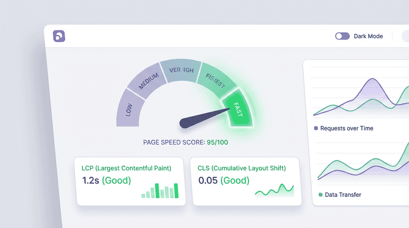
Core Web Vitals directly impact your search rankings and user experience. Images are often the largest contributors to poor scores. This guide shows you exactly how to optimize images for each metric.
Understanding Core Web Vitals
Google measures three core metrics that affect rankings:
| Metric | What It Measures | Target | Image Impact |
|---|---|---|---|
| LCP | Largest Contentful Paint | < 2.5s | Often THE LCP element |
| CLS | Cumulative Layout Shift | < 0.1 | Missing dimensions cause shifts |
| INP | Interaction to Next Paint | < 200ms | Large images block main thread |
Why Images Matter
Images typically account for:
- 50-70% of page weight
- The LCP element on most pages
- Major contributors to layout shifts
- Potential main thread blockers
Optimizing for LCP (Largest Contentful Paint)
LCP measures when the largest content element becomes visible. On most pages, this is an image.
Identifying the LCP Element
Using Chrome DevTools:
- Open DevTools → Performance tab
- Record a page load
- Look for the “LCP” marker in the timeline
- Hover to see which element triggered LCP
Using Lighthouse:
Lighthouse → Performance → Diagnostics → Largest Contentful Paint elementProgrammatically:
new PerformanceObserver((entryList) => {
  for (const entry of entryList.getEntries()) {
    console.log('LCP element:', entry.element);
    console.log('LCP time:', entry.startTime);
  }
}).observe({ type: 'largest-contentful-paint', buffered: true });
LCP Optimization Strategies
1. Preload the LCP Image
Tell the browser to fetch the LCP image immediately:
<head>
  <!-- Simple preload -->
  <link rel="preload" as="image" href="hero.jpg">

  <!-- With modern formats -->
  <link rel="preload" as="image" href="hero.webp" type="image/webp">

  <!-- Responsive preload -->
  <link
    rel="preload"
    as="image"
    href="hero-1200.jpg"
    imagesrcset="hero-600.jpg 600w, hero-900.jpg 900w, hero-1200.jpg 1200w"
    imagesizes="100vw"
  >
</head>
2. Use fetchpriority=“high”
Signal that the image is high priority:
<img
  src="hero.jpg"
  fetchpriority="high"
  alt="Hero image"
  width="1200"
  height="600"
>
Browser behavior with fetchpriority:
high: Load before other imageslow: Defer until other resources loadedauto: Browser decides (default)
3. Never Lazy Load LCP Images
Lazy loading the LCP image delays its appearance:
<!-- WRONG: Delays LCP -->
<img src="hero.jpg" loading="lazy" alt="Hero">

<!-- CORRECT: Load immediately -->
<img src="hero.jpg" alt="Hero">
4. Optimize Image Size
Larger files take longer to download:
<!-- For a 1200px hero displayed at 100vw -->
<img
  src="hero-1200.webp"
  srcset="
    hero-600.webp 600w,
    hero-900.webp 900w,
    hero-1200.webp 1200w,
    hero-1800.webp 1800w
  "
  sizes="100vw"
  alt="Hero"
>
Target file sizes for LCP images:
| Connection | Target Size | Reasoning |
|---|---|---|
| 4G | < 100KB | ~0.8s download |
| 3G | < 50KB | ~0.8s download |
| 2G | < 20KB | ~0.8s download |
5. Use Modern Formats
AVIF and WebP offer significant savings:
<picture>
  <source srcset="hero.avif" type="image/avif">
  <source srcset="hero.webp" type="image/webp">
  <img src="hero.jpg" alt="Hero" fetchpriority="high">
</picture>
Format savings example:
| Format | Size | LCP Impact |
|---|---|---|
| JPEG (original) | 250 KB | 2.8s |
| WebP (q=80) | 120 KB | 1.9s |
| AVIF (q=65) | 75 KB | 1.4s |
6. Use a CDN
Serve images from edge locations:
<!-- Origin server: 200ms latency -->
<img src="https://example.com/hero.jpg">

<!-- CDN: 20ms latency -->
<img src="https://cdn.example.com/hero.jpg">
Benefits:
- Lower latency (closer to users)
- Better caching
- Automatic format conversion
- Edge optimization
LCP Checklist
- ✅ Identify your LCP element
- ✅ Preload the LCP image
- ✅ Use
fetchpriority="high" - ✅ Never lazy load LCP images
- ✅ Compress aggressively (use AVIF/WebP)
- ✅ Right-size for display
- ✅ Serve from CDN
- ✅ Avoid chains (redirects, dependencies)
Optimizing for CLS (Cumulative Layout Shift)
CLS measures visual stability. Images without dimensions cause layout shifts when they load.
How Images Cause CLS
The problem:
- Browser renders page layout
- Image loads and pushes content down
- User clicks where button was
- Frustrating experience
CLS calculation:
CLS = Impact Fraction × Distance FractionA full-width image loading and pushing 50% of the viewport equals a CLS of 0.5 (failing score).
Always Set Dimensions
The simplest fix: always include width and height:
<!-- Browser can calculate aspect ratio before load -->
<img src="photo.jpg" width="800" height="600" alt="Photo">
How it works:
- Browser sees 800×600 (4:3 ratio)
- Reserves correct space before loading
- Image loads into reserved space
- Zero layout shift
Responsive Images with Dimensions
For responsive images, set the intrinsic dimensions:
<img
  src="photo-800.jpg"
  srcset="photo-400.jpg 400w, photo-800.jpg 800w, photo-1200.jpg 1200w"
  sizes="(max-width: 600px) 100vw, 800px"
  width="800"
  height="600"
  alt="Photo"
>
CSS handles the responsive sizing:
img {
  max-width: 100%;
  height: auto; /* Maintains aspect ratio */
}
CSS aspect-ratio Property
For complex layouts, use CSS aspect-ratio:
.hero-image {
  aspect-ratio: 16 / 9;
  width: 100%;
  height: auto;
  object-fit: cover;
}<img src="hero.jpg" class="hero-image" alt="Hero">Container-Based Approach
Reserve space with a container:
<div class="image-container">
  <img src="photo.jpg" alt="Photo" loading="lazy">
</div>
.image-container {
position: relative;
aspect-ratio: 4 / 3;
background: #f0f0f0; /* Placeholder color */
}
.image-container img {
position: absolute;
inset: 0;
width: 100%;
height: 100%;
object-fit: cover;
}Background Images
Background images don’t reserve space by default:
/* Problem: No reserved space */
.hero {
  background-image: url('hero.jpg');
  background-size: cover;
}

/* Solution: Set explicit dimensions */
.hero {
  background-image: url('hero.jpg');
  background-size: cover;
  aspect-ratio: 16 / 9; /* Or min-height */
}
Dynamic Content
For images loaded dynamically via JavaScript:
// Get dimensions before inserting
async function loadImageWithDimensions(src) {
  const img = new Image();

  await new Promise((resolve, reject) => {
    img.onload = resolve;
    img.onerror = reject;
    img.src = src;
  });

  return {
    src: img.src,
    width: img.naturalWidth,
    height: img.naturalHeight
  };
}

// Create element with proper dimensions
const { src, width, height } = await loadImageWithDimensions(imageUrl);
const imgElement = document.createElement('img');
imgElement.src = src;
imgElement.width = width;
imgElement.height = height;
imgElement.alt = 'Dynamic image';
container.appendChild(imgElement);
CLS Debugging
Chrome DevTools:
- Performance tab → Record
- Look for red “Layout Shift” markers
- Click to see which elements shifted
Web Vitals Extension: Shows real-time CLS contributions with visual overlay.
Layout Instability API:
new PerformanceObserver((entryList) => {
  for (const entry of entryList.getEntries()) {
    if (!entry.hadRecentInput) {
      console.log('Layout shift:', entry.value);
      entry.sources.forEach(source => {
        console.log('Shifted element:', source.node);
      });
    }
  }
}).observe({ type: 'layout-shift', buffered: true });
CLS Checklist
- ✅ Set width and height on all images
- ✅ Use CSS aspect-ratio for responsive layouts
- ✅ Reserve space for lazy-loaded images
- ✅ Set dimensions on background image containers
- ✅ Avoid inserting content above images
- ✅ Use placeholder containers for dynamic images
Optimizing for INP (Interaction to Next Paint)
INP measures responsiveness. Large images can block interactions.
How Images Affect INP
Image decoding can block the main thread:
- Large images (4K+) take 50-200ms to decode
- During decoding, clicks don’t respond
- Especially problematic on lower-end devices
Async Decoding
Use decoding="async" for non-critical images:
<!-- Let browser decode in background -->
<img src="photo.jpg" decoding="async" loading="lazy" alt="Photo">
Decoding options:
| Value | Behavior |
|---|---|
async | Decode in parallel, don’t block |
sync | Decode before next paint |
auto | Browser decides (default) |
When to use sync:
- LCP images (ensure immediate display)
- Critical above-fold content
When to use async:
- Below-fold images
- Image galleries
- User-loaded content
Optimize Image Sizes
Smaller images decode faster:
<!-- Don't serve 4K for 400px display -->
<img
  src="product.jpg"
  srcset="
    product-200.jpg 200w,
    product-400.jpg 400w,
    product-800.jpg 800w
  "
  sizes="(max-width: 600px) 200px, 400px"
  alt="Product"
>
Offscreen Image Handling
Lazy loading prevents unnecessary work:
<img src="photo.jpg" loading="lazy" decoding="async" alt="Photo">Use requestIdleCallback for Heavy Operations
For JavaScript image processing:
// Don't block interactions
requestIdleCallback(() => {
  const img = new Image();
  img.src = 'large-image.jpg';
  img.onload = () => {
    // Process when idle
    processImage(img);
  };
});
INP Checklist
- ✅ Use
decoding="async"for non-critical images - ✅ Right-size images (don’t serve 4K for thumbnails)
- ✅ Lazy load off-screen images
- ✅ Use requestIdleCallback for image processing
- ✅ Monitor main thread during image loads
Implementation Patterns
Hero Image Pattern
<head>
  <!-- Preload hero with modern format -->
  <link
    rel="preload"
    as="image"
    href="hero.avif"
    type="image/avif"
  >
</head>
<body>
  <picture>
    <source srcset="hero.avif" type="image/avif">
    <source srcset="hero.webp" type="image/webp">
    <img
      src="hero.jpg"
      alt="Hero image"
      width="1920"
      height="1080"
      fetchpriority="high"
    >
  </picture>
</body>
Product Grid Pattern
<div class="product-grid">
  <!-- First 4 products: eager load -->
  <img
    src="product-1.webp"
    width="400"
    height="400"
    alt="Product 1"
    fetchpriority="high"
  >
  <!-- ... products 2-4 similar -->

  <!-- Remaining products: lazy load -->
  <img
    src="product-5.webp"
    width="400"
    height="400"
    alt="Product 5"
    loading="lazy"
    decoding="async"
  >
</div>
Blog Post Pattern
<!-- Featured image (above fold) -->
<img
  src="featured.webp"
  srcset="featured-600.webp 600w, featured-900.webp 900w, featured-1200.webp 1200w"
  sizes="(max-width: 800px) 100vw, 800px"
  width="1200"
  height="630"
  alt="Featured image"
  fetchpriority="high"
>

<!-- Content images (below fold) -->
<img
  src="content-image.webp"
  width="800"
  height="450"
  alt="Illustration"
  loading="lazy"
  decoding="async"
>
Background Image Pattern
<style>
  .hero-section {
    background-image: url('hero-mobile.webp');
    background-size: cover;
    background-position: center;
    aspect-ratio: 16 / 9;
  }

  @media (min-width: 768px) {
    .hero-section {
      background-image: url('hero-desktop.webp');
    }
  }
</style>

<link
  rel="preload"
  as="image"
  href="hero-desktop.webp"
  type="image/webp"
  media="(min-width: 768px)"
>

<section class="hero-section" role="img" aria-label="Hero background">
  <!-- Content overlay -->
</section>
Monitoring and Testing
Lab Testing
Lighthouse:
# CLI
lighthouse https://example.com --only-categories=performance

# Chrome DevTools
DevTools → Lighthouse → Performance
WebPageTest:
- Multi-location testing
- Filmstrip comparison
- Detailed waterfall
PageSpeed Insights:
- Real user data (CrUX)
- Lab data (Lighthouse)
- Specific recommendations
Field Data (RUM)
web-vitals library:
import { onLCP, onCLS, onINP } from 'web-vitals';

onLCP(console.log);
onCLS(console.log);
onINP(console.log);

// Send to analytics
function sendToAnalytics(metric) {
  const body = JSON.stringify({
    name: metric.name,
    value: metric.value,
    id: metric.id
  });
  navigator.sendBeacon('/analytics', body);
}

onLCP(sendToAnalytics);
onCLS(sendToAnalytics);
onINP(sendToAnalytics);
Key metrics to track:
- LCP by page template
- CLS by device type
- INP during image galleries
- LCP element identification
Performance Budgets
Set targets for your images:
// Lighthouse CI budget
{
  "budgets": [
    {
      "resourceSizes": [
        { "resourceType": "image", "budget": 500 }
      ],
      "resourceCounts": [
        { "resourceType": "image", "budget": 20 }
      ]
    }
  ]
}
Common Mistakes
Mistake 1: Lazy Loading LCP Image
<!-- WRONG -->
<img src="hero.jpg" loading="lazy" alt="Hero">

<!-- CORRECT -->
<img src="hero.jpg" fetchpriority="high" alt="Hero">
Mistake 2: Missing Dimensions
<!-- WRONG: Causes CLS -->
<img src="photo.jpg" alt="Photo">

<!-- CORRECT: Reserves space -->
<img src="photo.jpg" width="800" height="600" alt="Photo">
Mistake 3: Oversized Images
<!-- WRONG: 4K image for 400px display -->
<img src="photo-4k.jpg" style="width: 400px" alt="Photo">

<!-- CORRECT: Right-sized image -->
<img
  src="photo-400.jpg"
  srcset="photo-400.jpg 1x, photo-800.jpg 2x"
  width="400"
  height="300"
  alt="Photo"
>
Mistake 4: Not Preloading LCP
<!-- WRONG: Browser discovers image late -->
<img src="hero.jpg" alt="Hero">

<!-- CORRECT: Early discovery -->
<head>
  <link rel="preload" as="image" href="hero.jpg">
</head>
<body>
  <img src="hero.jpg" fetchpriority="high" alt="Hero">
</body>
Mistake 5: Sync Decoding Everything
<!-- WRONG: Blocks main thread -->
<img src="gallery-1.jpg" decoding="sync" alt="Gallery">
<img src="gallery-2.jpg" decoding="sync" alt="Gallery">

<!-- CORRECT: Async for non-critical -->
<img src="gallery-1.jpg" decoding="async" loading="lazy" alt="Gallery">
Framework-Specific Guidance
Next.js
import Image from 'next/image';

// Automatic optimization
<Image
  src="/hero.jpg"
  width={1200}
  height={600}
  alt="Hero"
  priority // For LCP images
/>

// Lazy loaded (default)
<Image
  src="/photo.jpg"
  width={800}
  height={600}
  alt="Photo"
/>
Nuxt.js
<template>
  <NuxtImg
    src="/hero.jpg"
    width="1200"
    height="600"
    alt="Hero"
    loading="eager"
    fetchpriority="high"
  />
</template>
Astro
---
import { Image } from 'astro:assets';
import heroImage from '../assets/hero.jpg';
---

<Image
  src={heroImage}
  width={1200}
  height={600}
  alt="Hero"
  loading="eager"
/>
Summary
Quick Reference
| Metric | Key Image Optimizations |
|---|---|
| LCP | Preload, fetchpriority=“high”, modern formats, CDN |
| CLS | Always set width/height, use aspect-ratio |
| INP | decoding=“async”, right-size images, lazy load |
Master Checklist
For LCP:
- ✅ Preload LCP image in
<head> - ✅ Use
fetchpriority="high" - ✅ Never lazy load LCP images
- ✅ Use AVIF/WebP
- ✅ Right-size for display
- ✅ Serve from CDN
For CLS:
- ✅ Set width and height on all images
- ✅ Use CSS aspect-ratio for responsive
- ✅ Reserve space for lazy-loaded images
- ✅ Avoid inserting content above images
For INP:
- ✅ Use
decoding="async"for non-critical images - ✅ Don’t serve oversized images
- ✅ Lazy load off-screen images
Passing Core Web Vitals is achievable with focused attention on these image optimization techniques. Start with your LCP images, ensure all images have dimensions, and progressively enhance with modern formats and loading strategies.