Squarespace Image Optimization Guide
Optimize images on Squarespace for speed and quality. Learn upload best practices, focal points, galleries, banners, and performance tips for the platform.
Squarespace handles much of image optimization automatically, but understanding what you can control helps you get the best results. This guide covers how to prepare images, use platform features effectively, and maximize performance within Squarespace’s system.
How Squarespace Handles Images
Automatic Optimization
Squarespace automatically:
- Generates multiple image sizes
- Serves WebP to supporting browsers
- Implements lazy loading
- Uses a global CDN
- Creates responsive srcset
What You Control
Despite automation, you still control:
- Upload quality and dimensions
- Focal points for cropping
- Image placement and sizing
- Gallery layouts and settings
- Alt text for accessibility/SEO
Image Upload Guidelines
Recommended Specifications
| Use Case | Dimensions | Format | File Size |
|---|---|---|---|
| Banner/Hero | 2500×1500 | JPEG | Under 500KB |
| Gallery | 2500×2500 | JPEG | Under 300KB |
| Blog post | 1500×1000 | JPEG | Under 200KB |
| Logo | 400×400 | PNG | Under 50KB |
| Icon | 500×500 | PNG | Under 30KB |
Squarespace’s Processing
When you upload an image, Squarespace:
- Creates variants from 100px to 2500px wide
- Converts to WebP for modern browsers
- Preserves original for largest requests
- Applies compression (you can’t adjust this)
Optimal Upload Size
Upload at 2500px on the longest edge for most use cases:
Recommended: 2500×1667 (3:2 ratio)
Maximum useful: 2500px (larger gets scaled down)
Minimum for heroes: 1500px (for quality on retina)
Why 2500px?
- Squarespace’s maximum processed width
- Covers most screen sizes including retina
- Balances quality with file size
Pre-Upload Optimization
Before Uploading
Since Squarespace applies its own compression, optimize before upload:
# Export from Lightroom/Photoshop
# - Quality: 85-90%
# - Color Space: sRGB
# - Resolution: 72 PPI
# - Size: 2500px longest edge

# Command line optimization
magick input.jpg -resize 2500x2500 -quality 85 -strip output.jpg
Format Selection
| Content | Format | Reason |
|---|---|---|
| Photos | JPEG | Best compression |
| Logo (transparent) | PNG | Preserves transparency |
| Logo (solid) | JPEG or PNG | Either works |
| Graphics | PNG | Sharp edges |
| Screenshots | PNG | Text clarity |
Color Profile
Always use sRGB:
# Convert to sRGB with ImageMagick
magick input.jpg -colorspace sRGB -profile sRGB.icc output.jpg
Other profiles may display colors incorrectly.
Focal Points
Focal points control how images are cropped at different screen sizes.
Setting Focal Points
- Click on the image in the editor
- Click “Edit” or the pencil icon
- Click “Focal Point”
- Drag the focal point to the important area
- Save
Best Practices
Portraits:
- Set focal point on face
- Ensures face stays visible in all crops
Products:
- Center on the product
- Keep key features in focus
Landscapes:
- Set on the subject of interest
- Consider rule of thirds
Text overlays:
- Set focal point opposite to text
- Ensures text area has clear background
When Focal Points Matter
| Block Type | Focal Point Importance |
|---|---|
| Banner images | High |
| Gallery (cropped) | High |
| Image blocks (cropped) | High |
| Inline content images | Low |
| Gallery (original ratio) | None |
Banner and Hero Images
Banner Specifications
| Device | Typical Display | Upload Size |
|---|---|---|
| Desktop | 1920×800 | 2500×1000+ |
| Tablet | 1024×600 | Same image |
| Mobile | 375×400 | Same image |
Optimizing Banners
Single banner image:
- Upload at 2500px wide minimum
- Set focal point on subject
- Use appropriate aspect ratio for template
Different mobile image: Some templates support separate mobile images:
- Upload desktop version (2500×1000)
- Upload mobile version (1000×1200)
- Squarespace shows appropriate version
Banner Text Readability
Ensure text overlays remain readable:
Good practices:
- Use images with clear areas for text
- Add overlay (in Squarespace settings)
- Choose appropriate contrast
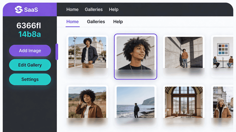
- Test on mobile previewGallery Optimization
Gallery Types
| Gallery | Best For | Image Prep |
|---|---|---|
| Grid | Uniform sizing | Consistent aspect ratios |
| Masonry | Mixed sizes | Varying aspects OK |
| Slideshow | Full-screen | 2500px wide |
| Carousel | Scrolling | Consistent dimensions |
Grid Gallery Best Practices
For consistent grid appearance:
- Use same aspect ratio for all images
- Batch crop before uploading
- Set focal points after upload
Common grid ratios:
- 1:1 (square) - Instagram-style
- 4:3 - Classic photo
- 16:9 - Widescreen
- 3:2 - Standard photo
Lightbox Considerations
For galleries with lightbox (click to enlarge):
- Upload at 2500px for crisp enlargement
- First image loads immediately
- Others load on demand (lazy)
- Consider load time for large galleries
Blog Images
Featured Images
Featured images appear in:
- Blog list pages
- Social sharing previews
- Email summaries
Recommended: 1500×1000 (3:2 ratio)
In-Post Images
Inline images:
- Width: 1500px minimum
- Will scale to content width
- Lazy loaded automatically
Full-width images:
- Width: 2500px
- Use image blocks, not inline
Image Placement
Best practices:
- Use image blocks for full-width
- Use inline for in-text flow
- Add captions for context
- Set alt text for SEO
Product Images (Commerce)
Product Photo Requirements
| Image | Dimensions | Notes |
|---|---|---|
| Main | 2500×2500 | Square recommended |
| Additional | 2500×2500 | Consistent with main |
| Thumbnail | 750×750 | Auto-generated |
E-commerce Best Practices
-
Consistent backgrounds
- White or neutral preferred
- Consistent across products
-
Multiple angles
- Front, back, side, detail
- 4-6 images per product
-
Zoom quality
- Upload full 2500px for zoom
- Check zoom quality in preview
-
Variant images
- Different colors/options get own images
- Same angle/style as main
Performance Tips
What Squarespace Controls
You cannot directly adjust:
- Compression level
- CDN caching
- Lazy loading behavior
- WebP conversion
What You Can Optimize
Pre-upload:
- Optimize images before upload
- Use correct dimensions
- Strip unnecessary metadata
- Choose appropriate format
In Squarespace:
- Use galleries for multiple images
- Limit images per page
- Use appropriate gallery type
- Enable/disable lightbox wisely
Page Speed Considerations
Heavy pages:
- More than 10 images may slow loading
- Consider pagination for galleries
- Split content across pages
Hero sections:
- Single optimized hero image
- Video can be heavier than image
- Test with mobile connection
Checking Performance
Tools to test Squarespace pages:
- Google PageSpeed Insights
- GTmetrix
- WebPageTest
- Squarespace’s built-in analytics
Image SEO
Alt Text
Always add alt text:
- Click on image in editor
- Open image settings
- Add descriptive alt text
- Save
Good alt text:
Bad: "image1.jpg"
Bad: "Photo"
Good: "Red leather handbag with gold hardware"
Good: "Mountain landscape at sunset with pine trees"
File Names
Name files descriptively before upload:
Bad: IMG_4523.jpg
Bad: photo.jpg
Good: red-leather-handbag.jpg
Good: mountain-sunset-landscape.jpg
Squarespace uses original filename in URL.
Structured Data
Squarespace automatically includes:
- Product image schema for commerce
- Blog post featured images
- Open Graph tags for sharing
Troubleshooting
Blurry Images
Cause: Image too small for display size
Fix:
- Re-upload at 2500px width
- Check original image quality
- Ensure export settings are correct
Wrong Crop
Cause: Focal point not set or misplaced
Fix:
- Adjust focal point
- Consider different aspect ratio
- Use image blocks with “Original” aspect
Slow Loading
Cause: Too many large images, unoptimized uploads
Fix:
- Reduce images per page
- Pre-optimize before upload
- Check image dimensions aren’t excessive
Colors Look Wrong
Cause: Wrong color profile
Fix:
- Export in sRGB color space
- Don’t use CMYK or Adobe RGB
- Check monitor calibration
Template-Specific Tips
Brine Family
- Large headers benefit from 2500px images
- Index pages: set focal points carefully
- Banner images are cropped by default
Bedford Family
- Sidebar layouts need smaller images
- Blog thumbnails are square by default
- Gallery blocks have multiple layout options
Pacific Family
- Full-bleed images need 2500px
- Parallax effects work best with taller images
- Check mobile preview for all pages
Fluid Engine
- More control over image placement
- Responsive behavior still automatic
- Test different breakpoints
Summary
Quick Reference
| Image Type | Dimensions | Format |
|---|---|---|
| Hero/Banner | 2500×1000+ | JPEG |
| Gallery | 2500×2500 | JPEG |
| Blog featured | 1500×1000 | JPEG |
| Product | 2500×2500 | JPEG |
| Logo | 400×400 | PNG |
Checklist
- ✅ Export at 2500px for main images
- ✅ Use sRGB color profile
- ✅ Pre-compress to 85-90% JPEG quality
- ✅ Use descriptive filenames
- ✅ Set focal points after upload
- ✅ Add alt text to all images
- ✅ Test on mobile preview
- ✅ Check page speed after adding images
- ✅ Use consistent aspect ratios in galleries
- ✅ Strip metadata before upload
Squarespace Limitations
Accept these platform constraints:
- Cannot adjust compression level
- Cannot disable WebP conversion
- Cannot modify lazy loading
- Cannot access CDN settings
Work within the system:
- Optimize before upload
- Use platform features correctly
- Test results in preview modes
- Monitor with external tools
Squarespace’s automatic optimization handles most heavy lifting. Your job is providing properly prepared source images and using the platform’s features effectively.