Retina/HiDPI Images: Complete Implementation Guide
Master retina and HiDPI image delivery. Learn device pixel ratios, srcset, responsive images, and optimization strategies for sharp images on all displays.
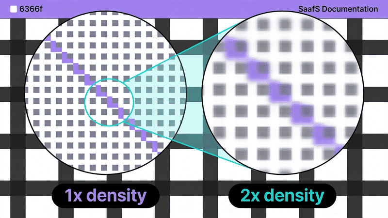
High-resolution displays are now the norm. From smartphones to 4K monitors, users expect sharp images. This guide covers everything you need to know about serving crisp images on HiDPI displays while maintaining performance.
Understanding Device Pixel Ratio
Device Pixel Ratio (DPR) is the ratio between physical pixels and CSS pixels.
Common DPRs
| DPR | Devices |
|---|---|
| 1x | Older monitors, budget displays |
| 1.25x, 1.5x | Some Windows laptops |
| 2x | iPhone 6-13, MacBooks, many Android |
| 3x | iPhone Plus/Max models, flagship Android |
| 4x | Some 4K+ displays |
The Math
Physical pixels = CSS pixels × DPR

Example: 400px CSS × 2x DPR = 800 physical pixels needed
If you serve a 400px image at 400 CSS pixels on a 2x display, it will look blurry—the display is stretching 400 pixels across 800 physical pixels.
Checking DPR
// Current device DPR
const dpr = window.devicePixelRatio;
console.log(`Device Pixel Ratio: ${dpr}`);

// Listen for changes (zoom, display switch)
window.matchMedia('(resolution: 2dppx)').addEventListener('change', (e) => {
  console.log('DPR changed to:', e.matches ? '2x' : 'other');
});
Implementation Strategies
Strategy 1: srcset with Density Descriptors (x)
For fixed-size images where only resolution varies:
<img
  src="logo.png"
  srcset="
    logo.png 1x,
    logo@2x.png 2x,
    logo@3x.png 3x
  "
  alt="Logo"
  width="200"
  height="50"
>
When to use:
- Logos with fixed display size
- Icons at fixed sizes
- Avatars
- Any image that doesn’t change size with viewport
Naming conventions:
image.png      (1x)
image@2x.png   (2x)
image-2x.png   (2x)
image_2x.png   (2x)
Strategy 2: srcset with Width Descriptors (w)
For responsive images that change size with viewport:
<img
  src="hero-1600.jpg"
  srcset="
    hero-400.jpg 400w,
    hero-800.jpg 800w,
    hero-1200.jpg 1200w,
    hero-1600.jpg 1600w,
    hero-2400.jpg 2400w
  "
  sizes="100vw"
  alt="Hero"
>
Browser calculates needed size:
Display width × DPR = Needed image width

100vw on 375px mobile × 2x DPR = 750px needed → 800w selected
100vw on 1440px desktop × 1x DPR = 1440px needed → 1600w selected
When to use:
- Hero images
- Content images
- Product galleries
- Any image that scales with layout
Strategy 3: CSS image-set()
For background images:
.hero {
  background-image: url('hero.jpg');
}

/* Modern syntax */
.hero {
  background-image: image-set(
    url('hero.jpg') 1x,
    url('hero@2x.jpg') 2x,
    url('hero@3x.jpg') 3x
  );
}

/* WebKit prefix (Safari) */
.hero {
  background-image: -webkit-image-set(
    url('hero.jpg') 1x,
    url('hero@2x.jpg') 2x
  );
  background-image: image-set(
    url('hero.jpg') 1x,
    url('hero@2x.jpg') 2x
  );
}
Strategy 4: Resolution Media Queries
Alternative CSS approach:
.logo {
  background-image: url('logo.png');
  width: 200px;
  height: 50px;
  background-size: 200px 50px;
}

@media (min-resolution: 2dppx) {
  .logo {
    background-image: url('logo@2x.png');
  }
}

@media (min-resolution: 3dppx) {
  .logo {
    background-image: url('logo@3x.png');
  }
}
Calculating Image Sizes
For Fixed-Size Images
1x size = display size
2x size = display size × 2
3x size = display size × 3

Example: 200×50 logo
- 1x: 200×50 pixels
- 2x: 400×100 pixels
- 3x: 600×150 pixels
For Responsive Images
Calculate max needed size:
Max image size = Max display size × Max DPR

Example: Full-width hero (max 1920px display)
- For 1x: 1920px
- For 2x: 3840px
- For 3x: 5760px (usually unnecessary)
Practical limits:
- 2x is usually sufficient
- 3x matters mainly for small, sharp elements
- Beyond 2400-3000px, returns diminish
Recommended Breakpoints
For full-width images:
400, 800, 1200, 1600, 2000, 2400, 3200For half-width images:
200, 400, 600, 800, 1000, 1200, 1600For thumbnails (200px display):
200, 400, 600Framework Implementations
React
function ResponsiveImage({ src, alt, width, height }) {
  return (
    <img
      src={`${src}.jpg`}
      srcSet={`
        ${src}.jpg 1x,
        ${src}@2x.jpg 2x,
        ${src}@3x.jpg 3x
      `}
      alt={alt}
      width={width}
      height={height}
    />
  );
}

// Usage
<ResponsiveImage
  src="/images/logo"
  alt="Logo"
  width={200}
  height={50}
/>
Next.js
Next.js Image component handles DPR automatically:
import Image from 'next/image';

// Automatically generates 1x, 2x variants
<Image
  src="/hero.jpg"
  width={1200}
  height={600}
  alt="Hero"
/>

// Custom device sizes in next.config.js
module.exports = {
  images: {
    deviceSizes: [640, 750, 828, 1080, 1200, 1920, 2048, 3840],
    imageSizes: [16, 32, 48, 64, 96, 128, 256, 384],
  },
};
Vue
<template>
  <img
    :src="`${src}.jpg`"
    :srcset="`${src}.jpg 1x, ${src}@2x.jpg 2x, ${src}@3x.jpg 3x`"
    :alt="alt"
    :width="width"
    :height="height"
  >
</template>

<script setup>
defineProps(['src', 'alt', 'width', 'height']);
</script>
CSS-in-JS
// Styled Components
const Logo = styled.div`
  width: 200px;
  height: 50px;
  background-image: url('/logo.png');
  background-size: cover;

  @media (min-resolution: 2dppx) {
    background-image: url('/logo@2x.png');
  }
`;
Optimization Strategies
1. Serve 2x to Everyone
Simpler approach for many sites:
<!-- Serve 2x, display at 1x size -->
<img
  src="logo@2x.png"
  width="200"
  height="50"
  alt="Logo"
>
Pros:
- Simple implementation
- Sharp on all displays
- No srcset complexity
Cons:
- Wastes bandwidth on 1x displays
- Larger files
When this works:
- Small images (logos, icons)
- When 2x image is still small
- Critical above-fold elements
2. Cap at 2x
3x images are often overkill:
<img
  src="photo.jpg"
  srcset="
    photo.jpg 1x,
    photo@2x.jpg 2x
  "
  alt="Photo"
>
Reasoning:
- 3x adds ~50% more pixels than 2x
- Diminishing perceptual returns
- Significant bandwidth cost
- Most users can’t tell the difference
3. Compress Aggressively at Higher DPR
Higher resolution allows lower quality:
const sharp = require('sharp');

// 1x at high quality
await sharp('input.jpg')
  .resize(400)
  .jpeg({ quality: 85 })
  .toFile('output.jpg');

// 2x at lower quality (still looks sharp)
await sharp('input.jpg')
  .resize(800)
  .jpeg({ quality: 75 })
  .toFile('output@2x.jpg');
Why this works: The extra resolution masks compression artifacts.
4. Use Modern Formats
AVIF and WebP help offset HiDPI size increases:
<picture>
  <source
    srcset="image.avif 1x, image@2x.avif 2x"
    type="image/avif"
  >
  <source
    srcset="image.webp 1x, image@2x.webp 2x"
    type="image/webp"
  >
  <img
    src="image.jpg"
    srcset="image.jpg 1x, image@2x.jpg 2x"
    alt="Image"
  >
</picture>
SVG for Resolution Independence
SVG scales perfectly to any DPR:
<!-- Always sharp, any size -->
<img src="logo.svg" alt="Logo" width="200" height="50">
Use SVG for:
- Logos
- Icons
- Illustrations
- Any vector-friendly graphics
Benefits:
- Single file for all DPRs
- Often smaller than multiple raster versions
- Can be styled with CSS
<!-- Inline SVG with styling -->
<svg viewBox="0 0 100 50" fill="currentColor">
  <path d="..."/>
</svg>
Generating HiDPI Images
Using Sharp
const sharp = require('sharp');

async function generateMultipleDensities(inputPath, outputBase, displayWidth) {
  const densities = [1, 2, 3];

  for (const dpr of densities) {
    const suffix = dpr === 1 ? '' : `@${dpr}x`;
    const width = displayWidth * dpr;

    await sharp(inputPath)
      .resize(width)
      .toFile(`${outputBase}${suffix}.jpg`);
  }
}

// Usage
generateMultipleDensities('./source.jpg', './output/logo', 200);
Using ImageMagick
#!/bin/bash
# Generate 1x, 2x, 3x versions

INPUT=$1
OUTPUT_BASE=$2
WIDTH=$3

convert "$INPUT" -resize ${WIDTH}x "$OUTPUT_BASE.jpg"
convert "$INPUT" -resize $((WIDTH * 2))x "$OUTPUT_BASE@2x.jpg"
convert "$INPUT" -resize $((WIDTH * 3))x "$OUTPUT_BASE@3x.jpg"
Build Tool Integration
Webpack with responsive-loader:
module.exports = {
  module: {
    rules: [
      {
        test: /\.(png|jpg)$/,
        use: {
          loader: 'responsive-loader',
          options: {
            sizes: [1, 2, 3].map(x => x * 200), // For 200px display
            adapter: require('responsive-loader/sharp'),
          },
        },
      },
    ],
  },
};
Common Mistakes
Mistake 1: Mixing w and x Descriptors
<!-- WRONG: Can't mix -->
<img srcset="image.jpg 400w, image@2x.jpg 2x">

<!-- CORRECT: Use one type -->
<img srcset="image.jpg 1x, image@2x.jpg 2x">
<!-- OR -->
<img srcset="image-400.jpg 400w, image-800.jpg 800w">
Mistake 2: Missing Fallback src
<!-- WRONG: No fallback -->
<img srcset="logo.png 1x, logo@2x.png 2x" alt="Logo">

<!-- CORRECT: Include src -->
<img
  src="logo.png"
  srcset="logo.png 1x, logo@2x.png 2x"
  alt="Logo"
>
Mistake 3: Serving 3x for Everything
<!-- Overkill for most images -->
<img
  src="hero.jpg"
  srcset="hero.jpg 1x, hero@2x.jpg 2x, hero@3x.jpg 3x"
>

<!-- Better: Cap at 2x for large images -->
<img
  src="hero.jpg"
  srcset="hero.jpg 1x, hero@2x.jpg 2x"
>
Mistake 4: Not Setting Dimensions
<!-- WRONG: Causes layout shift -->
<img srcset="logo.png 1x, logo@2x.png 2x" alt="Logo">

<!-- CORRECT: Set display dimensions -->
<img
  srcset="logo.png 1x, logo@2x.png 2x"
  width="200"
  height="50"
  alt="Logo"
>
Mistake 5: Forgetting CSS background-size
/* WRONG: 2x image displayed at 2x size */
.logo {
  background-image: url('logo@2x.png');
  width: 400px;  /* Wrong! */
  height: 100px;
}

/* CORRECT: Display at intended size */
.logo {
  background-image: url('logo@2x.png');
  width: 200px;
  height: 50px;
  background-size: 200px 50px; /* Or cover/contain */
}
Testing
DevTools Device Emulation
- Open Chrome DevTools
- Toggle device toolbar
- Select device or set custom DPR
- Refresh to see different images load
Check Which Image Loaded
document.querySelectorAll('img').forEach(img => {
  console.log({
    displayWidth: img.clientWidth,
    naturalWidth: img.naturalWidth,
    currentSrc: img.currentSrc,
    dpr: window.devicePixelRatio,
    effectiveDPR: img.naturalWidth / img.clientWidth
  });
});
Performance Testing
Compare file sizes at different DPRs:
async function measureImageSizes() {
  const img = document.querySelector('img');
  const srcset = img.srcset.split(',').map(s => s.trim().split(' ')[0]);

  for (const src of srcset) {
    const response = await fetch(src, { method: 'HEAD' });
    const size = response.headers.get('content-length');
    console.log(`${src}: ${Math.round(size / 1024)}KB`);
  }
}
Summary
Quick Reference
| Image Type | Strategy | Example |
|---|---|---|
| Fixed-size logo | Density descriptors | srcset="logo.png 1x, logo@2x.png 2x" |
| Responsive hero | Width descriptors | srcset="hero-800.jpg 800w, hero-1600.jpg 1600w" |
| CSS background | image-set() | image-set(url('bg.jpg') 1x, url('bg@2x.jpg') 2x) |
| Icon/logo | SVG | <img src="logo.svg"> |
Size Recommendations
| Display Size | 1x | 2x | 3x |
|---|---|---|---|
| 200px | 200px | 400px | 600px |
| 400px | 400px | 800px | Optional |
| 800px | 800px | 1600px | Usually skip |
| Full-width | 1920px | 3840px | Usually skip |
Checklist
- ✅ Use SVG for logos and icons when possible
- ✅ Use density descriptors (x) for fixed-size images
- ✅ Use width descriptors (w) for responsive images
- ✅ Always include display dimensions
- ✅ Cap at 2x for large images (diminishing returns at 3x)
- ✅ Use modern formats (AVIF, WebP) to offset size increase
- ✅ Consider serving 2x to everyone for simple cases
- ✅ Test on actual devices, not just emulators
- ✅ Use lower quality at higher resolutions
- ✅ Measure bandwidth impact
Retina/HiDPI support is about finding the balance between sharpness and performance. For most sites, serving 2x images with modern formats provides excellent quality without excessive bandwidth costs.