Next.js Image Component Mastery
Master the Next.js Image component for optimal performance. Learn configuration, optimization strategies, responsive images, and advanced patterns for image handling.
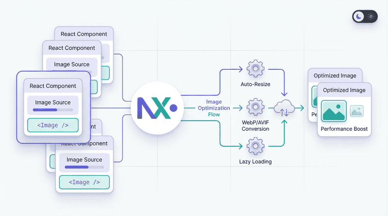
Next.js provides powerful built-in image optimization through the next/image component. This guide covers everything from basic usage to advanced optimization patterns.
Why next/image?
The Next.js Image component automatically handles:
- Format conversion: Serves WebP/AVIF to supporting browsers
- Responsive images: Generates multiple sizes automatically
- Lazy loading: Built-in, enabled by default
- Size optimization: Resizes images on-demand
- Layout stability: Prevents Cumulative Layout Shift
- Blur placeholders: Shows preview while loading
The Impact
| Metric | Without next/image | With next/image |
|---|---|---|
| Format | JPEG only | WebP/AVIF auto |
| Sizes | Single size | Multiple responsive |
| Loading | Eager | Lazy by default |
| LCP | Often poor | Optimized |
| CLS | Common issue | Prevented |
Basic Usage
Static Images (Imported)
import Image from 'next/image';
import heroImage from '@/public/hero.jpg';

export default function Hero() {
  return (
    <Image
      src={heroImage}
      alt="Hero image"
      placeholder="blur" // Automatic blur placeholder
    />
  );
}
Static imports provide:
- Automatic width/height detection
- Built-in blur placeholder
- Build-time optimization
Remote Images
import Image from 'next/image';

export default function Profile({ user }) {
  return (
    <Image
      src={user.avatarUrl}
      alt={user.name}
      width={200}
      height={200}
    />
  );
}
Remote images require explicit dimensions (or fill layout).
Configuration
next.config.js Setup
/** @type {import('next').NextConfig} */
const nextConfig = {
  images: {
    // Remote image domains
    remotePatterns: [
      {
        protocol: 'https',
        hostname: 'cdn.example.com',
        pathname: '/images/**',
      },
      {
        protocol: 'https',
        hostname: '*.cloudinary.com',
      },
    ],

    // Output formats (in preference order)
    formats: ['image/avif', 'image/webp'],

    // Device widths for responsive images
    deviceSizes: [640, 750, 828, 1080, 1200, 1920, 2048, 3840],

    // Image widths for next/image with sizes prop
    imageSizes: [16, 32, 48, 64, 96, 128, 256, 384],

    // Minimum cache TTL in seconds
    minimumCacheTTL: 60,

    // Disable optimization for specific paths
    unoptimized: false,

    // Custom loader (for external optimization services)
    loader: 'default',
  },
};

module.exports = nextConfig;
Remote Patterns Explained
remotePatterns: [
  // Allow specific subdomain
  {
    protocol: 'https',
    hostname: 'images.example.com',
  },

  // Allow all subdomains
  {
    protocol: 'https',
    hostname: '*.example.com',
  },

  // Allow specific path pattern
  {
    protocol: 'https',
    hostname: 'cdn.example.com',
    pathname: '/user-uploads/**',
  },

  // Allow with port
  {
    protocol: 'http',
    hostname: 'localhost',
    port: '3001',
  },
]
Sizing Strategies
Fixed Size
<Image
  src="/photo.jpg"
  alt="Photo"
  width={800}
  height={600}
/>
Best for: Images with known, fixed dimensions.
Fill Container
<div className="relative aspect-video">
  <Image
    src="/hero.jpg"
    alt="Hero"
    fill
    className="object-cover"
  />
</div>
Requires parent with position: relative and defined dimensions.
Responsive with sizes
<Image
  src="/hero.jpg"
  alt="Hero"
  width={1200}
  height={600}
  sizes="(max-width: 768px) 100vw, (max-width: 1200px) 50vw, 33vw"
/>
The sizes prop tells Next.js how wide the image will display at different viewports, optimizing the generated srcset.
Priority and Loading
LCP Images
Mark above-the-fold images as priority:
<Image
  src="/hero.jpg"
  alt="Hero"
  width={1920}
  height={1080}
  priority // Disables lazy loading, preloads image
/>
priority does:
- Disables lazy loading
- Adds preload link to head
- Sets fetchpriority=“high”
Lazy Loading
Default behavior—no prop needed:
// Lazy loaded by default
<Image
  src="/content.jpg"
  alt="Content"
  width={800}
  height={600}
/>

// Explicit (same behavior)
<Image
  src="/content.jpg"
  alt="Content"
  width={800}
  height={600}
  loading="lazy"
/>

// Eager loading (use sparingly)
<Image
  src="/content.jpg"
  alt="Content"
  width={800}
  height={600}
  loading="eager"
/>
Placeholders
Blur Placeholder (Static)
For imported images, blur is automatic:
import heroImage from '@/public/hero.jpg';

<Image
  src={heroImage}
  alt="Hero"
  placeholder="blur"
/>
Blur Placeholder (Remote)
For remote images, provide a data URL:
<Image
  src="https://cdn.example.com/photo.jpg"
  alt="Photo"
  width={800}
  height={600}
  placeholder="blur"
  blurDataURL="data:image/jpeg;base64,/9j/4AAQSkZJRg..."
/>
Generating Blur Data URLs
// Using plaiceholder
import { getPlaiceholder } from 'plaiceholder';

export async function getStaticProps() {
  const { base64 } = await getPlaiceholder('/public/hero.jpg');

  return {
    props: {
      blurDataURL: base64,
    },
  };
}
// Using sharp
import sharp from 'sharp';
async function getBlurDataURL(imagePath) {
const buffer = await sharp(imagePath)
.resize(10, 10, { fit: 'inside' })
.toBuffer();
return `data:image/jpeg;base64,${buffer.toString('base64')}`;
}Empty Placeholder
For skeleton-style loading:
<Image
  src="/photo.jpg"
  alt="Photo"
  width={800}
  height={600}
  placeholder="empty"
/>
Quality Control
Global Quality
// next.config.js
module.exports = {
  images: {
    quality: 75, // Default quality (1-100)
  },
};
Per-Image Quality
// High quality for hero
<Image
  src="/hero.jpg"
  alt="Hero"
  width={1920}
  height={1080}
  quality={85}
  priority
/>

// Lower quality for thumbnails
<Image
  src="/thumb.jpg"
  alt="Thumbnail"
  width={200}
  height={200}
  quality={60}
/>
Custom Loaders
External Image Services
// next.config.js
module.exports = {
  images: {
    loader: 'custom',
    loaderFile: './lib/imageLoader.js',
  },
};
// lib/imageLoader.js
export default function cloudinaryLoader({ src, width, quality }) {
const params = ['f_auto', 'c_limit', `w_${width}`, `q_${quality || 'auto'}`];
return `https://res.cloudinary.com/demo/image/upload/${params.join(',')}${src}`;
}Inline Loader
const sirvLoader = ({ src, width, quality }) => {
  return `https://example.sirv.com${src}?w=${width}&q=${quality || 80}`;
};

<Image
  loader={sirvLoader}
  src="/products/item.jpg"
  alt="Product"
  width={400}
  height={400}
/>
Common Loader Configurations
Cloudinary:
export default function cloudinaryLoader({ src, width, quality }) {
  const params = ['f_auto', 'c_limit', `w_${width}`, `q_${quality || 'auto'}`];
  const paramsString = params.join(',');
  return `https://res.cloudinary.com/YOUR_CLOUD/image/upload/${paramsString}${src}`;
}
Imgix:
export default function imgixLoader({ src, width, quality }) {
  const url = new URL(`https://YOUR_DOMAIN.imgix.net${src}`);
  url.searchParams.set('auto', 'format');
  url.searchParams.set('w', width.toString());
  url.searchParams.set('q', (quality || 75).toString());
  return url.href;
}
Sirv:
export default function sirvLoader({ src, width, quality }) {
  return `https://YOUR_ACCOUNT.sirv.com${src}?w=${width}&q=${quality || 80}&format=optimal`;
}
Sirv CDN Integration
Sirv provides powerful image optimization with Next.js. Here’s a comprehensive integration guide.
Basic Setup
// sirvLoader.js
export default function SirvLoader({ src, width, quality }) {
  const url = new URL(`https://demo.sirv.com${src}`);
  const params = url.searchParams;
  params.set('w', width.toString());
  params.set('q', quality.toString());
  return url.href;
}
// next.config.js
const nextConfig = {
images: {
loader: 'custom',
loaderFile: './sirvLoader.js',
},
}
module.exports = nextConfig;Advanced Loader with Defaults
Include format conversion and optimization profiles:
// sirvLoader.js
export default function SirvLoader({ src, width, quality }) {
  const url = new URL(`https://demo.sirv.com${src}`);
  const params = url.searchParams;
  params.set('w', width.toString());
  params.set('q', (quality || 80).toString());
  params.set('format', 'optimal'); // Auto WebP/AVIF
  params.set('profile', 'my-profile'); // Sirv optimization profile
  return url.href;
}
Dynamic URL Builder
For complex transformations, build URLs dynamically:
// components/SirvImage.jsx
'use client';

import Image from 'next/image';
import { useState } from 'react';

function buildSirvUrl(src, params) {
  const url = new URL(`https://demo.sirv.com${src}`);
  Object.entries(params).forEach(([key, value]) => {
    if (value !== undefined && value !== '') {
      url.searchParams.set(key, value.toString());
    }
  });
  return url.href;
}

export default function SirvImage({ src, alt, initialParams = {} }) {
  const [params, setParams] = useState({
    w: 800,
    h: 600,
    q: 80,
    format: 'optimal',
    ...initialParams
  });

  const imageUrl = buildSirvUrl(src, params);

  return (
    <div>
      <Image
        src={imageUrl}
        alt={alt}
        width={params.w}
        height={params.h}
        unoptimized // Sirv handles optimization
      />
    </div>
  );
}
Sirv Transformation Parameters
Common Sirv parameters for the loader:
| Parameter | Description | Example |
|---|---|---|
w | Width | w=800 |
h | Height | h=600 |
q | Quality (1-100) | q=80 |
format | Output format | format=webp, format=optimal |
scale.width | Scale by width | scale.width=50% |
canvas.width | Canvas dimensions | canvas.width=1000 |
crop.type | Crop method | crop.type=face |
profile | Optimization profile | profile=my-profile |
Complete Example with Controls
// components/SirvImageWithControls.jsx
'use client';

import Image from 'next/image';
import { useState, useCallback } from 'react';

function buildSirvUrl(src, params) {
  const url = new URL(`https://demo.sirv.com${src}`);
  Object.entries(params).forEach(([key, value]) => {
    if (value !== undefined && value !== '') {
      url.searchParams.set(key, value.toString());
    }
  });
  return url.href;
}

export default function SirvImageWithControls({ src, alt }) {
  const [params, setParams] = useState({
    w: 800,
    q: 80,
    format: 'optimal'
  });

  const updateParam = useCallback((key, value) => {
    setParams(prev => ({ ...prev, [key]: value }));
  }, []);

  return (
    <div className="space-y-4">
      <Image
        src={buildSirvUrl(src, params)}
        alt={alt}
        width={params.w}
        height={Math.round(params.w * 0.75)}
        unoptimized
        className="rounded-lg"
      />

      <div className="flex gap-4">
        <label>
          Width:
          <input
            type="range"
            min="200"
            max="1600"
            value={params.w}
            onChange={(e) => updateParam('w', parseInt(e.target.value))}
          />
          {params.w}px
        </label>

        <label>
          Quality:
          <input
            type="range"
            min="1"
            max="100"
            value={params.q}
            onChange={(e) => updateParam('q', parseInt(e.target.value))}
          />
          {params.q}%
        </label>

        <label>
          Format:
          <select
            value={params.format}
            onChange={(e) => updateParam('format', e.target.value)}
          >
            <option value="optimal">Optimal (Auto)</option>
            <option value="webp">WebP</option>
            <option value="avif">AVIF</option>
            <option value="jpg">JPEG</option>
          </select>
        </label>
      </div>
    </div>
  );
}
Responsive Patterns
Full-Width Hero
<div className="relative w-full aspect-[21/9]">
  <Image
    src="/hero.jpg"
    alt="Hero banner"
    fill
    sizes="100vw"
    priority
    className="object-cover"
  />
</div>
Two-Column Layout
<div className="grid grid-cols-1 md:grid-cols-2 gap-4">
  <Image
    src="/feature-1.jpg"
    alt="Feature 1"
    width={600}
    height={400}
    sizes="(max-width: 768px) 100vw, 50vw"
  />
  <Image
    src="/feature-2.jpg"
    alt="Feature 2"
    width={600}
    height={400}
    sizes="(max-width: 768px) 100vw, 50vw"
  />
</div>
Product Grid (3 Columns)
<div className="grid grid-cols-2 md:grid-cols-3 gap-4">
  {products.map((product) => (
    <Image
      key={product.id}
      src={product.image}
      alt={product.name}
      width={400}
      height={400}
      sizes="(max-width: 640px) 50vw, (max-width: 1024px) 33vw, 25vw"
      className="rounded-lg"
    />
  ))}
</div>
Styling
With Tailwind CSS
<Image
  src="/photo.jpg"
  alt="Photo"
  width={800}
  height={600}
  className="rounded-xl shadow-lg hover:shadow-xl transition-shadow"
/>
Fill with Object Position
<div className="relative w-full h-[500px]">
  <Image
    src="/hero.jpg"
    alt="Hero"
    fill
    className="object-cover object-top" // Focus on top of image
  />
</div>
Aspect Ratio Container
<div className="relative aspect-video overflow-hidden rounded-lg">
  <Image
    src="/video-thumbnail.jpg"
    alt="Video thumbnail"
    fill
    className="object-cover"
  />
</div>
Error Handling
onError Callback
function ImageWithFallback({ src, fallbackSrc, ...props }) {
  const [imgSrc, setImgSrc] = useState(src);

  return (
    <Image
      {...props}
      src={imgSrc}
      onError={() => setImgSrc(fallbackSrc)}
    />
  );
}
Loading States
function ImageWithLoading({ src, ...props }) {
  const [isLoading, setIsLoading] = useState(true);

  return (
    <div className="relative">
      {isLoading && (
        <div className="absolute inset-0 bg-gray-200 animate-pulse" />
      )}
      <Image
        {...props}
        src={src}
        onLoad={() => setIsLoading(false)}
        className={isLoading ? 'opacity-0' : 'opacity-100 transition-opacity'}
      />
    </div>
  );
}
Performance Optimization
Device Sizes
Configure based on your design system:
// next.config.js
module.exports = {
  images: {
    // Common device widths
    deviceSizes: [640, 750, 828, 1080, 1200, 1920, 2048, 3840],

    // Fixed image widths (thumbnails, avatars)
    imageSizes: [16, 32, 48, 64, 96, 128, 256, 384],
  },
};
Format Priority
module.exports = {
  images: {
    // Prefer AVIF over WebP
    formats: ['image/avif', 'image/webp'],
  },
};
Caching
module.exports = {
  images: {
    // Cache optimized images for 60 days
    minimumCacheTTL: 60 * 60 * 24 * 60,
  },
};
Common Patterns
Avatar Component
function Avatar({ src, name, size = 48 }) {
  return (
    <Image
      src={src}
      alt={name}
      width={size}
      height={size}
      className="rounded-full"
      sizes={`${size}px`}
    />
  );
}
Product Card
function ProductCard({ product }) {
  return (
    <div className="group">
      <div className="relative aspect-square overflow-hidden rounded-lg bg-gray-100">
        <Image
          src={product.image}
          alt={product.name}
          fill
          sizes="(max-width: 640px) 50vw, (max-width: 1024px) 33vw, 25vw"
          className="object-cover group-hover:scale-105 transition-transform"
        />
      </div>
      <h3>{product.name}</h3>
      <p>{product.price}</p>
    </div>
  );
}
Gallery with Lightbox
function Gallery({ images }) {
  const [selected, setSelected] = useState(null);

  return (
    <>
      <div className="grid grid-cols-3 gap-2">
        {images.map((img, i) => (
          <button key={i} onClick={() => setSelected(img)}>
            <Image
              src={img.thumb}
              alt={img.alt}
              width={300}
              height={300}
              className="object-cover aspect-square"
            />
          </button>
        ))}
      </div>

      {selected && (
        <div className="fixed inset-0 bg-black/90 flex items-center justify-center z-50">
          <Image
            src={selected.full}
            alt={selected.alt}
            width={1200}
            height={800}
            className="max-h-[90vh] w-auto"
            priority
          />
        </div>
      )}
    </>
  );
}
Troubleshooting
Common Issues
“Invalid src prop”
// Add domain to remotePatterns
remotePatterns: [
  { hostname: 'example.com' }
]
Image not lazy loading
// Remove priority prop for below-fold images
<Image src="/content.jpg" priority /> // Wrong
<Image src="/content.jpg" /> // Correct - lazy by default
CLS with fill
// Ensure parent has position and dimensions
<div className="relative h-64"> {/* or aspect-ratio */}
  <Image fill src="/photo.jpg" />
</div>
Blur placeholder not showing
// For remote images, provide blurDataURL
<Image
  src="https://..."
  placeholder="blur"
  blurDataURL="data:image/..." // Required for remote
/>
Debugging
// Check what URL is generated
<Image
  src="/photo.jpg"
  alt="Photo"
  width={800}
  height={600}
  onLoad={(e) => console.log('Loaded:', e.target.currentSrc)}
/>
Summary
Quick Reference
| Scenario | Key Props |
|---|---|
| Hero image | priority, sizes="100vw" |
| Product grid | sizes="(max-width: ...) ...vw" |
| Avatar | width, height, fixed sizes |
| Background | fill, className="object-cover" |
| Remote image | remotePatterns config |
| Blur loading | placeholder="blur" |
Checklist
- ✅ Use
priorityfor LCP images - ✅ Provide accurate
sizesfor responsive images - ✅ Configure
remotePatternsfor external images - ✅ Enable AVIF:
formats: ['image/avif', 'image/webp'] - ✅ Use
fillwithobject-coverfor backgrounds - ✅ Add blur placeholders for better UX
- ✅ Set appropriate quality per use case
- ✅ Use custom loader for external CDNs
The Next.js Image component handles the complexity of image optimization automatically. Focus on providing good sizes values, marking priority images, and the component handles the rest.